
I Used a Designer’s “3-4-5” Rule to Decorate My Living Room, and I’m Going to Try It In Every Room
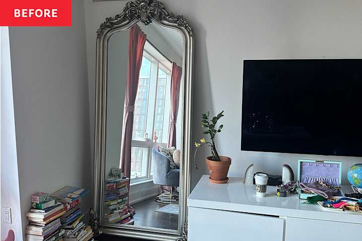
I’ve made personal style such a big part of my life and career, but my living room didn’t reflect it. It looked like a place trying to pass as a grown-up space for adults in their 30s but still clinging to the scrappy charm of being 20-somethings in New York City on a budget. The effort was there, but the polish? Not so much. It felt lived-in — just not in the chic, intentional way I had hoped.
My husband, Bren, and I met at 19 (shoutout to my friend Veronica for that one!) and have been living together ever since. Over the years we’ve called seven different apartments home, and our current place is the one we’ve stayed in the longest.


Living in New York was always the dream. I imagined myself as one of those women who had her life together, down to a curated collection of coffee table books with a perfectly styled space to match. The move to a cute New York apartment? That part happened. Actually getting my design scheme together? That was still a work in progress.
Luckily I became friends with interior designer Nancy Cavaliere, whose personal and home style instantly clicked with mine. After bonding with Nancy at a tag sale over antique candleholders and visiting her beautiful home in Jackson Heights, Bren and I knew we’d found someone who truly understood our taste. In a world ruled by millennial pink and minimalist gray, it was a rare joy to find someone who embraced our love for the ornate, the pretty, and the timeless.


With Nancy’s keen eye for design and her easy-to-use 3-4-5 method, we decided on some key points to get the living room looking chic — all while keeping the art we’ve loved for years.
What’s the 3-4-5 method, you ask? More on that below, but it’s a super-easy-to-understand framework for making your place pop.

What’s the “3-4-5” Rule for Decorating a Room?
This designer-approved method is a super-simple recipe that calls for 3 patterns, 4 period styles, and 5 colors or textures within a room. Yes, it’s a more maximalist-leaning strategy, but I’m good with that. I want a space that feels bold and bright without getting too busy.
As a fashion and style writer, putting together an outfit recipe takes me no time at all, but putting together a living room had me stumped. That’s why Nancy’s 3-4-5 method appealed to me.


It’s about creating variety, texture, and layers in a living room without going overboard. Pretty much everything you bring into your space is accounted for in her formula because it’ll fall into one of those three guiding categories.
Take the three, for instance, which is all about pattern. We started the room design based on three prints: We’d use stripes for our drapery, a floral rug underfoot, and leopard print in the form of a side chair.
Then came the four part of the formula, which is all about period styles and decorating eras. We decided on an aesthetic blend of traditional, regency, chinoiserie, and modern styles for an eclectic, maximalist look.

Once you home in on your four styles, the idea is to shop for pieces that fit into these categories. You use them to guide purchases big and small, from furniture to decorative accessories. Most of the items should be solids or solid-leaning, versus patterns, to keep the overall room design feeling balanced (unless said items can fit into your three chosen pattern schemes, like the striped frame below).
Then, for our five colors and/or textures we pulled shades from the wool rug and our existing art: red, pink, blue, green, and black. First, the room got an instant facelift from a fresh coat of paint. We chose Behr’s Bengal Blue (M480-3) and fell in love with the way it brightened the whole room.
The rest of the shades were mixed in from furniture pieces, like the green lacquered screen and black credenza, the chrome and rattan stools, the pink velvet sofa, and the brass and glass tables. I shopped secondhand where I could so we could find truly unique pieces.
Nancy and I scoured Facebook Marketplace and scored the couch for just $200, found a beautiful glass coffee table and a Karl Springer side table, and even lucked out at Salvation Army and Housing Works with a cozy new chair and a vintage (crystal!!) Champagne bucket.


What tied everything together for me was the gold from all the Framebridge frames in my gallery wall — and the couple of vintage frames I mixed in. All of the art in our living room is deeply personal to us. Most of the pieces have been with us for over a decade.
There’s a photographed shoe that was a gift from my time at Harper’s BAZAAR, and the most meaningful piece, hanging above the TV, is a painting my mom bought from an up-an-coming artist in North Carolina. It was one of the first things she purchased after immigrating to the U.S., and it’s been in every apartment we’ve ever lived in.


Each piece tells a story, and together they feel like a love note to our lives and the places we’ve been. For the pieces not in vintage gold frames, we used Framebridge to help accentuate the beauty of each piece of art and make all of them feel cohesive.
Our budget has grown since our 20s, but we weren’t looking to spend a fortune just to make the room feel new. We were more interested in it feeling new to us. While all of these pieces might sound like a lot, it all came together in a way that felt rich, cohesive, and full of personality, without being too matchy-matchy or forced. And that’s all thanks to Nancy’s “3-4-5” rule.
Design Defined
Never miss the style inspo and recommendations you crave with Design Defined. Follow along each week as our Home Director Danielle shares the best style advice, latest trends, and popular decor finds you just can't miss.