
6 Daring, Real-Life Wall Paint Colors to Try From This Week’s Top Tours
We had some house tours from folks not afraid of color this week. Rich, soothing and energizing, these colors would complement a lot of styles. And as evidenced from the gorgeous real-life spaces that accompany these hues, you know they work. Grab wall paint color inspiration from these actual rooms for your own color project this weekend.
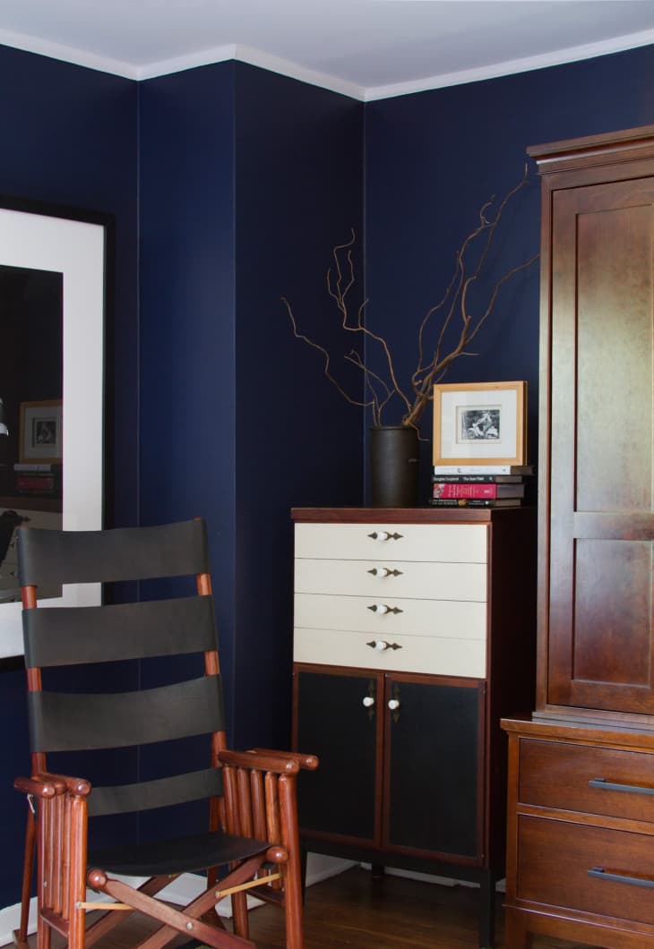
Top image: It’s deep, it’s dramatic and it’s dark; Ralph Lauren’s Club Navy coats the walls in Lucie & Chris’ Spanish Colonial in bedroom.

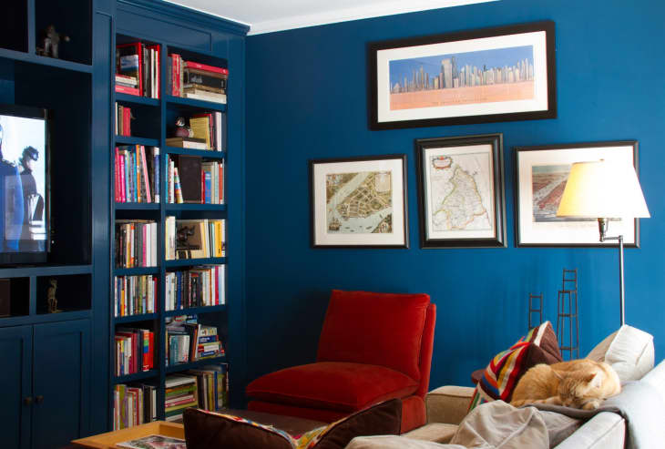
Benjamin Moore’s Deep Ocean in Lucie & Chris’ library and media room is like a cool summer breeze while floating on the sea. A step under their dark bedroom color but still bold and arresting.
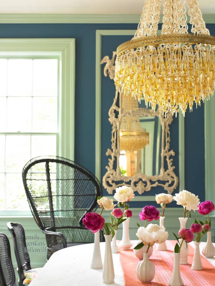
Cinda & Mark’s House of Chic Contrasts house tour showcases not only great colors, but great color combinations. Like in the dining room, where Benjamin Moore’s Ashwood (OC-47) with a top layer of Pearlescent Gold makes the ceiling pop. And Pratt & Lambert‘s Dark Blue (#1238) walls mix with trim painted in Pratt & Lambert‘s Light Blue (#683).
What’s that? You don’t think white’s a daring color? Then you’ve never tried to pick out a good white that’s just right. We found a perfect white shade in Madelyn Baker’s Naturally Elegant Abode, Benjamin Moore’s Mountain Peaks White.
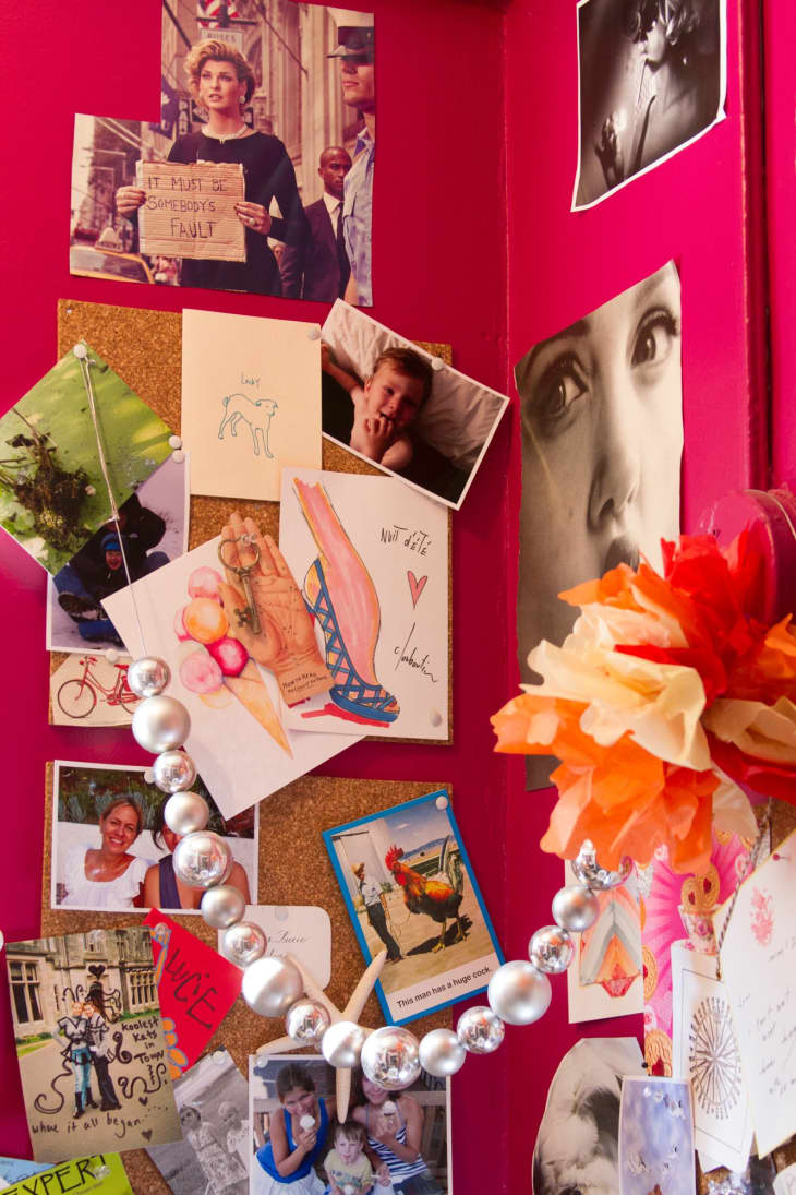
This hue sure will wake you up in the morning! It definitely makes all these fun and inspiring pinned up images pop in Lucie & Chris’ office. She just lists this as “hot pink” but we think Benjamin Moore’s Razzle Dazzle could be a good match.
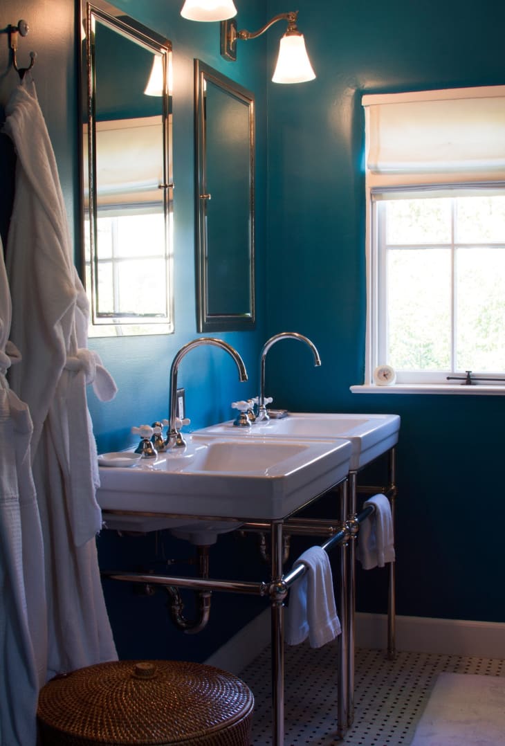
One last color from Lucie & Chris’ Spanish Colonial house tour (there were so many good colors in there!). This time in the bathroom, another beautiful, dramatic, soothing blue: Dunn Edwards’ Rare Turquoise.