
That ’70s Color Palette Is Back, Here’s How to Get It Right
Avocado green, harvest gold, rust, brown. The “it” colors that defined 1970s interiors are popping up again in a big way. They’re showing up on kitchen cabinets, velvet sofas, tiled backsplashes, and even ceilings. It’s easy to see why: ’70s design strikes that rare balance between grounded and free-spirited, two things many people want to feel at home.
Beyond bold florals and the disco balls, the 1970s leaned into natural materials, earthy color stories, and a cozy kind of maximalism design. Think shag rugs, wood-paneled walls, lots of houseplants, and rooms that felt collected, not overly styled or curated.

So what defines a ’70s color palette, and how do you make it work today? I asked a few experts to weigh in.
1970s Color Palette Basics
If you’re thinking about bringing a ’70s palette into your home, it’s helpful to start with the overall vibe. Personally, I think the best color palettes start with a feeling — not a formula — and designer James Yarosh agrees. “Seventies design is less about a strict palette of earth tones and more about creating a feeling,” he says. “The essence of the ’70s is a mellow, laid-back energy that invites relaxation.”
That mellow feeling is evident in the colors and textures of the era, with nothing too stark or high-gloss. “Details like pinch-pleated drapes, wood paneling, and folded blankets recall the cozy aesthetic of old Polaroids and family scrapbooks. That’s the magic of the ’70s: a design language that feels familiar, emotional, and somewhat intangible,” Yarosh says.
What Colors Are Considered ’70s?
Specific colors instantly evoke the feeling of this decade, but there’s more range than you might think. “When I think of the colors of the 1970s, I think of warm earth tones like sienna, mahogany, goldenrod, and terracotta, accented with pops of slate blue and mossy green,” designer Kathy Kuo says.
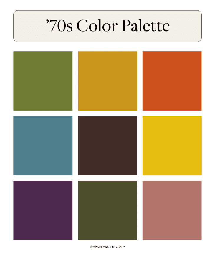
Here’s a quick breakdown of popular hues from the era:
- Avocado Green
- Harvest Gold
- Burnt Orange
- Teal
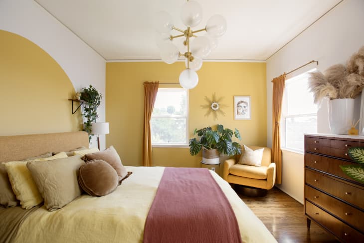
- Mustard Yellow
- Chocolate Brown
- Olive Green
- Deep Plum
- Dusty Rose
- Maroon

What to Avoid in ’70s-Inspired Design
Rooted in warmer tones, a ’70s color palette can clash with certain colors. For example, bright pastels, high-contrast combos, and cool grays or stark whites can feel out of place in a ’70s-inspired space. Gerri Chmiel, a senior design manager at Formica, also warns against going too literal.
“If you want to use avocado green, don’t go for the shag carpet. Instead pick something with a more modern low pile.” The goal isn’t to re-create a set from a sitcom (as tempting as that might be!) — it’s to borrow the best parts of the era and make them work for your lifestyle today.

Examples of ’70s-Inspired Color Palettes
There are countless ways to channel a ’70s palette without feeling theme-y. For Yarosh, it starts with emotion. “When I think of ’70s-inspired design, I think about rest and mental clarity — themes that the ’70s often took to delightful extremes.” He believes the decade was all about self-expression.
Below are a few real-world examples of how to make it work.

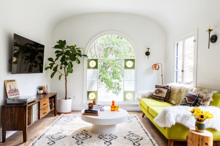
Mix In Natural Wood & Metals
This cozy cabin nails the ’70s look by pairing warm-toned walls with natural materials. Dark walnut furniture contrasts beautifully with lighter oak stools, while touches of brass and chrome in light fixtures and table legs add polish without overpowering the palette.
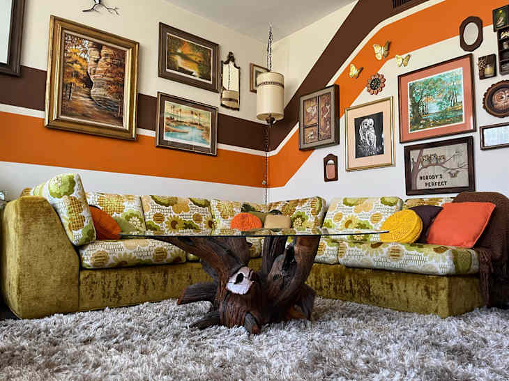
Lean Into Pattern Play
In this Scottsdale home, retro stripes and florals live in harmony. Large-scale patterns, such as the sofa, cafe curtains, and bedroom rug, are balanced by slimmer stripes and clean architectural lines. It’s an example of ’70s maximalism done right.

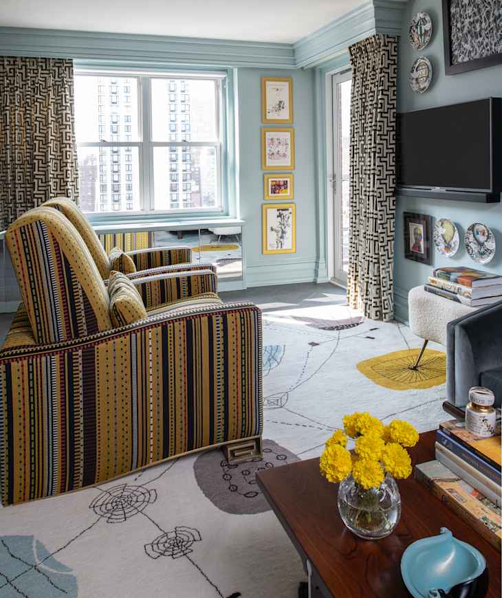
Don’t Forget About Textiles
Velvet armchairs, a bouclé footstool, and pillows with a subtle sheen bring softness and dimension to Yarosh’s New York City project. The mix of textures makes the space feel tactile and inviting — exactly the kind of layered look that defined the decade.