
The 9 Best Beige Paint Colors Designers Love for a Warm, Timeless Look
Beige is misunderstood — it’s written off as bland, and dismissed as “safe.” But these days, the best beige paint colors are finally getting the recognition they deserve — not necessarily because the shades have changed, but because we have.

When chatting about beige with interior architect Jack Mochelle, he told me that designers and homeowners are seeing beige through a new lens — not as boring, but as a neutral color that adds beautiful balance. (I’m convinced.) Beige is warm without being too yellow, soft without being too stark, and modern without trying too hard. The color creates space for everything else to shine, from furniture to texture to light, while still holding its own.
If I haven’t won you over, consider this: Beige doesn’t shrink into the background. It wraps a room in calm, creates cohesion in eclectic spaces, and flatters nearly every style, from eclectic design to Scandinavian. It’s the quiet confidence of a perfectly tailored coat; the comfort of a well-worn linen shirt.
If you’ve ever dismissed beige as bland, it might be time for a second look. In pursuit of the best shade of beige for those chasing the perfect neutral, I asked several designers what their favorites on the market are. Here are the best beige paint colors that prove neutral doesn’t mean forgettable; it means endlessly livable.

The Best Beige Paint Color
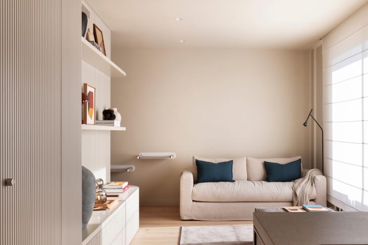
With thousands of beige paint colors on the market, it’s hard to know where to even start whittling down what shades to even test for a wall in your living room, bedroom, or kitchen — but there was one shade that stood out to designers from the rest: Benjamin Moore’s White Down 970.
In a serene primary bedroom that doubles as a nursery, White Down creates a calm, cozy, and quietly elegant atmosphere. This soft, light beige brings just enough warmth to make the space feel inviting without overpowering it, which makes it ideal for restful sleep and early morning cuddles. The wall color complements natural tones, woven textures, and soft textiles, which makes it an excellent fit for other rooms in a home.
“We love this light beige because of its versatility and ability to warm up a space effortlessly,” says Bart Caldwell, co-owner of Caldwell Painting in Nashville and Memphis. “It works great with natural wood tones as well. If you want a soft and extremely versatile shade, keep this one nearby for your next project.”
Other designers agree. Interior architect John Mochelle explains that a subtle hint of cream gives this shade of beige an airy, inviting feel. “The shade is perfectly balanced without an overbearing yellow tone, so it works beautifully with cooler tones of white and gray, and warmer shades of tan and khaki,” he said.
Interior designer Meghan Jay is also a fan. “What I love about White Down is its chameleon quality; it shifts beautifully with the light, and adds warmth without overpowering a space. It’s elegant, timeless, and incredibly easy to layer with other neutrals or bolder colors.”

8 Other Beige Paint Colors That Give You the Perfect Neutral

Benjamin Moore Revere Pewter
In this thoughtfully curated and eclectic San Francisco apartment, Benjamin Moore’s Revere Pewter HC-172 acts as a subtle-yet-sophisticated anchor. Chosen by Anand Sheth, an architect, designer, furniture maker, and curator who calls this space home, the soft, adaptable neutral brings a sense of cohesion to a dimly lit corridor wrapped in green wainscoting. This iconic beige shade works because it effortlessly bridges cool and warm tones.
“I chose Revere Pewter because it adapts beautifully to changing light,” Sheth says. “The hallway is lit only by an attic skylight and borrowed light from a bedroom. The paint color brings softness and cohesion without dulling the space.”
With its ability to complement traditional architectural details and eclectic decor, Revere Pewter proves it’s far more than a backdrop. It’s a quietly confident neutral that elevates bold materials and colors while leaving room for evolving personal style.

Little Greene Silt
Beige is sometimes unfairly maligned in the design world. “Beige has long conjured images of bland hotel rooms, sterile contemporary spaces, and dull dentist’s bathrooms,” says interior designer Kristina Phillips. She notes that many overlook its strength as an accent color — especially when it’s deepened in tone. Phillips shows just how powerful beige can be in this formal living room when it leans warmer and richer.
She paired a classic English-inspired wallpaper with trim painted in a deep beige-brown hue called Silt by Little Greene, flipping the beige narrative on its head. The result is a warm, grounded frame that highlights the room’s architectural charm and complements the ornate motif. Instead of disappearing, the beige trim acts as a tonal bridge, combining traditional patterns, layered textures, and soft lighting in a way that feels elevated and cohesive.

Sherwin-Williams Loggia
In this meticulously designed kitchen, Sherwin-Williams Loggia 7506 brings just the right amount of warmth to the cabinetry. The soft, taupe-leaning beige acts as a gentle backdrop, allowing other materials — like wood grain, stone, and metal finishes — to take center stage without competing for attention.
“This soft, grounded cabinet color strikes the perfect balance; it’s warm enough to feel welcoming, subtle enough to let textures and finishes shine,” says designer Jennifer Janeway, who created the space. “Proof that neutral doesn’t mean boring; it means timeless.” Loggia delivers exactly that in this space: a cabinet color that feels current yet classic, and ideally suited for layered, lived-in kitchens.

Sherwin-Williams Alabaster
Soft, subtle, and endlessly versatile, Sherwin-Williams Alabaster 7008 is a warm white and a designer favorite for spaces that need to feel fresh and inviting. It brings a hint of beige to the mix, and adds depth without reading yellow or stark. Ideal for open-concept homes, it creates a calming backdrop that shifts beautifully with natural light throughout the day.
This shade delivers the perfect balance, whether working with bold furniture or a quiet, neutral palette. It is sophisticated, adaptable, and cozy enough to make any room feel like home. “The warmth in this white makes it versatile for various lighting conditions,” says Netherlands-based interior designer Valentina Labodina. “It looks fresh in the morning and cozy at night. Perfect for Scandinavian interiors, where light matters a lot.”

Sherwin-Williams Steamed Milk
Beige in a small bathroom? It can be tricky. If the shade is too warm, the space can feel cramped and dark, and lose its airiness. But in this elegant primary bathroom, designer Ruthie Staalsen found the sweet spot with Sherwin-Williams Steamed Milk 7554. Applied to the cabinetry, this soft beige brings just the right amount of warmth without overwhelming the space.
Staalsen says, “This is a great color to use in a smaller bathroom space because anything darker would make the space feel much smaller. Instead, the shade opened up the space, making it look sophisticated when paired with the stone counter.”

Sherwin-Williams Minimalist
In this traditional living room by interior designer Colleen Primm, Sherwin-Williams Minimalist 9611 feels modern with a bright white ceiling, clean trim, and crisp marble accents. The soft beige walls create a grounded and effortlessly stylish space. “For my clients’ new build, they wanted a relaxing color they could carry through the home,” says Primm. “With SW Minimalist, we found the perfect color to convey a feeling of tranquility and freshness.”
The paint color offers enough warmth to feel inviting while remaining neutral enough to flow seamlessly from room to room. The hue works hard without calling attention to itself, which makes it versatile and perfect for creating a calm, cohesive backdrop across an entire home.

Portola Paints San Fernando
In this cozy dining area, Portola Paints’ San Fernando wraps the walls in a warm, welcoming glow. Interior designer Antoinette Allande Anderson calls it “One of my favorite beige colors! It is warm but still bright enough and makes the room feel cozy.”
“This paint color also blends nicely with all other neutral finishes and fabrics in the room,” she adds. The dead-flat finish shown here is 100% non-reflective, which is ideal for spaces where you want to soften natural light rather than bounce it around.
Farrow & Ball Matchstick
Interior designer Meghan Jay describes Matchstick by Farrow & Ball as a “soft, warm beige that adds a cozy, elegant feel to any space.” And it’s easy to see why this hue is a go-to for rooms that need extra warmth. Inspired by the natural tone of unbleached matchstick wood, this yellow-based neutral carries a subtle hint of black pigment that keeps it grounded and sophisticated.
What makes Matchstick truly special is its ability to shift with the light. It leans brighter and fresher in sun-drenched rooms, but in low-light spaces like the north-facing family room shown here, it reveals a gentle golden undertone that prevents the space from feeling cold or shadowy. As Jay puts it, “Matchstick delivered just the right warmth,” transforming an otherwise dim space into something much more welcoming. It’s a perfect example of how the right beige can do more than blend in; it can brighten, elevate, and adapt gracefully.