
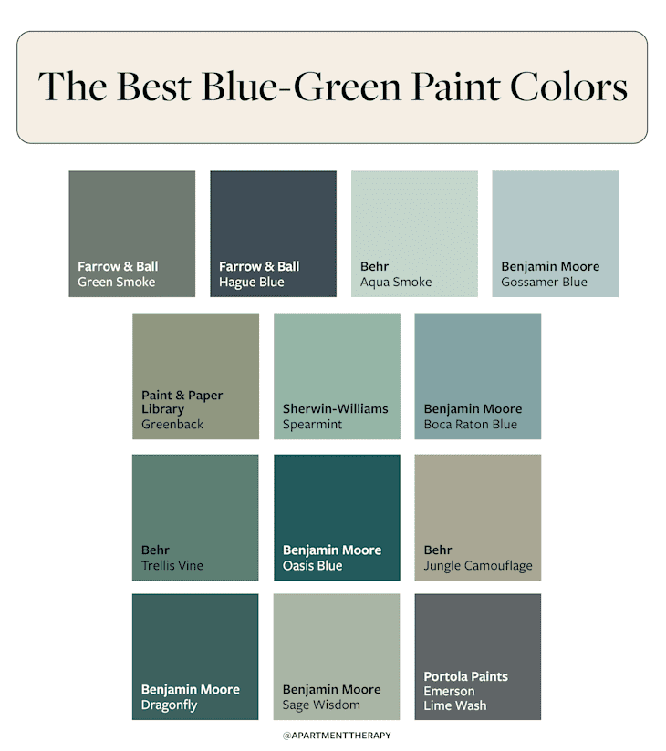
The 12 Best Blue-Green Paint Colors for the Most Soothing Rooms Ever
There are blue paint colors, there are green paint colors — and then there are the ones that live somewhere in between. At first glance, these shades might all blur together, but design lovers know blue-green is its own thing. This in-between shade family strikes a dreamy balance between two of the most beloved shades in interiors, and if you look at the color psychology behind it, it makes perfect sense why it’s so popular.
The best blue-green paint colors combine the calming qualities of blue with the grounding energy of green. It’s a pairing that works almost anywhere, from walls and cabinets to trimwork and ceilings. In my own design projects and work as a pro color consultant, I’ve found that moodier shades like teal or peacock blue create a cocoon-like feel that’s perfect for bedrooms or bathrooms. But you can find blue-green paint colors that skew softer, say a eucalyptus or aqua mist hue, which are wonderful backdrops for living and dining areas.

Blue-green, as it turns out, is a very versatile color and can go high energy (or low energy), depending on how you want to feel in a space. Whether you’re into barely there blue-greens or prefer bold and dramatic ones, this list of designer faves covers the full range.
To help narrow it down and simplify your search, I asked a handful of pros to share their thoughts on the best blue-green paint colors. The following 12 shades have proven to be great choices, whether you’re looking for an accent wall or you want to color drench an entire space.
1. Farrow & Ball’s Green Smoke
If you’re looking for something a little deeper than your average sage but with the same amount of serenity and a hint of blue, Farrow & Ball’s Green Smoke (No.43) could be for you. As seen in this London home, this paint color is an earthy meets jewel tone backdrop that plays well with punchy colors like fuchsia pink and mellower accents like butter yellow, too.
“This color is best suited for spaces where a calm and comforting atmosphere is needed,” explains designer Isfira Jensen of Jensen & Co. Interiors. “It works beautifully in bedrooms since its earthy and muted tone helps promote relaxation, helping foster great sleep.”
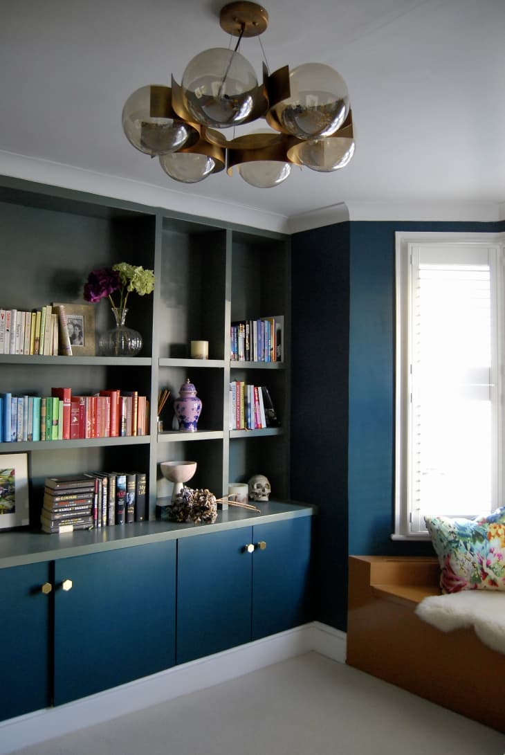
2. Farrow & Ball’s Hague Blue
Want to level up the moody factor at home? Jensen recommends Farrow & Ball’s Hague Blue (No. 30) to create a sense of intimacy and elegance. “This shade would bring sophistication to a powder room or study, fostering a sense of warmth and connection.”
Personally, I can totally imagine using this color for a library room, as shown in this English loft, or somewhere I could host a fancy book club. It’s a beautifully dimensional, deep greenish blue that provides a lovely contrast to colored book spines and brass finishes.
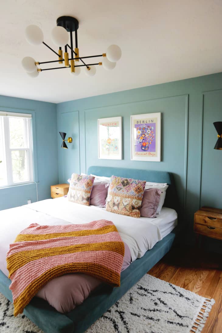
3. Behr’s Aqua Smoke
Designer Diana Farberov of Artemuse Design loves Behr’s Aqua Smoke (470E-3) for bringing a Nordic-inspired coolness to any interior space. “This color is perfect for the Scandi design lovers,” she says. “I love how it pairs with warmer colors, especially a trendy butter yellow.”
This aqua hue also plays well with matte black fixtures and classic Moroccan style rugs, if this Pittsburgh mid-century modern style bedroom is any indicator. I love the way the slightly darker upholstered bed frame just fades into its Aqua Smoke background.
4. Benjamin Moore’s Gossamer Blue
A nuanced shade on the lighter side in terms of saturation, Benjamin Moore’s Gossamer Blue (2123-40) toes the line between blue and green subtly. Can’t decide where this color would look best? Interior designer Kathy Kuo’s top choice is the bedroom, though it also looks quite homey here in a New York City apartment’s living room, which features a colorful statement painting. The nice thing about this shade is that it almost reads as a neutral, since it is so light and airy.
“I love the idea of using this color in a bedroom to create a really calming effect,” Kuo says. She also recommends it for transitional spaces like hallways and foyers because of its “earthy and undeniably sophisticated” feel.

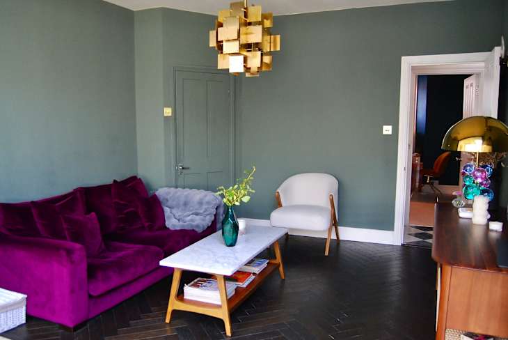
5. Paint & Paper Library’s Greenback
I love a blue-green color that skews slightly more green because of its inherent connection to nature. Farberov thinks Paint & Paper Library’s Greenback (579) is the perfect color for spring. “It feels very spring-appropriate, bringing a crisp, fresh experience.”
She suggests pairing it with black or beige tones for a slightly more elegant look, as shown here in this London living room. The color corresponds almost perfectly with the stems of the fresh bouquet of tulips on display in the space.

6. Sherwin-Williams’ -Spearmint
Not quite as deep as teal but also not as soft as light aqua, Sherwin-Williams’ Spearmint (SW 6465) is a middle tone that’s easy to work into a space. It’s a refreshing shade that would look great in any area needing a little jolt of color, whether it’s a front door, powder room, or closet interior.
Because of the color’s slightly retro vibe, it’s best to have fun leaning into that. Consider pairing it with a pale pink or rich coral, the latter of which is shown in the corner of this Tampa living room.
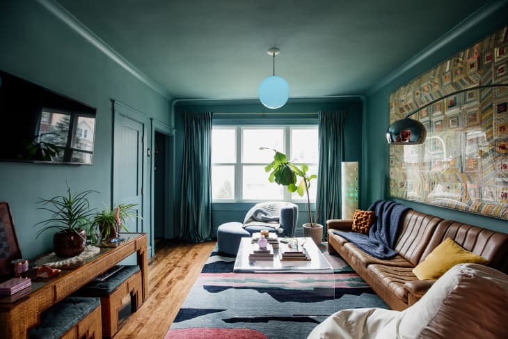
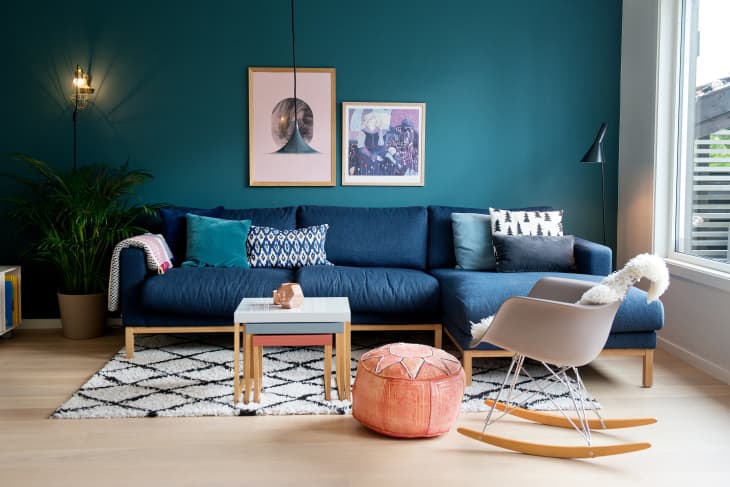
7. Benjamin Moore’s Boca Raton Blue
One thing’s for sure: Teal is having a moment, and Benjamin Moore’s Boca Raton Blue (711) fits the bill, even though it has a slightly gray undertone that gives it a little complexity. “Like everyone else out there, I have been glued to the latest season of The White Lotus lately, and all of the teal accent colors in the interiors have really struck a chord,” Kuo says. “This understated teal option from Benjamin Moore is a lovely way to bring it into your home in a way that’s effortless and luxurious.”
Talk about a color made for drenching, this shade truly shines in the front room of this Chicago home. It complements the tan leather sofa and mid-tone wood furniture perfectly.
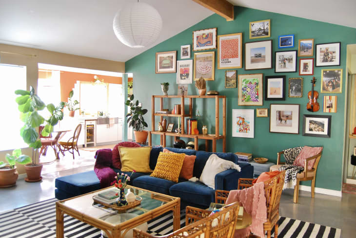
8. Behr’s Trellis Vine
If you’re looking for a paint color that feels like a walk around your favorite garden, Behr’s Trellis Vine (M440-6) might be up your alley. This rich blue-green shade adds a layer of vibrancy and harmony to the home.
For eclectic or bohemian interiors, consider pairing Trellis Vine with other jewel tones for a curated mix of colors. This shade shines as the background for a gallery wall in the Austin home just above.
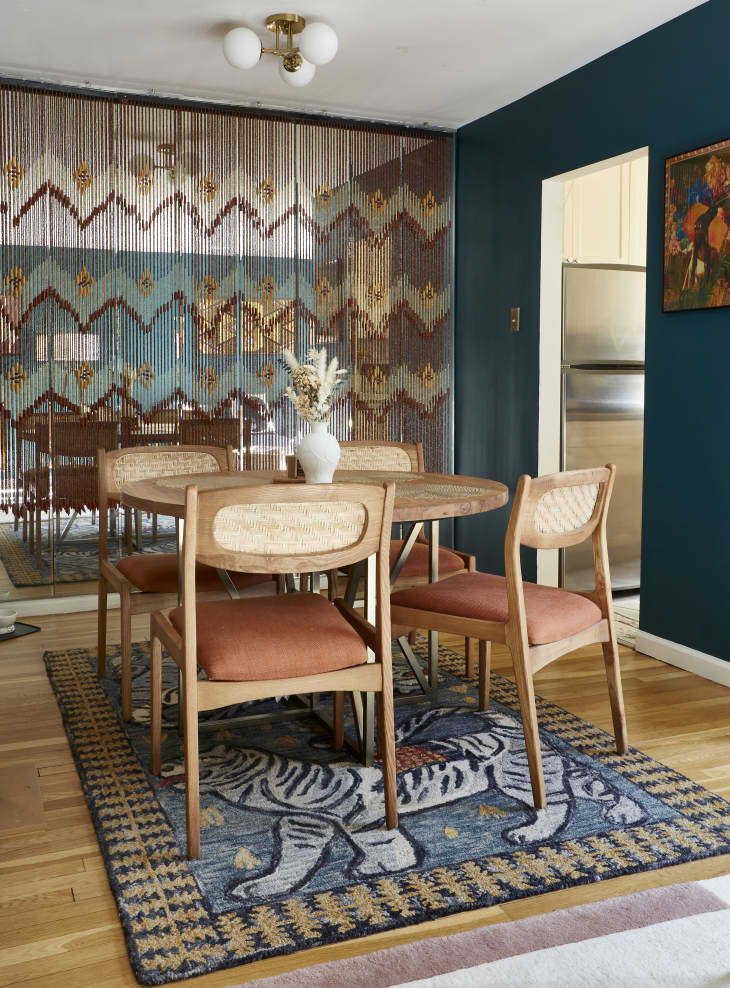
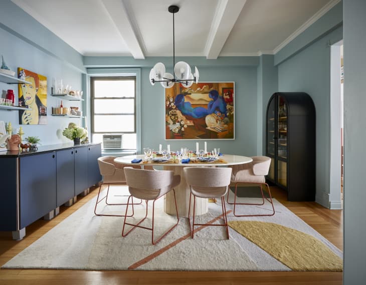
9. Benjamin Moore’s Oasis Blue
Interior designer Gala Magriñá is thrilled that moody colors are making a comeback. “I love Benjamin Moore’s Oasis Blue (2049-20) because it strikes the right balance with a rich depth but is uplifting at the same time,” she says. “It’s a really powerful shade with a vibrant, complex vibe.”
As for where to try this paint color, Magriñá suggests a wall in a dining room to create an energetic accent. This color reads like a peacock blue, so its regalness makes it ideal for a slightly more formal space, as seen in this funky NYC apartment.
10. Behr’s Jungle Camouflage
Farberov thinks Behr’s Jungle Camouflage (N350-4), a rich and earthy green that’s reminiscent of eucalyptus, can bring a refreshing feeling into a space. Just take a look at this lovely Toronto interior, which features this shade throughout (including in the dining room).
“This color evokes a grounded mood while still feeling fresh and modern,” Farberov says. “Consider offsetting it with taupe and terracotta tones for a more polished interior.”

11. Benjamin Moore’s Dragonfly
“When in doubt, turn to nature for inspiration,” Kuo says of Benjamin Moore’s Dragonfly (AF-510). “That ethos is alive and well in this paint color. With a deep and complex fusion of blues and greens, Dragonfly pairs beautifully with an organic modern design motif.”
You can see this shade’s majesty at work in this Edwardian living room. It pops against white woodwork, thanks to its saturation and depth.

12. Portola Paints’ Emerson Lime Wash
Sometimes you just need a paint color that’s going to bring in some extra texture, and lime wash is the easiest solution for adding that to interior walls. Farberov has a trick or two up her sleeve when it comes to that.
“The right blue-green tone will transform a space, and I’m absolutely in love with this Emerson Lime Wash by Portola Paints. Since it’s a cooler tone, I recommend using it in rooms with strong natural light where the deep, rich color can shine.”
Don’t let its darker appearance deter you from trying it. Farberov recommends pairing it with neutrals to balance out the room, although she fully encourages the use of a bolder, warm shade to add contrast too.