
The All-Time 10 Best Sage Green Paint Colors for the Most Soothing Spaces, According to Designers
Cream, beige, and black have long been labeled as neutral colors. These are the paints you pick when you’re hoping for a classic, timeless feel, with a surrounding accent color palette that allows you to layer in patterns and trendy items. But in the last few years, another shade has succeeded in earning the label of a neutral color: sage green.
“I love decorating with sage green paint because it feels organic and soothing,” says designer Sasha Basso of Capiz Studio. “It’s one of those colors that can act as a neutral and is a great way to dip your toe into color without feeling like you’re making too big of a statement.”

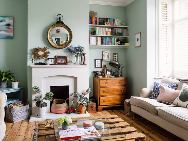
You’ve probably spotted this warm green on everything from kitchen cabinets and living room shelving to bedding and vanities. A finish that effortlessly brings the outdoors in, the best sage green paint can fit into a range of aesthetics — like coastal, bohemian, modern, or cottagecore style — based on its application.
“Using sage green in spaces dedicated to relaxation, like the bedroom, inspires rest,” says designer Regan Baker. “Alternatively, using them in light-filled, high-traffic areas can introduce a welcome feeling of calm to busier, shared spaces in the home.”
If this lovely shade has started to pique your interest, you’ve come to the right place. I asked four pros to share their tips for using the best sage green paint options, including a list of their favorite tried-and-true picks. Read on for tips on using the best sage green paint in your home — and the 10 best versions of this new neutral.
What to Know About Sage Green Paint
Before you choose an option for your space, you’ll want to remember this info about the best sage green paints: A paint’s finish will change its overall appearance, and sage paint is no different. After you’ve chosen a specific shade, be sure to also determine the right finish.
“I prefer flat finishes on walls and satin or semigloss for trim and woodwork,” designer Denise McGaha says. “I’ll occasionally use a high-gloss lacquer in smaller spaces like powder rooms or on cabinetry, or even on ceilings in larger rooms for major impact.”
And since no shade exists entirely by itself in a room — unless you want to seriously get in on the color-drenching trend — the next thing to determine is the subsequent shades that’ll work with your sage green paint. “I love using blues and corals with sage,” McGaha continues. “They balance the quietness of the sage and offer many of the tones found in nature. My own garden is always a perfect place to find inspiration for rooms filled with green.”
If there’s one color that might not be an ideal pick, just know that it wouldn’t necessarily be wrong during the most wonderful time of the year — does that give the answer way. (If not, it’s red).
“I hate to say that any color is off-limits when it comes to sage, especially since it’s relatively neutral,” Basso notes. “The only color I’d probably say is tough would be a bright Christmas-y red, mostly because of its holiday associations.”
As a general rule for creating a color palette that includes sage green, designer Becca Casey has a smart shortcut. “I typically avoid cooler or brightly saturated colors, and instead pair it with soothing complementary hues that help set the tone of the room,” she says. Time to break out the color wheel!
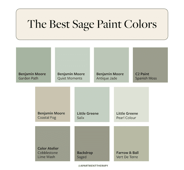
To make the choice of selecting the best sage green paint easier, consider these 10 picks designers recommend for every room in your home.

1. Benjamin Moore’s Garden Path
“This is a soft sage green that provides a calming, nature-inspired feel that works perfectly for more vibrant or colorful accents,” Baker says of Benjamin Moore’s Garden Path (466). The designer used this color for millwork and built-ins in a bunkroom — energizing it with colorful plaid bedding — but it doesn’t have to skew young. Try it on the walls with neutral furnishings for a more sophisticated look.

2. Benjamin Moore’s Quiet Moments
“This color [Benjamin Moore’s Quiet Moments (1563)] exudes tranquility and is perfect for more relaxed and intimate spaces such as the bedroom,” Baker notes. Here, she’s paired this subtle sage with a rattan bed and mustard linens for a very earthy, grounded mix.

3. Benjamin Moore’s Antique Jade
“I consider this to be a ‘gentle’ green with a hint of gray for a relaxing effect,” Baker says of Benjamin Moore’s Antique Jade (465). “Perfect for light-filled utility spaces like a laundry room while tending to chores.” I love the color psychology behind choosing something that puts you at ease in a space where work gets done. And in certain hues, sage green is the perfect soothing yet slightly energizing backdrop.

4. C2 Paint’s Spanish Moss
“This is an artisan-inspired color offering a tranquil feeling, and I’d recommend it in light-filled, high-traffic spaces like the kitchen,” Baker notes of C2 Paint’s Spanish Moss (C2-940). The luminosity of the pigment in this shade can also be great for spaces that don’t get a ton of natural light. The finish will do its best to throw whatever sun it sees around a room.

5. Benjamin Moore’s Coastal Fog
“This color’s mix of green and khaki tones creates a chameleon-like hue that’s exciting in a kitchen,” Baker says when referencing Benjamin Moore’s Coastal Fog (976). She coated the cabinetry and island in this airy kitchen in this shade. Even though the paint’s name makes you think this shade would be cool, its a warm neutral that plays so well with golden finishes, like brass hardware and pendants.

6. Little Greene Paint’s Salix
“I love using Little Greene Paint and was recently introduced to them when we specified their paint for a personal project,” McGaha says. “Salix (99) would look great in a bathroom.” It’s a nice shade for highlighting woodwork, as shown on the paneling in this bath here.

7. Little Greene Paint’s Pearl Colour – Mid
“This color has the perfect amount of saturation while still feeling light,” McGaha says of Little Greene Paint’s Pearl Colour – Mid (168). It would likely do well in an entryway or guest bedroom.

8. Color Atelier’s Cobblestone Limewash
“This color is a beautiful organic green that I adore,” Basso says of Color Atelier’s Cobblestone Limewash. “I love limewash in general because it’s textured, natural, odorless and has zero [volatile organic compounds (VOCs)]. With this color, it makes sense to go all in on the natural and organic vibes.” Try it in a primary suite to feel especially tranquil, or go for it in a powder room.
9. Backdrop’s Saged
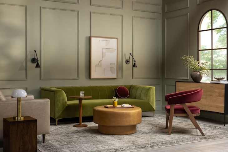
“I think of this color as sage green perfection,” Basso says of Backdrop’s Saged, which can best be described as a muted sage with a hint of olive (as seen above in a living room by Interior Define). It would make the built-ins of a living room really pop. It’s also beautiful on picture frame molding, as shown here, and a great candidate for color drenching.

10. Farrow & Ball’s Vert De Terre
“This is the ideal understated soft sage,” Basso says of Farrow & Ball’s Vert De Terre (No. 234). It would be worth the splurge on kitchen cabinetry, but it also grounds a living room and helps to highlight pretty picture frame molding and trimwork.