
17 Yellow Paint Colors That Interior Designers Swear By
If there’s a shade famous for its ability to boost moods and inspire smiles, it’s yellow. At the same time, yellow is a color with a reputation for not being all that popular — that is, until butter yellow began trending in 2024. Now interior designers and the clients they work with seem all too eager to use yellow to make spaces feel welcoming.
Given its bright personality, yellow has often been used as a poppy side character in recent palettes that favor minimalism and restraint. Those days are over: Now that maximalism is gaining traction and design is more widely embracing color, yellow might be finally getting its due.

“Yellow is such a rich, bold color choice and it reflects the desire for spaces that feel unique, personalized, and distinctly warm,” says Kiyanna Handy, interior designer and founder of BLK MKT Vintage. “I’ve noticed cultural pushback against the whitewashing of interiors and an intentional reach toward spaces with more play, joyousness, and, dare I say, eclecticism.”
This year has been a banner one for yellow, and as far as interiors go, it has appeared everywhere from cheery bedrooms and homespun dining areas to kitchen cabinetry and charming bathrooms.
“As longtime fans of the color, we’re thrilled to see yellow have its moment in the sun,” adds designer Mallory Robins of Kobel + Co. “Yellow has a naturally inviting feeling to it, and tends to evoke cheerfulness and nostalgia.”
Why Is Yellow Trending Now?
It’s tough to pinpoint exactly why yellow is so popular right now, although there are a number of influences at play.
There’s a considerable move away from all-over neutrals this year, alongside a collective push to be more daring with surroundings. Greens and blues have been reliable shades for bringing the outdoors in for years, whereas yellow does the same with an unexpected twist. And speaking of surprises, yellow doesn’t always have to be bright. It can also come across as subtle, depending on its context. That makes it more palatable to those who don’t necessarily want to go all in.
“Yellow can overpower the room if not paired with an appropriate counterpoint, such as a pink or brown,” says Elizabeth Bennett, designer and Kobel + Co’s other partner. “Be thoughtful about the shade so as not to lean too electric.”
Choosing the best yellow paint for your project can be a challenge, which is why we asked the pros to share their favorite colors below.

Our List of the Best Yellow Paint Colors
There’s likely a shade of yellow that immediately comes to mind when thinking about the color: a school bus. This can be comforting, but it’s probably not the first pick for your vision. The truth is, yellow is a spectrum of colors — from a bold school bus neon, to a more subdued mustard, to a lighter lemon slice.
“When selecting a yellow, consider the story you’re trying to tell and the feelings you’re trying to evoke. If your ‘why’ is at the crux of your decisions, it’ll be intentional,” Handy advises. “I also think natural lighting is critical when selecting yellow tones, and the brightness is going to dictate how it’ll ultimately dress your walls. Go bold, but do a color test to see how it’ll look (at different times during the day) before fully committing.”
Because this color can’t easily fade into the background, you should embrace its confidence! Read on for the designers’ favorite yellows, from boldest to palest, and get a better idea of how this shade can make a lasting impact in your home. Their selections are organized into bright yellows, mustards, and pale shades for all projects.
Best Bright Yellow Paints
If you’re in the market for a yellow paint, chances are you’re already comfortable with its brightest iterations. How you apply this shade is everything, and frankly designers agree that it’s often more fun to be bold. “Yellow is an ideal color for color-drenching a space because it creates a cohesive, tonal effect throughout the room,” says Los Angeles-based interior designer Jessica Nicastro.
“Its brightness can unify design elements to help make a space feel cohesive, inviting, and thoughtfully curated,” she adds.

1. Farrow & Ball’s Sudbury Yellow
When you want to smile as soon as you arrive home, Robins says that bright yellow is the way to go. “We turned an otherwise functionally forward room into a room teeming with personality by going all in on Farrow & Ball’s Sudberry Yellow,” she adds. “As the point of entry for the family, this mudroom immediately set a welcoming tone to the space, while also adding a bit of unexpectedness compared to the more neutral rooms that surrounded it.”
In reality, a bright yellow complements neutrals, as it offers a more attention-grabbing counterpart for those shades to play off of. “Yellow offers an easy way for people to dip their toes into color,” adds Nicastro. “They can help add a pop of color into a room that would be otherwise muted.”
Get the Look: Farrow & Ball’s Sudbury Yellow

2. Sherwin-Williams’ Bee
Handy was recently tasked with updating a home office inside a ranch house in New Jersey, and the owner’s favorite color happened to be yellow.
“[The client] wanted to add large skylights to the ceiling, and once those were installed we decided to paint her office ceiling in Bee by Sherwin-Williams, framing the skylights and contrasting the sky-blue tones,” Handy says. “It made the room feel warmer and distinctly brighter.”
Get the Look: Sherwin-Williams’ Bee

3. Benjamin Moore’s Bright Yellow
Up the unexpected quality of embracing yellow as a design feature by using it to paint your floors, as was the case in this London home. By keeping the walls and furniture neutral, the room still feels approachable.
Get the Look: Benjamin Moore’s Bright Yellow

4. Backdrop’s Disco Nap
“We drenched this sun-filled porch with pale butter yellow to reinforce the vibes and design brief, which was a happy morning retreat for coffee and conversation,” says designer Robin Heller of Surrounded by Color. “The color really guides it all.”
Get the Look: Backdrop’s Disco Nap

5. Clare Paint’s Golden Hour
A bright yellow tone can be used to quite literally highlight your moldings, as is the case in this living space. This warm shade is impressive when used in pops of yellow on accents in any room.
Get the Look: Clare Paint’s Golden Hour
6. Backdrop’s Stardust
“This color combination took a good while to home in on. It began with various peach tones, and the yellow was essential in the mix,” Heller says. “It gives it the edge.”
Get the Look: Backdrop’s Stardust

7. Benjamin Moore’s Provence Crème
“We chose this shade for a Brooklyn townhouse living room because it was the perfect color to amplify the already-sunny nature of this well-lit, south-facing space,” says Rachel Robinson, architect and partner at New York’s Dunham Robinson. “This yellow is soft, yet bold at the same time — able to act as a neutral backdrop to the more vibrant colors of the vintage rug while still providing a powerful wash.”
Get the Look: Benjamin Moore’s Provence Creme
Best Mustard Yellow Paints
For those who don’t want their take on yellow to be quite as bright, mustard hues can tone down yellow paint into a darker and more sophisticated shade. This color can be used throughout a home, including a kids’ space.

8. Benjamin Moore’s Leap of Faith
“We wanted this powder room to feel cheerful and sophisticated, so we chose a warm, mustard yellow in a saturated hue for the wallpaper and ceiling paint,” Robinson explains. “It wraps the room in a cozy glow that feels grounded and earthy, creating a dramatic impact without overwhelming the space.”
Get the Look: Benjamin Moore’s Leap of Faith

9. Benjamin Moore’s Dorset Gold
While you might think that brighter shades of yellow would be the design direction of a kids’ room, that wasn’t the thought process for this Kobel + Co project. “We used Dorset Gold by Benjamin Moore for a moodier yellow; it offered a sophisticated pop of a yellow hue while not overshadowing the mural paper,” Bennett shares.
Mustards tend to do well with other popular shades of the moment, like dusty pink and chocolate brown, also seen in this space.
Get the Look: Benjamin Moore’s Dorset Gold

10. Clare Paint’s Good As Gold
“I painted my primary bedroom Good as Gold and love the warmth it offers,” Handy shares. “I have five southeast-facing windows in my bedroom and the incredible sunlight hitting Good As Gold on my walls not only keeps the room bright for most of the day, but also makes the space feel like the respite I intend it to be. I love how a muted yellow-mustard offers a slight moodiness to a bedroom.”
If you’re going to follow in Handy’s footsteps and paint your bedroom in a mustard shade, you might want to consider adding two more popular counterparts: eggplant and wine-hued accents.
Get the Look: Clare Paint’s Good As Gold

11. Farrow & Ball’s Wet Sand
“This is a color I’ve been dying to integrate into a project,” Handy says. “I personally love colors that live on the margins and require you to look a little deeper to prescribe a label. Is it orange? Is it yellow? It’s both, with a gorgeous red undertone. I’d apply this in a stately dining room, with lots of molding accents.”
Another option? This color looks striking on kitchen cabinetry, alongside brass fixtures and marble countertops.
Get the Look: Farrow & Ball’s Wet Sand

12. Backdrop’s Tanlines
The best part about a bedroom color-drenched in mustard, like this one in Chicago, is that it looks simultaneously old-school yet totally modern. Follow suit with this deeper shade of yellow that carries a semi-matte finish.
Get the Look: Backdrop’s Tanlines
Best Pale Yellow Paints
Like deeper mustard tones, pale and light yellow shades create warmth and brighten spaces without drawing too much attention. These particular colors are extremely versatile and make for good complements to other paints used in any given room.

13. Benjamin Moore’s Lemon Chiffon
“The pale yellow used in this space lends a soft, ethereal quality that feels at once serene and uplifting,” Robinson says. “By infusing the millwork and walls with just a hint of warmth, the color gently reflects natural light, giving the room a luminous, almost weightless feel. It’s just a hint of color, barely there, but enough to distinguish the space from a stark white to create a sense of quiet personality and calm.”
Get the Look: Benjamin Moore’s Lemon Chiffon
14. Portola Paint’s Wicker
For those who want the look and feel of yellow on a more relaxed scale, pale options would suit your projects best. These shades would be a more timeless option for kitchen cabinetry, as well as a living room that gets a lot of light. While Nicastro hasn’t used this shade in one of her projects yet, she’d recommend Portola Paint’s Wicker. “It’s a soft but saturated yellow that brings a happy tonality to a space,” she says.
Get the Look: Portola Paint’s Wicker

15. Clare Paint’s Lemonade
Yellow makes for a reliable accent shade, particularly if you plan on painting a mural. In this Jersey City loft, yellow is used in a bold palette that resembles a geometric sunset. This shade by Clare Paint would also help you draw in those endless summer vibes in any space.
Get the Look: Clare Paint’s Lemonade

16. Farrow & Ball’s Dayroom Yellow
Alongside the increased popularity of yellow paints, ceilings are also experiencing a long-overdue moment to shine. Why not take advantage of the “fifth wall” in your bedroom and drench it in this muted, pale hue? In this Pasadena, California, home, a similar application is soft and cheery.
Get the Look: Farrow & Ball’s Dayroom Yellow
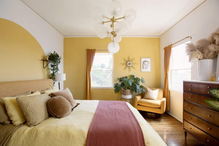
17. Benjamin Moore’s Sun Salutation
Sometimes you don’t need to color-drench a bedroom to make an impact — a duo of accents will do the trick. This Los Angeles bedroom features yellow on two walls in different applications, and you could riff on it with this calming shade from Benjamin Moore.
Get the Look: Benjamin Moore’s Sun Salutation
Design Defined
Never miss the style inspo and recommendations you crave with Design Defined. Follow along each week as our Home Director Danielle shares the best style advice, latest trends, and popular decor finds you just can't miss.