
Before and After: IKEA Brings Some Drama to This Newly Remodeled Kitchen
A Michigan couple took this kitchen down to the studs, rearranging plumbing, moving electricity, installing drywall, painting, tiling, and so much more. With the help of professionals to install countertops and cabinets, they now have a bright black-and-white kitchen that’s meant to be lived in.
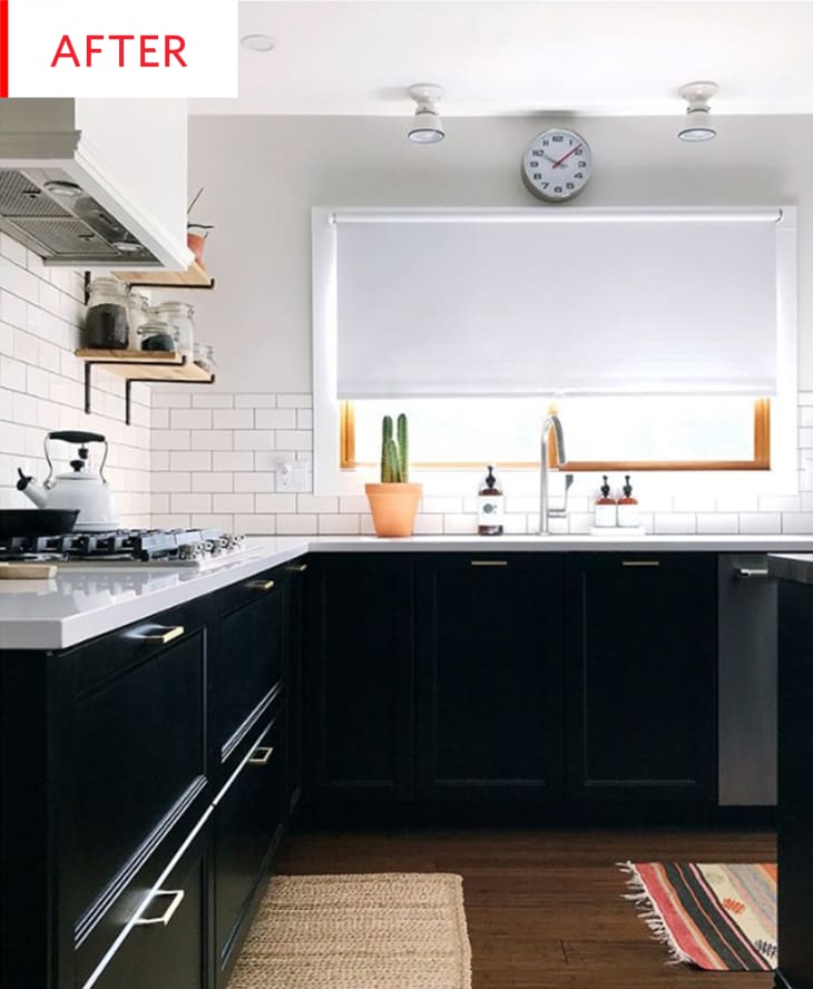

Clare Conklin—@conklinhouse on Instagram—and husband completely transformed this room, creating a bright new space that looks like a joy to cook, feast, and chat in. The new high-contrast palette is bold and combines the best of two worlds: white paint, tiles, and counters to reflect light and keep pristine, black IKEA cabinets for drama and glamour. The wooden floor, frame, and shelves, plus the gold hardware add warmth and luxury, as well as a cozy glow enhanced by the rugs. A few practical features that round out the clean monochromatic look of the kitchen are the clock, the simple spotlights, and the sleek white range hood vent. (And for anyone interested where the oven and refrigerator are, they can be seen in this photo.)
And while all the new fixtures, finishes, and appliances are gorgeous and enviable, the removal of the soffit is perhaps the most dramatic change. That extra foot of vertical space is a remarkable improvement, and the now-uniform-height ceiling is much more modern than the dropped-ceiling border.

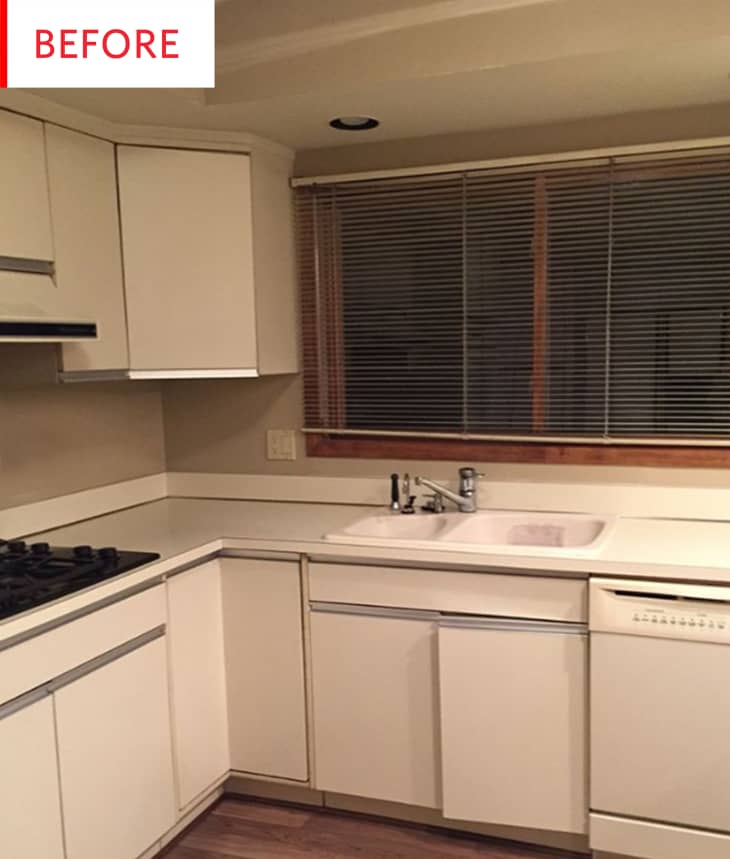
To get your bearings, know that the kitchen window is directly to the left of this photo, and that the kitchen counters were U-shaped. But not anymore…

The kitchen is now a thousand times more airy and inviting. Clare explains:
We took out all the ceiling soffits to make this space feel more bright and open. We also took out the upper cabinets that hung down in the middle of the room. They made it feel like a cave!
The upper cabinets and peninsula prevented daylight from flowing throughout the kitchen and closed the kitchen in severely—all the isolation of an enclosed kitchen with none of the mess-hiding powers. The space also flows better now, while the new island incorporates seating and storage just as the peninsula did. The beautiful wooden top on the island is a luxurious touch that links the island with the dark, rich floors, making for an ideal spot for sipping coffee, working on homework, and chatting with the cook on duty.
Thank you, Clare Conklin!