
A Bland 2000s Brown Wood Kitchen Goes Dark — And Transforms into a Bold, Moody Showstopper
Light brown wood cabinetry can be beautiful in a kitchen, but sometimes it just falls flat. Often it’s just the fact that it can feel generic — and like you might find it in a cold office building, not a warm, welcoming home. That’s what designer Vivian Hung of Global Home Interiors was dealing with in this Upper West Side apartment.
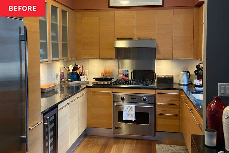
“The original kitchen was a textbook example of early 2000s ‘contemporary’ — think builder-grade finishes and a bland, corporate aesthetic,” says Hung. “It lacked character and warmth, and had some awkward spatial and functionality quirks that made it feel more like a showroom than a space to live in.”

A “Bold, Moody, and Truly Bespoke” Kitchen Design Plan
Hung was enlisted to help her clients create a kitchen that wouldn’t skimp on style or storage. “The goal wasn’t just to update the look, but also to elevate the function and create a space that felt cohesive with the rest of the apartment,” she says. “They wanted that ‘wow’ factor from the moment you walked in, and we knew we had to replace the generic builder kitchen with something bold, moody, and truly bespoke.”
The kitchen was part of a renovation that spanned a few rooms in the apartment, and Hung began her process with what she calls an “intensive discovery phase — lots of conversations, inspiration images, and mood boards to understand the clients’ vision.” It took a month or so to nail down the kitchen’s concept with material selection and layout tweaks, and then Graphic Builders came in to manage construction.

First, Hung had to get the layout right. The U-shape of the kitchen made sense; it just needed to be reconsidered for efficiency. “The footprint remained largely the same — typical for NYC apartments — but we reimagined every inch to enhance storage and functionality,” she says.
An awkward wall return was removed to make space for a custom bar and glassware display. This move also allowed them to nix an unnecessary soffit, which meant they could go with full-height custom cabinetry to eke out extra space for dishware, appliances, and the like. Less frequently used items sit on those top cabinet shelves.

The couple went with dark cabinetry for an extra dose of drama, which matches the jewel of the kitchen: a jet-black BlueStar 30″ Natural Gas RCS Culinary Series with serious cooking power. The range’s brushed brass knobs tie in nicely with the brass hood above it and the honey bronze hardware throughout.
Design Challenges Were Met with Creative Problem Solving
The project wasn’t without a few challenges, but Hung made lemonade out of lemons where she could. For example, when the original backsplash tile arrived in the wrong color, the team pivoted by sourcing a black subway style replacement that was cheaper and better for the design scheme. “The Sub-Zero fridge was on backorder for 11 months (!), but because it matched the size of the existing one, we were able to install everything else on schedule and swap it in later,” says Hung. So that was another lucky break.

A few clever solves made the room feel even more custom. The apartment’s electrical panel sits in the kitchen, so Hung covered up this eyesore with Thibaut’s Faux Tortoise wallpaper and removable shelving that matches the cabinetry. The cabinets weren’t left empty, either. From “smart organizational inserts in base drawers — including double-layered utensil dividers — to pull-out swivel shelving in lower corner cabinets to make hard-to-reach areas more usable,” no stretch of space was left untouched.
The Kitchen Went From “Showroom” to Showpiece
The designer did choose to keep the existing kitchen’s floors. “We designed around it, letting it ground the moody palette of the new kitchen,” says Hung. Beyond that, the space is pretty much unrecognizable — it’s like night and day, literally, thanks to the sleek, black-on-black color palette and metallic accents. Curiously, even though the kitchen is still just over 100 square feet, it manages to look bigger than before and “punches way above its size,” in Hung’s own words.

“The kitchen now has a moody elegance that feels unexpected in a high-rise apartment,” says Hung. “It’s dramatic yet deeply functional — a space made for both cooking and entertaining. And it ties in beautifully with the design of the rest of the home, reflecting our clients’ stylish and adventurous personalities.”
Design Defined
Never miss the style inspo and recommendations you crave with Design Defined. Follow along each week as our Home Director Danielle shares the best style advice, latest trends, and popular decor finds you just can't miss.