
3 Color Combos That Shouldn’t Work but Totally Do, According to Designers
There’s no shortage of design advice when it comes to picking the “right” color combo for a room. Choose complementary colors, which are opposites on the color wheel, say the pros. Don’t mix warm and cool shades is another frequent designer suggestion, or stick with tones in the same family for a monochromatic color palette. Whether you’re decorating your first room or your tenth, though, you might feel limited by these “rules” that potentially aren’t even true.
If you’re looking for a sign to ignore what you’ve previously heard about color combinations, consider this it. I chatted with two designers, who shared three surprising color combos that break all the rules but still sing. It just might be the time to reconsider these unexpected duos.

Pink and Red
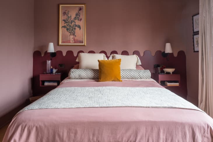
Pairing pink and red seems like a daring choice, and while not for minimalists or total neutral lovers, the combo somehow works. Often dismissed as too similar, as they sit next to each other on the color wheel, “you can actually do quite a lot with different shade combinations to create a gorgeous space,” says designer Tommy Kebbson of this mash-up.
Note that Kebbson is not exactly talking about combining hot pink and scarlet (although that, too, can work). But for a novice decorator, a far better way to give this a go is with one bold, saturated hue alongside a more subtle shade. “Try using a softer pink paired with a fiery red, or even a light, bright pink with a deeper, darker red to create contrast while still keeping the space harmonious,” suggests Kebbson. The latter is shown in this lovely Toronto bedroom that’s painted in Farrow & Ball’s Sulking Room Pink (No. 295).

Lavender and Chocolate Brown
More than any other color, purple tends to have a bad rap in interiors, whether used solo or in a pairing. That’s not the way Keely Smith, lead interior designer at JD Elite Interiors, feels, though. She loves lavender — especially when it’s on the cooler side and paired with an earthy chocolate brown to balance it out. “The warmth of brown makes lavender feel more relaxed, and the lavender brings a little lightness to the richness of brown,” says Smith.
Smith adds that this underrated duo can feel surprisingly calm, which makes it a great pairing for a bedroom where you don’t want to lean into an all-beige or white color scheme. It’s also a great combo in a living room, where you can accomplish the pairing with lavender walls and darker wood furniture, as shown in this Glasgow piano vignette.

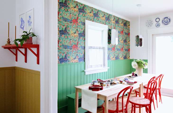
Red and Green
“Red and green should never be seen,” or so the traditional saying goes. Outdated fashion and design adage aside, you probably don’t want your home to look like a holiday card. But it doesn’t have to be that way, according to Kebbson. “Pair a pale green with a deep red to create a sophisticated look that doesn’t scream Christmas,” he says.
The secret, for Kebbson, lies in picking the right tones — you don’t want a mix of both saturated red and a highly saturated green here. Instead “a single statement piece of red against sage green walls, for example, can also pair really well without creating a festive feel,” adds Kebbson. Or, if you move away from an evergreen color, as shown in the Omaha dining area, you can choose springy shades like grass green and fire engine red — just be sure to mix in other colors, like blue, white, and yellow, for a non-holiday look.
Design Defined
Never miss the style inspo and recommendations you crave with Design Defined. Follow along each week as our Home Director Danielle shares the best style advice, latest trends, and popular decor finds you just can't miss.