
What Is a Cool Color Palette? 10 Soothing Hues You Should Pair Together
When your home feels a little too loud — visually or energetically — interiors washed in cool colors can feel like a reset button. These soothing shades (soft blues, misty greens, and silvery purples) are renowned by design pros for creating a sense of calm and relaxation. White is also a cool-toned classic, which is why so many designers name it one of the best living room colors.
Embracing a cool color palette is not as simple as thinking all blues, greens, purples, and whites are cool-toned, though. Each of those colors has a warmer-leaning version, and when paired with their complementary color opposites, you can create a palette that feels balanced. The beauty of choosing colors for your home is that there’s no right or wrong way to do it, as long as the hues support the feeling you’re trying to create in the space.

Not sure where to begin? Try using a color palette generator for inspiration or just start with a favorite hue and lean on color psychology to help you build from there. If you need more direction, keep on reading for expert-backed tips to help you make cool colors feel right at home.

What Is a “Cool” Color?
When looking at a color wheel, you’ll find cool colors on the left side of the circle (blue, green, purple) and warm colors (red, orange, yellow) on the right side. However, it’s important to note the nuance of color theory, as cool colors can also skew warm based on corresponding colors in your own palette. Something as simple as adding a bit of red or yellow alongside a cool-toned color transforms it into something that leans warmer and cozier. The same can be said for white or gray. The undertones can shift them warmer or cooler depending on what they’re mixed with.

Cool colors you might frequently spot used together include:
- Blue
- Green
- Teal
- Mint
- Turquoise
- Purple
- Lavender
- Lilac
- Cool gray
- Crisp whites
Which Colors Are Considered Cool and Why?
When it comes to why “cool” colors are considered cool, it all boils down to science. “Cool colors have shorter wavelengths, which means they have a higher number of waves per second in their frequency,” explains Amber Dunford, a style director who applies her clinical psychology background to her specialty as a design psychologist.
In short, these wavelengths move faster and contain more energy, but here’s the twist — you don’t perceive that energy as stimulating (it’s the opposite!). Dunford adds: “Warmer colors, like red, will have a longer wavelength and therefore a shorter frequency,” meaning they appear more stimulating and attention-grabbing, often feeling closer or more intense.


Because cool colors are designed to make people feel at ease, they’re generally recommended for rooms where you can do precisely that: bedrooms, bathrooms, or other spaces where quiet time and R&R go hand in hand.
Jessica Shaw, director of interior design at Turett Collaborative, tells those looking to harness cooler colors to steer away from clashing hues. Rather, you should work to find complementary colors within the color wheel to create a more relaxing frequency in the space at hand.
“While it can sound minor, these considerations can have major effects on the health and wellness properties of interiors,” Shaw explains. “Cool colors have a natural calming effect: They lower the frequency of a space in a really soothing way.”
Tips for Using a Cool Color Palette
Cool palettes can calm a space, but they’re best used in holistic design alongside some contrast and intention. Whether you’re decorating your entire house or looking for room-specific advice, these tips will help you get cool colors right before you begin decorating.

Layer Your Cool-Toned Colors.
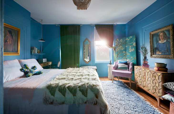
If you plan to decorate with blue (or any cool-toned color), layering different shades can add depth without overwhelming the space. Atlanta-based interior designer Olivia Westbrooks anchored this space with a tempered teal, bringing in complementary pops of blue in artwork and upholstery. A mix of materials throughout the space keeps it feeling dynamic, not one-note.

Create Contrast by Deliberately Pairing Cool Tones with Warm Hues
In areas of the home where you would prefer a more upbeat mood, Dunford suggests going for a contrasting warm color to create balance. “Pair a cool color like green with a warmer hue; this creates an energizing atmosphere where people are more social and talkative.” This Chicago apartment does a great job of creating a well-balanced space, featuring sage green walls and warmer shades of yellow-orange and rust throughout.
Or, Repeat the Same Cool Colors in Each Room for a Calm, Cohesive Flow
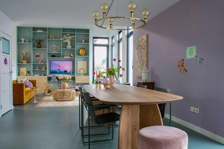
To create a sense of unity throughout your home, try repeating the same cool-toned colors from room to room. In this Amsterdam houseboat, the homeowner used a soft blue and lilac across the living room and dining area. The palette has given the entire space a shared design DNA without feeling too matchy-matchy.

Don’t Be Afraid to Experiment
Sometimes you just need a nudge of encouragement, and that’s why Westbrooks wants you to just go for it. “Cool colors are natural chameleons, and they blend in with almost every decor style,” she argues.
“If you are hesitant to make a big splash with these colors, start by incorporating them into your design with accent pieces. If you love the direction, you can always take it further by adding some upholstery pieces or painting the walls.”

I love that the renters of this East Village apartment just went for it with the cool-toned lavender painted walls. It’s the perfect example of a palette that works best for the space at hand, and marries perfectly with the furniture and decor accents inside. Why not go all in if you know you love a color?
Design Defined
Never miss the style inspo and recommendations you crave with Design Defined. Follow along each week as our Home Director Danielle shares the best style advice, latest trends, and popular decor finds you just can't miss.