
I Used a Pantry Find to Create Wall Art (It’s So On-Trend for Summer!)
It’s no secret that fisherman core is the aesthetic for the summer. If you think about it, the two really go hand in hand. Fisherman core is all about encapsulating that cozy coastal feel — think cable-knit sweaters, fresh lobster dinners, and quirky vintage pieces that allude to a lifetime spent by the sea. It’s basically the physical embodiment of summer in Maine, and I’m totally here for it.
All that considered, it probably doesn’t come as a surprise that tinned fish are having their moment in the spotlight, too (at least they are in our house!). Perhaps it’s the focus on all things fisherman aesthetic, or perhaps it’s because many tin fish companies have the best branding around. Either way, my food choices have officially intersected with my design choices, and I can’t bring myself to be mad about it.

How to Create Fisherman Core-Inspired Art
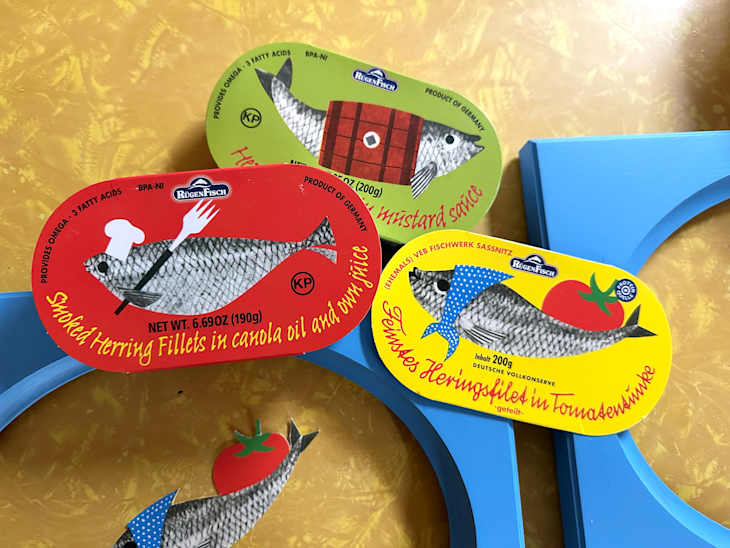
To be totally honest, I’m not sure if I picked up my latest tinned fish selection (found at World Market, by the way!) for what was on the outside or what was inside. Either way, I couldn’t bring myself to throw out these adorable labels that came on the tins, so I gave them new life as fun little art pieces for the kitchen. Painted a nautical-yet-preppy blue and framed them in porthole frames, they are my way of fully embracing the fisherman core aesthetic.
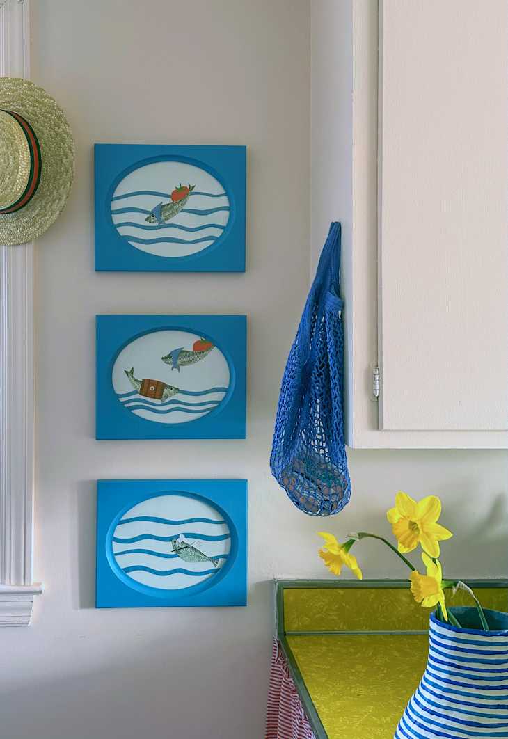
While the overarching trend leans more toward subdued colors and vintage maritime collections, my kitschy fish are working their way upstream, carving out a little spot of their own. I’m not usually big on trends, but it can be really fun to jump in and put your own twist on them. The blue frames on my pink kitchen walls work well with the silly little fish, and I really love how they turned out!
The best part? Creating the art was easy and fun. I used some thrifted frames that gave a “porthole” vibe, painted them a really pretty sea blue color, added some paper cutouts for waves, and then, of course, the fish from the labels. Grouping them all together on the wall makes it feel a bit like you’re out on a big boat, watching the adorable fish swim on by. Not into the fish? There are plenty of other really beautiful food labels that deserve to be on display. Food and art? What a great way to justify the pricier fish!