
We’re Calling It — This Is the One Color You’ll Immediately Want All Over Your Home
We've scoured markets and feeds to spot the standout looks shaping home style next year. From "Covecore" to bold colors, stripes, and DIY projects, see every trend we're calling in our full New/Next List.
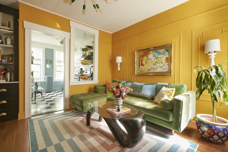
There’s always that moment after a color trend peaks when people collectively ask: What’s next? After butter yellow took over walls, cabinets, and decor, the natural next step was something just as feel-good but with more bite. Enter marigold: a rich, orange-yellow hue that feels like sunshine turned up a notch. It’s joyful, energizing, and surprisingly versatile. I’ve had marigold walls in my own living room for years (check them out below!), and I can say with confidence: This color has staying power.

Marigold might not fall into the food-themed color craze (technically, it’s named after a flower), but it’s still serving looks. After years of quiet minimalism and all-beige everything, people are craving colors with more guts. Principal designer Colleen Bennett of CBB Design Firm sees marigold as a natural evolution. “Just like butter yellow had its moment, marigold is a richer, more saturated take on a sunny yellow,” she says. “It’s for those who love color and want something a little bolder without going full neon.”
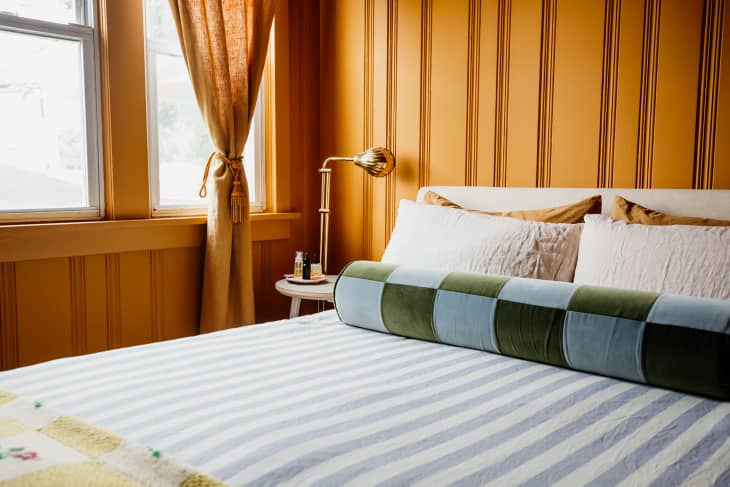
Because of its warmth and depth, marigold pairs beautifully with more tones than you might expect, too. It works with warm colors, from burgundy and soft yellow, to cool shades, like teal and dusty blue (these last two can be considered complementary colors of marigold).
Whether this hue takes center stage as a foundational color or acts as a supporting accent, the key is bringing marigold into a room with intention. A little goes a long way, but when used thoughtfully, marigold brings cohesion, contrast, and character to just about any palette. I know oranges can be controversial, but trust me: Marigold is for everyone.

How Marigold Works with Color Psychology
As a color consultant, I always start by asking my clients how they want to feel in a space. Color is emotional, and marigold’s power lies in its ability to energize without overwhelming. Sitting at the intersection of orange and yellow, this shade blends the optimism of yellow with the grounded creativity of orange.
“People are shifting away from the bland neutrals of the last decade and turning to warm, uplifting colors that invigorate their space,” says designer Isfira Jensen of Jensen & Co. Interiors. “It’s a ‘happy’ color that energizes a room without being overly bright.”
In interiors, marigold evokes feelings of:
- Inspiration
- Creativity
- Groundedness
- Joy
- Optimism
In short: It’s a color that works hard and looks good doing it.
How to Use Marigold in Your Home
If you’re marigold-curious but not quite ready to coat an entire room in this color, you can test it out without second-guessing yourself using these tips.

Go Marigold in Places You Want to Feel Energized
Marigold sparks creativity and focus, making it a great choice for home offices, studios, and even kitchen nooks. “If your space is feeling a little blah and uninspiring, the quickest way to show it some love is with color,” says holistic designer Gala Magriñá. “Marigold is a high-energy hue best suited for spaces where you want to feel awake and productive.” For lower commitment, try it in a hallway, entryway, or even just a closet — places that benefit from an unexpected splash of color.
Balance Its Brightness to Avoid Overstimulation
Marigold brings serious energy, but in highly saturated doses, it can be a lot to some people, especially in rooms where you spend hours at a time. Magriñá recommends grounding the space with white or neutral walls and using marigold as a focal point through paint (like a “fifth wall” ceiling) or decor. “We love painting an office space all white and then painting a focal wall in a bright color to infuse color into an office without it being too overpowering,” she says. It’s a simple way to get all the benefits of the color without it taking over the room.
Pair It with Complementary Colors to Bring Out Its Warmth
In her Apartment Therapy home tour, interior decorator Ally Doman used Farrow & Ball’s Dutch Orange (No.W76), a marigold-adjacent hue, in her living room, pairing it with deep green and teal accents for a bold, high-contrast palette.

Marigold’s Best Color Matches
- Burgundy: Adds richness, depth, and a cozy feel
- Olive: Provides an earthy, grounding vibe
- Cobalt or Teal: Creates a high-contrast pairing that’s full of energy
- Soft Blue or Baby Blue: Subdues marigold’s intensity without dulling it
- Yellow: Introduces a tonal, almost monochromatic look that still feels dynamic
Color trends come and go, but marigold feels different to me. Saturated without being overwhelming (spoken from the owner of a marigold-painted living room!), I know firsthand the joy, warmth, and distinct point of view this color brings to any space. I’d say it’s a shade worth experimenting with, and these shopping picks can help you dip your toe into this shade that shines in every season.

Get the Look With Marigold Home Decor
Want to start incorporating this color trend into your home today? Add a pop of sunshine with these marigold textiles and accessories.


