
The 6 Sophisticated Olive Green Paint Colors That Interior Designers Are Obsessed With
Olive green paint (as well as dark green colors) is having a moment, and it’s not hard to see why. Rich but subdued, this hue can elevate and relax a space while also evoking a hint of nature and classic charm. Olive green is definitely a multifaceted color.
While the editors at Apartment Therapy are obsessed, I wanted to make sure design professionals feel the same. And to my non-surprise, they love it. “I find olive green to be incredibly grounding and versatile,” says Amanda Jacobs of Amanda Jacobs Design. “It brings a natural warmth to a space and feels inherently connected to nature. It can be both calming and sophisticated, making it a great choice for creating depth and comfort in a room!”

Interior designers also love olive green because it plays well with others. “Nature is basically a giant green-on-green color palette, and I think that’s why our eyes love seeing lots of different shades of green all mixed together,” explains Kristin Wiens Keyes of Kristin Keyes Interiors. “I don’t think you can do that as easily with other colors.”
Keyes specifically loves pairing olive greens with red-leaning colors like berry and rust. Similarly, Jacobs enjoys combining the color with neutral, natural tones. “I love pairing it with cooler shades like electric blue or chartreuse for a punchy contrast, but it also harmonizes beautifully with warm terracottas, natural woods, soft linens, and earthy textures. It’s incredibly adaptable, which makes it such a fun color to work with,” she shares.
If you’re curious about using an olive green shade in your home or are a longtime fan of the color, you’ll want to see how Jacobs and Keyes used it in real homes they’ve designed. Keep reading to learn about these designers’ favorite olive green paint colors.

Interior Designers’ Favorite Olive Green Paints
While olive green paints definitely have the same characteristics, no two shades are exactly the same. That’s why I tapped experts to figure out what their go-to olive green shades are.


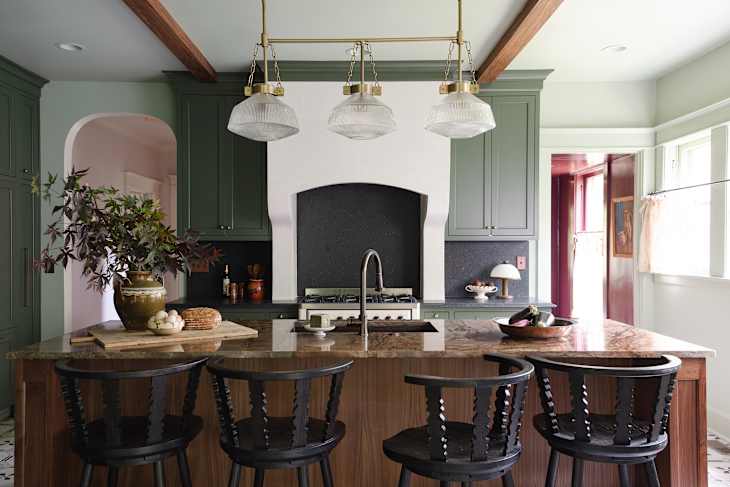
Benjamin Moore’s Aganthus Green (472)
“I think green pairs really well with other shades of green,” Keyes explains. This thought is proven in a project Jacobs worked on (seen above!) where she combined Benjamin Moore’s Aganthus Green (472) with another green shade to create an earthy, cozy space. She explains that she specifically chose this color because it “has a soft, minty quality that feels fresh and airy.”

Sherwin-Williams’ Retreat (SW 6207)
Keyes used this dark olive color in the bedroom project seen above. “I love it because it’s dramatic, moody, and plays well with others,” she shares. “I like to choose a color with some muddiness and ambiguity to it, and Sherwin-Williams’ Retreat (SW 6207) definitely had both qualities. Is it gray? Is it green? It’s whatever you need it to be!”
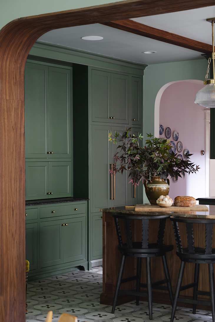
Benjamin Moore’s Vintage Vogue (462)
Remember how Jacobs used two green shades in a project (seen above!)? The other olive color was Benjamin Moore’s Vintage Vogue (462). She says she loves it because it “brings in that grounded olive depth. It’s a great example of how olive tones can be elevated when paired with lighter, complementary greens on the walls.”

Sherwin-Williams’ Sheraton Sage (SW 0014)
Keyes used Sherwin-Williams’ Sheraton Sage (SW 0014) to paint the built-ins in the living room above. “We needed something to balance the dark green sofa in the space, and this lighter, springier green was just what the space needed,” she says. “Sherwin-Williams’ Sheraton Sage (SW 0014) is part of the Sherwin-Williams Historical Collection, so it pairs well with lots of other colors that have been vetted and selected to work together.”

Benjamin Moore’s Creekside Green (2141-40)
“Benjamin Moore’s Creekside Green (2141-40) is a more subdued, refined olive,” Jacobs explains about the project above. “We chose it to complement a wallpaper featuring brighter, cool-toned accents. The soft olive played beautifully against those tones in the fruit, creating a subtle but striking harmony.”

Farrow & Ball’s Calke Green (No. 34)
If you’re looking for a dramatic color, Jacobs has just the olive green hue for you (see a sneak peek in the room above). “Farrow & Ball’s Calke Green (No. 34) has more intensity and personality — it’s a bolder olive that commands attention,” she shares. “For this project, we fully embraced it by color-drenching the entire space, which created such a rich, immersive environment. It’s one of my favorite uses of olive green.”