
I Asked 6 Designers About the Worst Color to Paint a Tiny Bathroom, and They All Agreed
If you need any proof that big things come in small packages, just look at a powder room. Though this small room doesn’t have the most generous footprint — oftentimes, there’s only enough room for a toilet and sink — it has the potential to be the perfect “jewel box” moment. You know, a place to take a step away from your home’s typical aesthetic and think outside of the box.
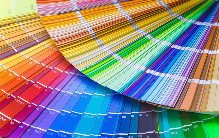
The powder room really is the perfect place to experiment with fun fixtures, bold patterns, and dramatic color palettes. So when we asked several designers what the worst shade for a powder room was, we weren’t surprised they all said the same thing.

White Is the Worst Color to Paint a Powder Room, According to Designers

Their answer? White is the worst color you could use in your powder room. “Painting your bathroom white is like going to Paris and eating at McDonalds,” says Yvonne Harty of Harty Interiors in Northern California. “Powder rooms are the one place in a home where you can really have fun and do something unexpected.”
All other designers I spoke with agreed: Reanna Channer of Design to Elevate says white powder rooms can “look utilitarian and totally unconsidered,” while Killy Scheer of Scheer & Co. says the combination can “come off cold, institutional, and sterile.”
The reason for that, they say, often has to do with lighting. “Powder rooms don’t get a lot of natural light, and white paint only reflects the quality and quantity of light that’s available — so a powder room in room white can feel sterile,” explains Bay Area designer Thecla Glueck. “Especially now that most lighting is LED.”

It’s a good idea to avoid beige, too. In fact, some experts like Jade Joyner of Metal + Petal say beige might even be a more controversial choice than a crisp white. “It washes everyone out, looks lifeless under artificial lighting, and feels more like a dated hallway than a memorable little jewel box,” the Athens, Georgia designer explains.
Hill Rondero of Ro House Studio agrees, noting the neutral can be “unflattering and harsh on skin tones” in such a small space. In fact, Scheer adds beiges with green undertones can appear “dingy, dated, or dirty.” In other words? Beige has the lackluster quality of a stark white, but with awkward undertones.

Alternative Color Choices for Your Powder Room
Neutrals can be great in literally any other room of the house, just not the powder room. So, what to try instead? “Since it’s a space where you don’t spend [usually] extended periods of time and it doesn’t require the same illumination as other bathrooms, [a powder room] is the ideal area to ‘wow’ your guests with bold design choices,” Channer says.
For Harty, a powder room is your chance to go full-blown maximalist. “I like combining a patterned wallpaper and a rich color, interesting plumbing fixtures or cabinet hardware, and unique light fixtures,” Harty shares. Or, you can always go for a moody paint shade: “Stick with warmer, richer hues like rust or rose to keep guests looking — and feeling — their best,” Rondero says. “Farrow & Ball’s Fox Red is a great choice.”
Whether you opt for wallpaper, paint, or a combination of the two, one thing’s for certain: A powder room is your chance to go for the bold. Why make this small space blend in when it was designed to stand out?