
2 Paint Projects Transform This Apartment Bathroom (but the Art Deco Tile Stays!)
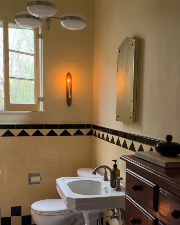
Pale butter yellow has been a trendy paint color for a while now, and in Tory Tawlks’ bathroom it was the perfect paint color to pair with the original Art Deco-style bathroom tile.
“I loved it right away,” Tory says of the yellow tile, and she decided that the best way to make the space feel calming was to bring in more of the color. “I want it to feel like sunshine is hugging me in this room,” she adds.


Step one was color drenching in a buttery yellow.
“I wanted to color drench it,” Tory says, and she picked Farrow & Ball’s Farrow’s Cream, a buttery almost-yellow. “It’s the perfect muted yellow, and it looks really beautiful with that specific tile,” Tory says, adding on Instagram that she feels like she’s “getting braver and braver with color.”
Tory’s painting advice? Color can make a space feel calming, if you choose the right tone. “If you’re someone, like me, who loves to feel peace in your home, sometimes actually leaning into color will bring you there instead of fighting against it,” she says. That, and be sure to paint the ceiling for a truly enveloping environment.
> Join the discussion of this B&A in our Community forum!
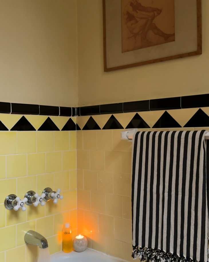

There are pops of red-brown.
Painting the walls was straightforward, but painting the built-in storage in the bathroom was a little trickier. “That took me a few different tries just because I wanted to get the right color of that deep wine,” Tory says. “Color just can be so emotional, depending on the lighting.” Her final pick was Sherwin-Williams’ Rookwood Red.
She layered in more pops of that same deep red with some charcoal drawings she had seen at the thrift store, and then she added wooden sconces and a small wooden stool. “I think wood makes every space feel a little cozier and a little earthy,” Tory says.
And last but not least, she added a clearance West Elm chandelier (now sold out) “I needed a light that would come low, but I wanted it to still have that mid-century or spacey round, playful feeling to it,” she says. “I just loved it.”
Inspired? Submit your own project here.