
25 Colors That Beautifully Pair with Red, As Seen in Real Homes
Fashion icon Christian Dior once famously declared, “There’s certainly a red for everyone.” While his domain definitely influenced closets, the sentiment certainly holds true for the rest of the home. A bold and fiery shade, red is beloved by designers who are spotlighting its power on TikTok — and popularizing everything from earthy shades (brick red) to punchier tints (vermillion and more!).
A pop of the hue (à la the “unexpected red” theory) can go far, but having red be the star of the show in your bedroom, living room, cozy kitchen, or bathroom can elevate your home to new levels of chic. The key? Knowing which colors to pair it with. You need a shade that is gutsy enough to go toe to toe with main character energy, but not so bold that it takes your room from chic to chaotic in an instant.

“Red adds depth to a scheme and really works to ground an otherwise neutral paint scheme without feeling too heavy,” says interior designer Laura Stephens. “Plus, it pairs brilliantly with so many colors.”
Russell Loughlan of The House on Dolphin Street, a U.K. design firm, agrees. “Red can make a room feel cozy, bold, and full of personality — you just need the right mix to balance it out,” he adds. “Pair red with neutrals like beige, cream, or soft gray if you want a calmer, more relaxing vibe. If you’re going for something dramatic, try adding dark blues or light greens for a cool contrast.”
This guide to red color pairings is suited for a myriad of styles, whether you lean more-is-more maximalist or headfirst into quiet modern luxury (or even have a penchant for bohemian style!). Whether you’re feeling ready to spice up life at home with a bold red-orange or channel a storied residence with a rich garnet living room, there’s a color combination out there for you. Below, we’re rounding up 25 real-life red color combinations that will work for your space, no matter what vibe you’re chasing.

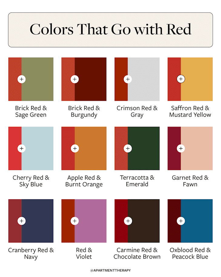
1. Brick Red and Sage Green
In this historic Utah home, designer Meta Coleman wanted to find a red that was both timeless and bold, eventually landing on brick-inspired shade (similar to Farrow & Ball’s Incarnadine). To bring a bit more country charm to the equation, she paired it with a soft sage green; both hues have a tinge of brown to them (often referred to as “muddiness” by designers), making the pairing feel natural and synergistic.

2. Crimson Red and Gray
When putting together this formal living room, interior designer Louise Copeland kept things traditional, swathing the room in all-over gray before bringing it to life with strategic pops of crimson on the chairs and back of the built-ins.
“We used this orangey-red (Benjamin Moore’s Crimson) for a major pop in an otherwise relatively neutral room,” Copeland explains. “The color carries through the space in subtle ways — the thin border of the custom rug, on a few chairs’ pillows, and as banding on the drapery — so that this beautiful red spreads around the room and spices things up without [being] overwhelming.”

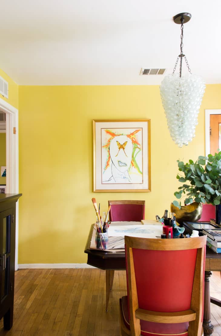
3. Saffron Red and Mustard
While the combination of red and yellow may call to mind summer picnics (and classic condiment colors), there’s absolutely a way to combine the two aesthetically. Here, designer Emily Smoor, founder of design firm Fantoush in Edinburgh, Scotland, opted for a plush velvet couch in rich saffron red, pairing it with an equally bold ottoman in dynamic mustard.

4. Cherry Red and Sky Blue
Red and blue conjure up imagery of nautical locales and patriotic celebrations. That said, no one wants a room that feels like it’s perpetually celebrating the Fourth of July, so it’s important to find the nuance in this pairing.
Here, principal designer Elizabeth Hay of Elizabeth Hay Design paired Dulux’s Chinese Sensation with shades of sky blue, all incorporated through soft touch points, like fabric and wallpaper. “We wanted the room to be really vibrant but also cozy, so [this] was a perfect color, as it has a pinkish undertone,” she adds. “To avoid the red feeling too overwhelming, we balanced it out with different scales of fabrics and introduced softer blue and white tones.”

5. Apple Red and Burnt Orange
While red can find a home in almost any room, it’s particularly well-suited to children’s rooms or other spaces that have an inherent playfulness about them. In this childhood bedroom, Connecticut-based designer Chauncey Boothby paired classic apple red with a burnt orange shade for a combination that feels both youthful and sophisticated.
“I actually custom colored this Ottoline stripe fabric based on paint colors I saw on an old boat,” Boothby adds. “Instead of using strong primary colors typically found in boys’ rooms, I tweaked the palette to more of a dove blue, crimson red, and ocher.”

6. Terracotta Red and Emerald Green
Red and green are notoriously pegged to the holiday season, but they also work year-round when styled properly. In this cozy snug, U.K.-based designer Katie Cardew played into the rich wood paneling, pairing a terracotta red couch with a high-gloss emerald green ceiling (for a similar shade, try Benjamin Moore’s Absolute Green), for a room that’s as comfortable as it is dramatic.

7. Burgundy Red and Lime Green
Sometimes, beauty lies in the contrast of two shades that shouldn’t work together (but somehow do!). Case in point? This inventive dining room by Houston-based interior designer Emily Spanos, which turns the volume up on traditional design with a rich red ceiling, high glossy cabinetry, and zesty wallpaper.
“We used Farrow & Ball’s Preference Red on the ceiling in this dining room to give the space a warm, inviting feel, while also incorporating cool colors, such as the lime green Phillip Jeffries wallpaper backing the cabinets and the neutrals of the cabinetry and trimwork,” Spanos explains. “I love using a ceiling for unexpected color that grounds the room in a way that is interesting and new!”

8. Garnet Red and Fawn
It can be tempting to keep things safe and neutral in the kitchen — it’s such an investment, after all — but opting for a bolder color can give your space a true sense of perspective and style. In this tailored cookspace, Stephens turned to Paint and Paper Library’s Scarlet ‘n’ Rust for the lower cabinetry, keeping the rest of the room serene in a neutral-but-better fawn brown shade.

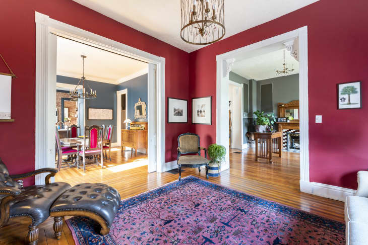
9. Cranberry Red and Navy
Red isn’t often described as “moody,” but with the right tint (and the right counter!) it can totally transform from vibrant and energizing to tranquil and transportive. Here, designer Loughlan chose Farrow & Ball’s Preference Red, which flows seamlessly into the nearby kitchen, swathed in complementary navy blue (Farrow & Ball’s Hague Blue).

10. Red and Animal Print
Hear us out: While animal prints aren’t actually a color, they’re often considered a neutral by designers, and subsequently layered into rooms with abandon, bringing with them a hefty dose of fun and personality. And if there’s one hue that matches their spicy energy? It’s red. In this dynamic living room, Atlanta-based designer Mallory Mathison paired a crimson couch with tiger print, leopard, and more.

11. Brick Red and Burgundy
Tone-on-tone palettes are all the rage in design right now, but to ensure they don’t feel one-dimensional, you’ll want to play with variations in your shades (or textures) to craft a palette that still feels fresh and dynamic. In this country kitchen by Texas-based interior designer Sarah Stacey, a rich red coats the 1940s cabinetry, appearing in slightly darker form on the Ferrick Mason wallpaper that covers the rest of the room.

12. Oxblood Red and Peacock Blue
Tiles come in just as many hues as paint, allowing you to personalize every inch of your bathroom, laundry room, or kitchen with bold pops of color. In this powder bath, designer Tobias Vernon of 8 Holland Street combined deep red tiles with a peacock blue version (and high-gloss mustard door) for a fresh take on color blocking.
“We used faceted and highly glazed zellige tiles in Mars Red to offset the coolness of the rest of the room,” Vernon says. “The strip of these at low level allowed us to introduce another juxtaposing color in the scheme for the room, while adding a warmth that works against the original wooden floorboards.”
13. Red and Metallic Touches
It’s true that “metallic” isn’t exactly a color, but red paint acts as a neutral against a metallic motif, especially if you mix metals in a single space.
“I love mixing metals together — like mixing brass tones with silver tones. Red equalizes it. Red acts like the neutral between the two metals, which is just so interesting,” says Ivana Carbajal, designer at Jamie Bush + Co. “You could pair a chrome fixture with a red lampshade, or a gold picture frame and the subject matter is red. Applying it in those ways is where it’s interesting.”
14. Carmine Red and Chocolate Brown
Looking to liven up just about any room in the house? Those who prefer a traditional look will love leaning into this combination. “Pairing chocolate and cherry red together are yummy like a chocolate with a cherry filling,” says Allison Paladino of Paladino Rudd Interior Design. “It’s such a great color combination — perfect for a traditional, rich library.”
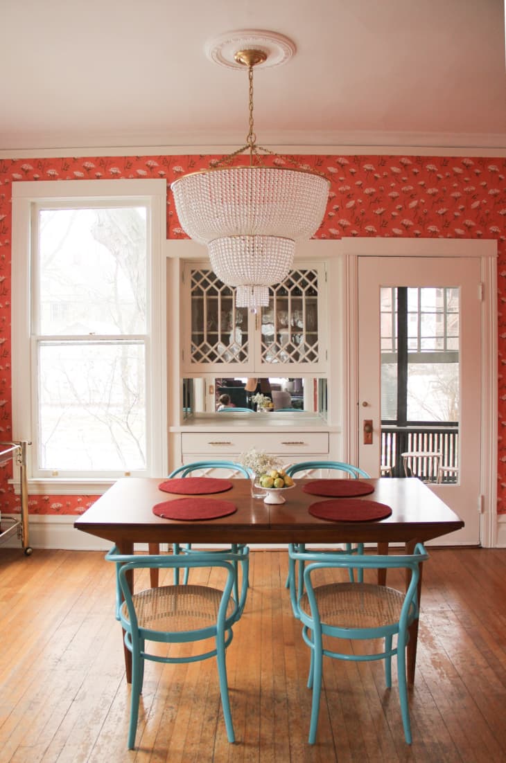
15. . Red and Turquoise
These two vibrant shades are loud on their own, but somehow, they neutralize each other when styled together. The result with this pairing? A colorful room that’s surprisingly soothing. “The tertiaries all look great with red,” adds interior designer Fran Keenan. “It feels spunky and helps red relate to a coral reef, turquoise sea combo.”
Case in point: This Midwestern Victorian dining room, which feels quirky with its subtle, sea-colored chairs and red floral wallpaper. White trim and accents will help break up the intensity of these two power hues.
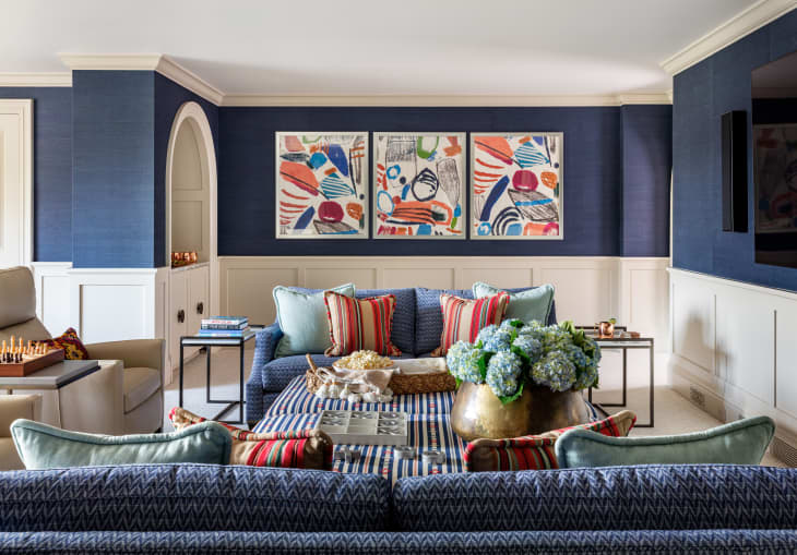
16. Blood Orange and Navy Blue
Steal this look from designer Betsy Wentz, who uses red as a bold-yet-inviting accent color in an otherwise soothing living space. This is another solid color palette for traditionalists to look to if they are afraid of taking on more color.
“Depending on its shade, I like to pair red with [calmer colors] to soften it,” she adds. “Red and blue are a classic combination, so for a more traditional look, I pair navy blue with shades of red.”
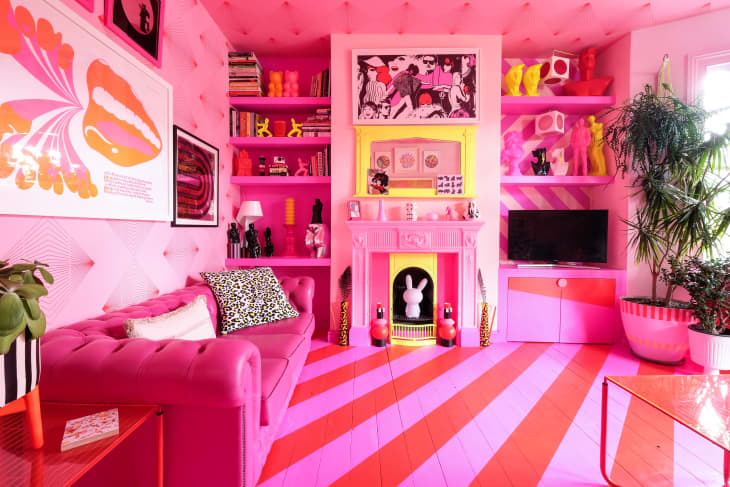
17. Candy Red and Hot Pink
If you’re a fan of color drenching (or its subsequent trends!), this look is for you. Not for the faint of heart, this vibrant color combo is executed all across this London home, making for an upbeat, lively place to cook, work, entertain and refresh. Pops of gray and yellow add an unexpectedly fun contrast to the punchy colors without overtaking the primary combination.
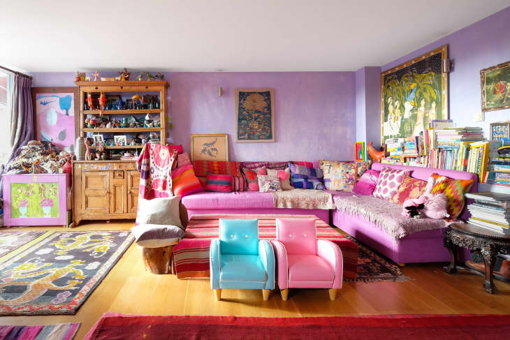
18. Red and Violet
If pairing two dramatic colors like red and purple seems too daunting, try different shades of each for a swoon-worthy color combination. An electric red and a pink-hued violet in this London flat make a beautifully bohemian pairing that’s perfectly accented by a colorful collection of throw pillows.
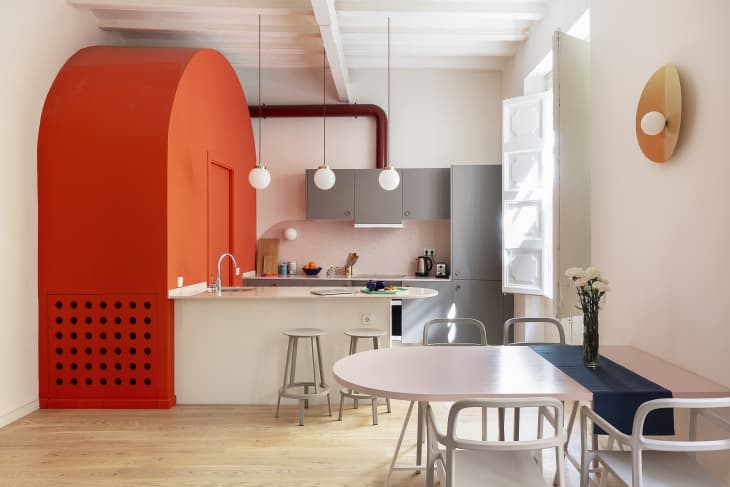
19. Red and Orange
For a cool, modern vibe, combine red with various shades of orange and touches of neutral hues. With its bright tangerine cabinetry, pinkish-peach walls, and pops of navy and gray, this Barcelona home feels warm and welcoming.
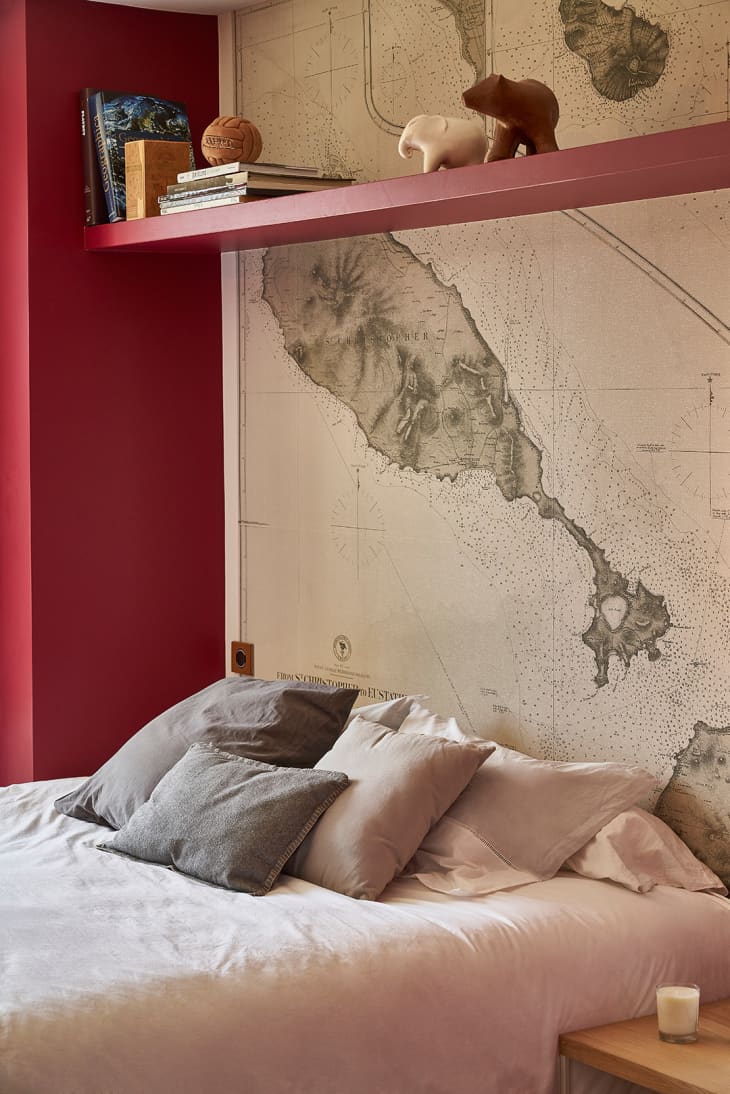
20. Red and Beige
Looking for a way to tame a fiery look? Add some beige to the mix. “We like to pair [red] with warm neutrals to bring some balance to the strong hue,” says Elizabeth Rees, founder of wallpaper company Chasing Paper.
Admittedly, beige gets a bad rap for being boring on its own. When beige is paired with red, however, it can offer the right amount of contrast. Plus, it’s more soothing than a crisp, bright white. For example, the subtle texture from this oversized map in a three-bedroom home in France rounds out the look of the red walls in the above bedroom, almost transporting you to the French countryside.
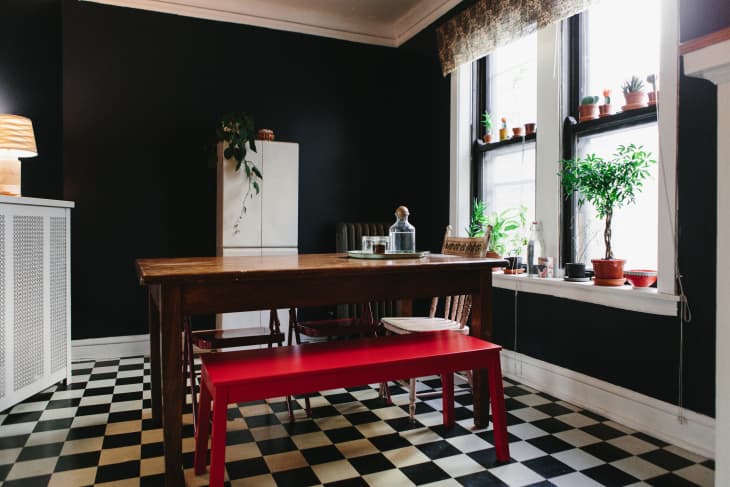
21. Red, White and Black
Red doesn’t need to be “all over” to make a statement. Take a cue from this Chicago apartment and put an exclamation point on your room with a cherry-colored bench. A few pops of red can be enough, particularly if you choose one larger item to focus on.
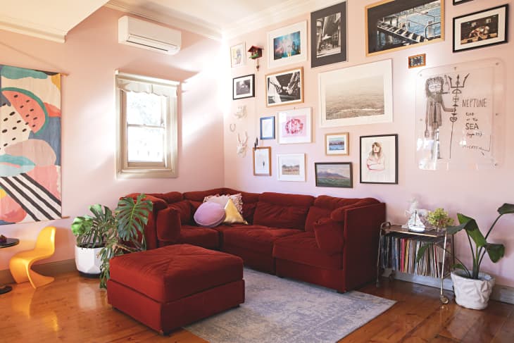
22. Dark Red and Blush Pink
Often, pink and red rooms can feel like you’re living inside a Valentine’s Day card. If you want to give this color combination a cool, modern edge, trade in the bubblegum pink for a subtle blush or millennial pink. In this eclectic Australian home, the blush acts as a neutral ground, so the red sectional can be the center of attention.
23. Red and Bright Yellow
Subtlety is neither yellow or red’s strong suit. Since they’re on the same end of the color spectrum, however, these two colors can actually play nice with each other. By incorporating softer shaders of each color, this Austin home ends up sweet and totally soft.
“Hues of red and yellow draw on the colors of sunshine, bringing warmth and energy to this living room without overwhelming one’s senses,” explains Washington, D.C.-based interior designer Marika Meyer. “Offset [these shades] with neutral tones of beige and white.”
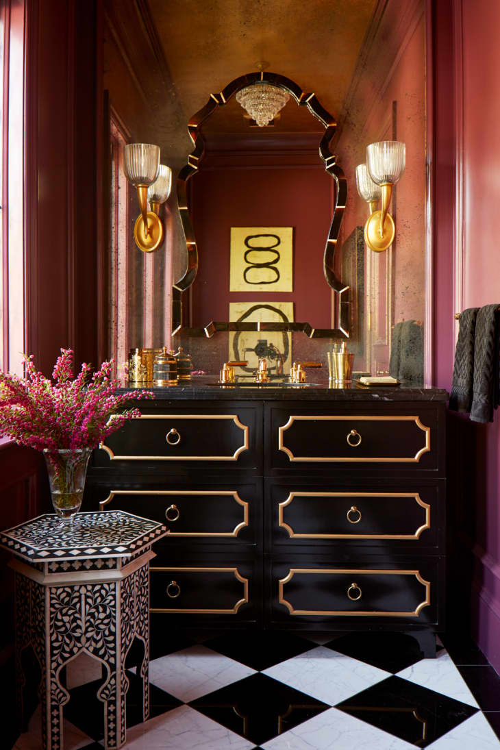
24. Bordeaux Red and Black
Treat your home to a luxurious look with a deep, wine-inspired red and glossy, black pairing.
“Deep reds can be tricky, depending on how much of a purple hue shows through,” explains San Francisco-based designer Kendall Wilkinson. “Here, the purple has been downplayed and contrasted rather than intensified. The Bordéaux tone and black painted cabinet pair nicely, and the red almost becomes neutral in this pairing.”
25. Red and Purple
Red and purple aren’t the first two colors you’d think to put together. According to Elizabeth Sesser, principal designer and founder of Studio E, this unlikely duo can deliver quite the punch, though. It all boils down to choosing the right shades. “Make sure that these colors are in the same tone range,” she advises. “I would use this combination as accents on neutral ground so they can really stand out.”
In this renovated Victorian home, tomato-colored walls and reddish-purple area rugs complement, not compete with, each other. This is because they have relatively the same saturation, so the look is balanced when you put them into the same space.
5 Designer Tips for Pairing Colors with Red:
Regardless of the hues you’re thinking of working with, keep these mixing-and-matching tips in mind from design pros who regularly dress rooms in daring red shades.
Match Your Color’s Undertone
Just like any other paint color, red can have different undertones, from blue to orange to brown. For a seamless meld between your hero hue and other colors you choose, make sure the undertone of your red matches that of your accompanying colors. “Cool reds pair best with cool neutrals or blues, while warm reds harmonize with creamy or golden tones,” Mathison explains.
Start Small
Red is a hue that can be intimidating to many, so don’t feel you need to go wall to wall with it on the first go.
“If you don’t feel confident in using red on an expensive piece of furniture, it is a really valuable color when styling,” Smoor says. “Many of the great master painters used very small strokes of red in their work; its function was to make the other colors in the piece sing. A small pop of red, whether the spine of a book, a vase, or candlesticks, can suddenly bring a room to life by invigorating the colors around it.”
Look for Depth (Not Brightness!).
When it comes to red, opting for the boldest fire-engine shade in the paint deck won’t typically give you the look you want. “Reds with brown, brick, or rust undertones are much easier to live with,” Cardew says. “They blend with wood tones, stone, and natural textures, rather than fighting them.”
Think About Scale
How much red you use in a room should be proportional to how strong the color is. “If it is a brighter red, maybe the size of the red is smaller, or the other colors next to it are complementary colors, or cool versus warm,” Coleman explains. “If the red is on a larger surface, like a cabinet, I suggest toning the red down a bit in vibrancy.”
Choose a “Hero” Print
Wallpaper and fabric are great partners to red, and they can also help inform your overall color palette, too. “When pairing colors with red, we choose our ‘hero’ fabric or wallpaper, then develop the scheme around it to ensure that the different colors work together tonally,” Hay says. “For instance, we wouldn’t use a fabric with a white base cloth when the room has a warmer tone of red, as that would create too much of a juxtaposition. Instead, we’d opt for a fabric in a much warmer ivory tone.”
How We Chose Our Red Color Combinations
Apartment Therapy editors searched high and low for color pairing inspiration for this piece, including revisiting more than 3,500 real-world house tours we’ve published over the years. Editors analyzed more than 10,000 photos from real homes where red is featured in unique ways, either in colorful paint jobs, stunning upholstered furniture or flooring, and in custom appliances (and more!).
In addition to exclusive house tour images, our reporter interviewed four interior designers in leading markets across the country — hours of conversations and Q&A were condensed into the guide above. These designers use bold colors in fresh ways, inspiring our chosen pairings and helping us to inform new ways of bringing red color into modern home design.