
A Guide to Every Pantone Color of the Year Since 2000
Color analysts at Pantone have been creating their annual “Color of the Year” (COTY) trend forecasts for over 25 years (the first was released in 1999!). 2026’s selection has been somewhat controversial due to its, ahem, neutral shade — but I have to applaud Pantone for finding more than two decades’ worth of new hues for a selection each year. While I’ve been surprised by just how many people are chiming in on Pantone’s latest selection, the world at large began reacting to this annual announcement back in 2012 for “Tangerine Tango.”
It wasn’t until recently that Pantone began sharing more info about its Color Institute — and the thorough process their representatives undergo to select a new trendy hue each year. Pantone’s own color database has more than 1,000 distinct shades — and color experts weigh consumer preferences alongside input from interior designers, per the company’s website.

This year’s selection of “Cloud Dancer” will drive trends in real ways: Across multiple industries, from retail packaging to product manufacturing, brands have already started heeding this trend declaration. This December’s announcement (a big departure from other forecasts from brands like Sherwin-Williams and Behr) has reminded me of a few other Pantone predictions that were equally surprising (and groundbreaking!) at their time.
Follow along as I recap the past 25 years of trending colors… none of which may ultimately be as polarizing as this year’s white!

2026: Cloud Dancer
In a surprising twist, Pantone’s 2026 declaration is a soft, wintry white; the first white shade crowned as such in the program’s history. Pantone officials describe this particular hue as a “billowy, balanced white imbued with a feeling of serenity.” Finding the perfect shade of white can be a challenge, and the company feels this particular color is the right one to brighten your interiors this year.
Laurie Pressman, vice president of Pantone’s Color Institute, added: “Cloud Dancer opens up space for creativity, allowing our imagination to wander and drift so that new insights and bold ideas can emerge and take shape.”

2025: Mocha Mousse
Design’s ongoing obsession with food is definitely reflected in this year’s selection, a “mellow” brown that color pros pinned back to rich chocolate mousse. While maximalism is certainly trendy these days, Mocha Mousse is a gorgeous neutral that proves that the obsession with earth tones is far from over. We’re sure that this particular hue will still find its way into chic interiors long after this year’s new selection is announced.

2024: Peach Fuzz
Sensing a trend here? Peach Fuzz was Pantone’s selection that provided a light, airy, and distinctly warm hug in soothing spaces like cozy bedrooms. Leatrice Eiseman, executive director of the Pantone Color Institute, told Apartment Therapy this upon its release: “A cozy peach hue softly nestled between pink and orange, Peach Fuzz brings belonging, inspires recalibration, and an opportunity for nurturing, conjuring up an air of calm, offering us a space to be, feel, and heal and to flourish.”

2023: Viva Magenta
Inspired by the signature hue tied to carmine red — a super-vivid and rare natural dye derived from cochineal insects — Pantone declared Viva Magenta its COTY after futuristic tones took center stage in 2023. It was a color that swept trendy statement walls all over the country; and certainly felt like a grown-up evolution beyond the millennial pink craze of the late-2010s.

2022: Very Peri
Created at the height of the global COVID-19 pandemic, the Pantone Color Institute’s Very Peri was designed to be a calming periwinkle hue that referenced the duality of blue tones both in nature as well as in digital environments. Many homeowners chose to incorporate this trendy blue shade with upholstery finishes like throw pillows, blankets, and more — the cozy essentials that made digital life at home more comfortable.

2021: Illuminating
In a twist, Pantone chose to release two shades for 2021 as a nod to the hardships that so many faced that year during the COVID-19 pandemic. The first hue, Illuminating, was chosen as a representation of the hope that all those across the world had for the year ahead. “The selection of two independent colors highlights how different elements come together to express a message of strength and hopefulness that is both enduring and uplifting, conveying the idea that it’s not about one color or one person — it’s about more than one,” said Eiseman back at the color’s release.
2021: Ultimate Grey
The other trending shade declared in this dual announcement was a clear reference to the fortitude and strength shown in 2020 — particularly by those working in public service. Pantone officials said this steely neutral color represented “solid and dependable elements” in nature and within life. Eiseman told us exclusively, “Ultimate Gray was that feeling of strength, something that’s enduring, rock solid, resilient, thoughtful,” Eiseman told Apartment Therapy. “With gray, people will always connect those words.”

2020: Classic Blue
To start the new decade off, Pantone went back to basics with Classic Blue. This color is the definition of chill but is also, well, deep — both literally and figuratively. Pantone sees the color as meditative and thought-provoking — just like the sky at dusk.

2019: Living Coral
Things warmed back up for 2019, as Pantone picked Living Coral, a close cousin of 2012’s Tangerine Tango. This time around, Pantone’s orange-based hue was a little bit lighter and sweeter, which made it even easier to use as a decorative accent in rooms.
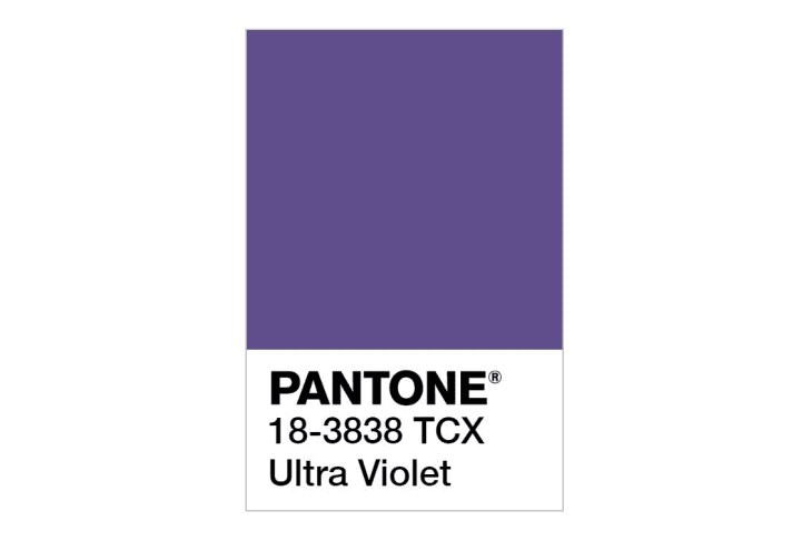
2018: Ultra Violet
This second blue-based purple was chosen for its mysterious, dramatic, and imaginative qualities. Pantone said it was representative of the expansiveness of the universe, which sort of makes sense, as all things space and mystical were trending at that moment.
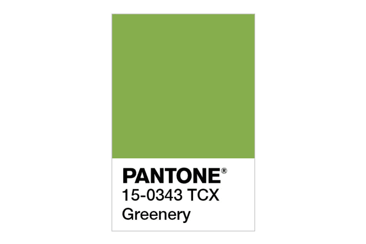
2017: Greenery
Greenery was a straight-up reaction to the fast-paced technological bubble we all live in. Pantone felt people were looking to get away from their gadgets and connect instead with nature, and this zesty yellow green was a manifestation of that longing.
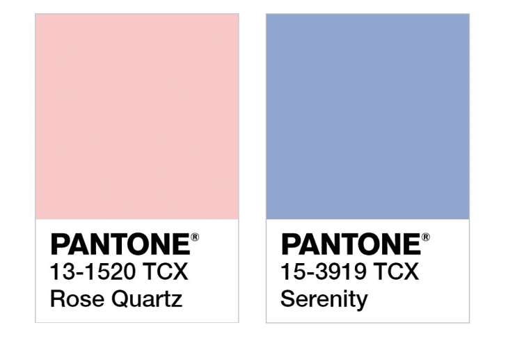
2016: Rose Quartz and Serenity
For the first time ever, Pantone actually picked two shades. One was a warm, gentle pink, Rose Quartz, that undoubtedly had something to do with the millennial pink craze. And that was paired with cool-toned Serenity, a soft, tranquil blue. These colors were chosen to speak to people who were craving comforting shades, and was also representative of the increasing blur along gender lines.
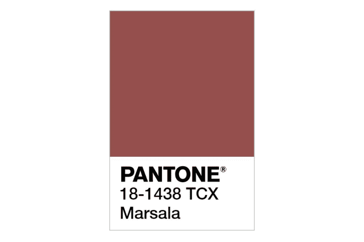
2015: Marsala
Like a fine wine, Marsala was chosen for its rich, full-bodied quality. Pantone saw the shade as sophisticated and earthy, touting its versatility as a color for living room upholstery, textiles, and rugs.
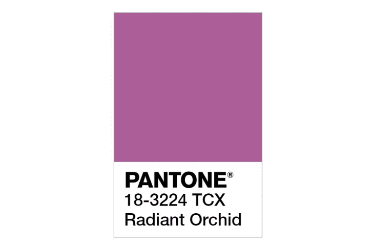
2014: Radiant Orchid
This fuchsia pinkish-purple was chosen by Pantone for its warmth, joy, and ability to spark creativity.
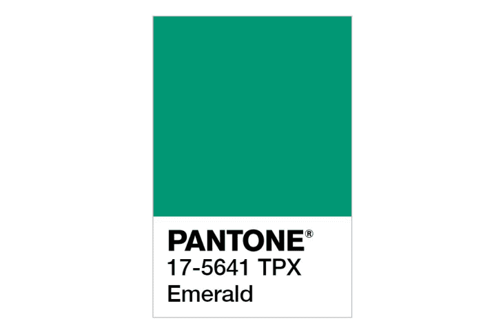
2013: Emerald Green
This year was a total mellowing out of 2012. Instead of a vibrating, warm tone, Pantone selected Emerald, a vivid but happy green. The thought was this deep jewel tone would enhance our sense of well-being and promote balance.
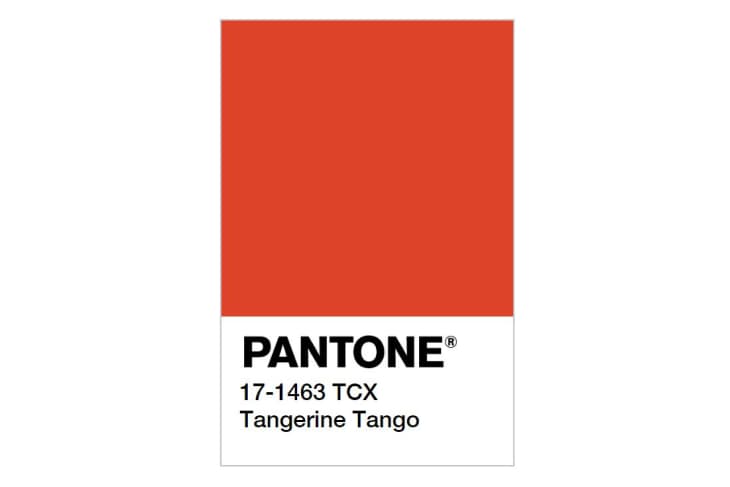
2012: Tangerine Tango
Pantone thought the world needed a little waking up. So they singled out this spicy reddish orange. Think of this one as a color of the sunset — vibrant and full of energy.

2011: Honeysuckle
A pretty reddish pink, Honeysuckle was selected for its optimistic quality. Pantone wanted something that would lift people’s moods and provide confidence and enthusiasm. You can’t say pink isn’t a happy, joyful color, right?
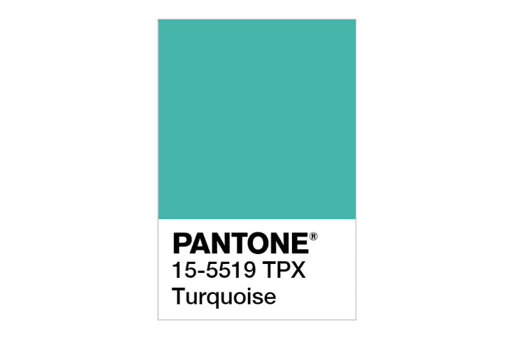
2010: Turquoise
Turquoise was all about escape (think: tropical waters and the stress-free feeling of a vacation). Things hadn’t totally rebounded from 2008, and Pantone wanted to give people the distraction they so desperately needed. The shade derives its chill vibes from the blue undertones and its invigorating, recharging properties from the hints of green.
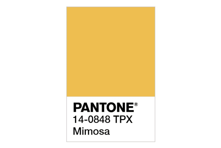
2009: Mimosa
Considering the economic climate, Pantone felt a dose of happy optimism was needed at this time and went with Mimosa, an ebullient, cheery yellow for 2009. It radiates the warmth Pantone believed people were craving.

2008: Blue Iris
The first of Pantone’s blueish-purple COTYs, Blue Iris was picked for its stable and calming blue undertones. The tinge of purple added a hint of excitement, according to Pantone. And this shade was meant to provide reassurance in our increasingly complex world.
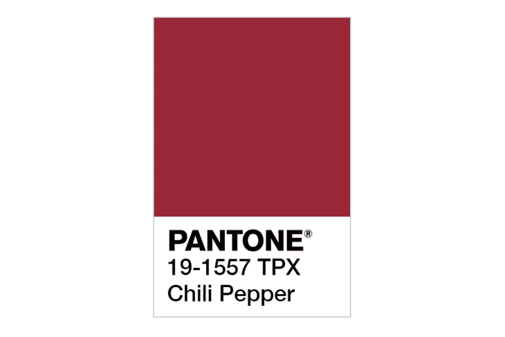
2007: Chili Pepper
Pantone named this spicy red the COTY for its powerful expressiveness. Red is a color that demands attention, and at the time Pantone felt people were all about making personal statements and going big and bold.
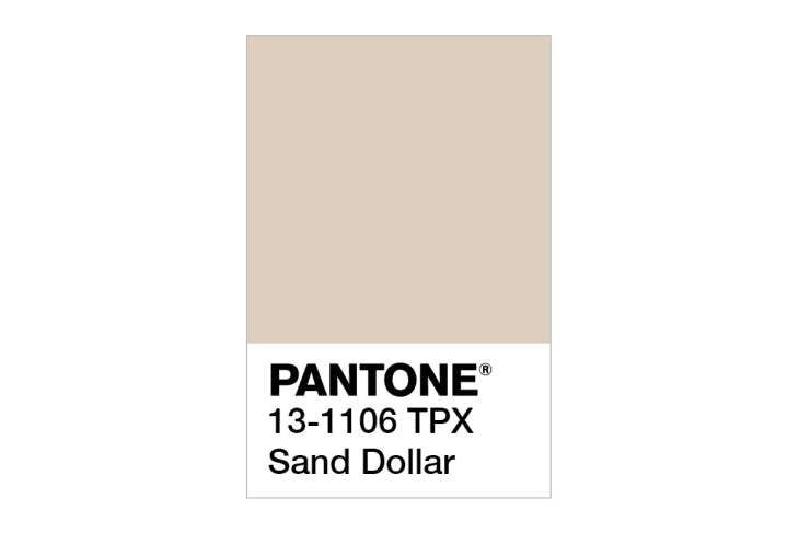
2006: Sand Dollar
Was Pantone the first to predict the mortgage crisis of 2008? Well, they apparently chose this sandy tan neutral in 2006 as a reaction to the economy. Very interesting.
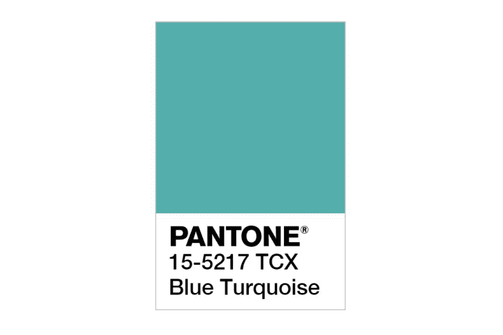
2005: Blue Turquoise
Pantone was really inspired by the colors of nature in the early days of the COTY franchise and chose Blue Turquoise because it was the color of the sea. Naturally, they felt the color would be calm and cool.
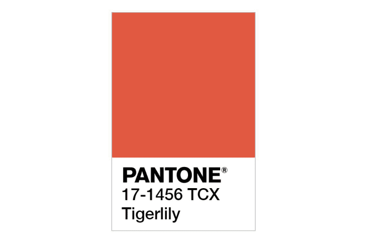
2004: Tiger Lily
Taking its color cue from the flower that shares its name, Tiger Lily was bright and had a touch of exoticism to it. Orange was apparently having a moment again, and Pantone wanted to tap into that cool factor this year.
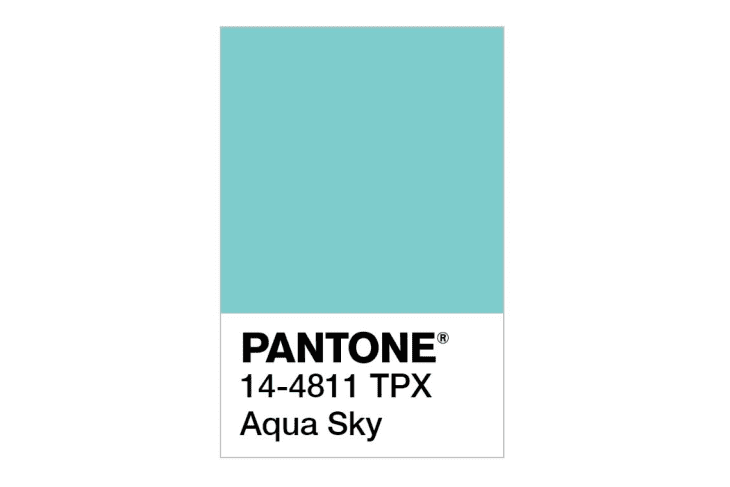
2003: Aqua Sky
This quiet, contemplative blue was chosen by Pantone for its serene quality. Side note: This is going to be a trend with Pantone and their blues, which tend to pop up every few years.
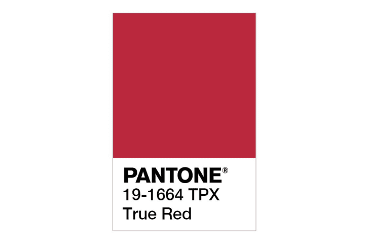
2002: True Red
There’s not much out there on this color except that it might have been a reaction to the September 11th attacks. True red is exactly what it sounds like — red like a fire engine or a heart — a color that stands for compassion and love.
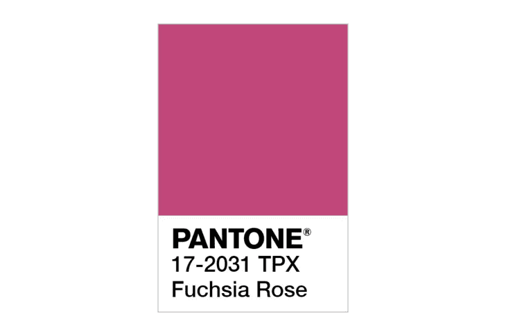
2001: Fuchsia Rose
This sultry, saturated pink might have been chosen for the sheer fact that it’s pretty much the opposite of 2000’s Cerulean. Things were a little more simplistic in Pantone land 20 years ago, it seems.
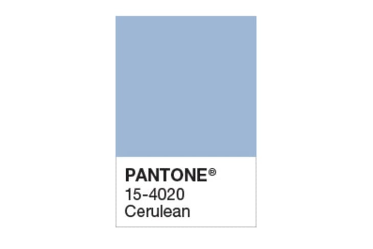
2000: Cerulean
In its inaugural year, Pantone kicked the COTY selection off with Cerulean, which they actually called the “color of the millennium.” They felt consumers would be seeking inner peace and fulfillment in a time of uncertainty, while also reflecting on the past and looking toward the future. Thus, they chose this calming blue shade that’s reminiscent of the sky.
Design Defined
Never miss the style inspo and recommendations you crave with Design Defined. Follow along each week as our Home Director Danielle shares the best style advice, latest trends, and popular decor finds you just can't miss.