
This “Frosted” Color Trend Is Millennial Pink 2.0, According to Designers
Millennial pink had its reign — a yearslong chokehold where pale rose hues washed over homes, workspaces, and coffee shops alike. Then came neutrals of all kinds, ushering in a more minimalist era, followed by warmer, moodier palettes. Now, designers say the pendulum is swinging back toward an aesthetically delightful palette that’s in between both of these camps.
We’re calling it — “frosted” hues are going to be the next big color trend in 2026. These colors are milky pastels that feel soft, serene, whimsical and a bit feminine, all while being packed with plenty of personality. Take it from Sherwin-Williams, which highlighted the movement in their 2026 Colormix Forecast, predicting that barely there blues, silvery greens, and muted lavenders will emerge as a refreshing alternative to neutral tones.

For professional designers, these icy pastels offer color without the commitment of a fully saturated tone. “They feel lighter and more uplifting, offering a fresh, even vacation-inspired aesthetic that still embraces color, but in a softer, more playful way,” says Austin, Texas-based interior designer Alicia Roche.

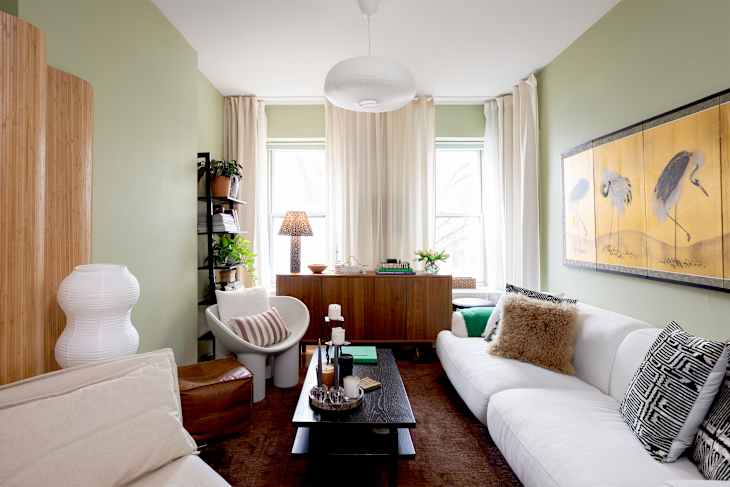
Interior designer Jen Dulac, based in Marblehead, Massachusetts, leaned into this frosted look for a recent project. “We had clients with a sunroom off their main living room that the previous owners had painted deep red with bright white trim,” she shares. “My client loves her morning coffee there with sunlight streaming in, but the red felt jarring — almost competing with all that natural light.”
Her solution? Frosted hues, which is photographed in the image below. “We bathed the walls and ceiling in Benjamin Moore’s First Snowfall, a silvery blue-gray, and painted the trim a few shades darker,” Dulac shares. “We selected furnishings that echoed those tones in varying depths. Now the room feels serene and head-clearing, but still immersive and cozy.”

Why Are Frosted Paint Colors Trending Now?
Color trends often reflect cultural shifts, and muted pastel tones are surging in popularity at a time when many people are craving calm at home.
“With ‘breaking news’ constantly pinging our phones, each headline more alarming than the last, I think we all crave that sense of new beginnings and possibility,” Dulac suggests. “At the same time, when an entire room is bathed in a frosted hue, it feels immersive without being confining the way deep, moody colors can.”

Dulac paints a poetic picture of a frosty-toned space: “These pale frosted hues feel like morning’s first light after an overnight snowfall — the world hushed, the sky a silvery blue-gray streaked with pale pink and blush as the sun rises, even the shadows on the snow tinged with the faintest lavender,” she says. “They evoke dawn, and with it that feeling of clarity, a fresh start, hope.”
How to Embrace Frosted Hues in Your Home
If you’re feeling paint shy, start with frosted-toned decor before picking up a paintbrush. Dulac suggests adding an antiqued silver mirror in a powder room or above a mantel, a collection of vintage silver candlesticks with wax candles, or a mother-of-pearl inlay catchall in your home’s entryway for a low-commitment frosted look.
Meanwhile, Roche recommends starting in a smaller space; a bathroom is ideal, where swapping towels, a shower curtain, or artwork can ease you into the palette before you commit.

Lighting is crucial when it comes to framing the delicate tones of a frosted room. Roche suggests opting for wall sconces and lamps, and whenever possible, putting light sources on dimmers. Temperature matters, too: “Lighting that’s too warm can shift the frost toward yellow, while lighting that’s too cool can make the space feel darker and flatter,” Roche says. Be sure to shop for bulbs in the 2,700 to 3,000K range to avoid this issue.
To ensure muted pastels don’t feel cold or dated, grounding elements are essential. “Add vintage wood furniture and natural woven materials — caned chairs, natural woven roman shades, a jute or sisal rug — to ground everything and keep the room from feeling too saccharine,” Dulac adds.
One thing designers caution against: Taking the “frosted” concept too literally. “To achieve a frosted palette, you don’t need to go the literal frosted lipstick route,” Dulac stresses. “You don’t need metallic-finish wallpaper or iridescent pieces everywhere.”

8 Paint Colors That Nail the “Frosted” Trend
Ready to give the trend a spin of the paintbrush? These whisper-soft shades hit the sweet spot for a stunning frosted interior in 2026:
- Sherwin-Williams’ Lite Lavender: A playful, soft purple.
- Benjamin Moore’s First Snowfall: A silvery blue-gray that evokes calmness.
- Farrow & Ball’s Tailor Tack: A delicate pink with a frosted edge.
- Sherwin-Williams’ Celery: An energizing yellow-green that screams spring.
- Farrow & Ball’s Calluna: A muted lavender that’s soft and sophisticated.
- Benjamin Moore’s Mountainscape: An airy, crisp white.
- Clare Paint’s Chill: A barely there gray with gentle green undertones.
- Sherwin-Williams’ Samovar Silver: A cool, silvery blue with a slate undertone.
Whether you start small with accessories or go all-in on color-drenched walls and ceilings, frosted hues offer a fresh way to bring lightness and optimism home — at least until millennial pink comes back in style.
Design Defined
Never miss the style inspo and recommendations you crave with Design Defined. Follow along each week as our Home Director Danielle shares the best style advice, latest trends, and popular decor finds you just can't miss.