
2026’s Trendiest Color Will Instantly Banish Your Winter Blues
Apartment Therapy’s style team spends months surveying hundreds of professional interior designers to find the newest trends before they’ve gone viral on social media. And in 2026, one of the cheeriest colors that editors predicted would be even more on trend than buzzy (and controversial!) Pantone hues is a deep, sunny shade of orange — a natural fit after butter yellow swept mood boards for years. Now that the design industry has firmly entered the new year, it’s clear: Our forecast was spot-on, and marigold is here to stay.
As highlighted in our New/Next List, Apartment Therapy’s newly minted annual trend forecast, marigold is a saturated orange-yellow hue that carries cozy spaces into sheer bliss. After years of quiet minimalism and an all-beige aesthetic dominating the industry, the design world has been craving richer colors.

Marigold fits perfectly into that shift; it’s warm, energizing, and surprisingly versatile. Think of it like sunshine — just turned up a few notches.
Why Is Marigold Trending Now?
Colors that command trends often reflect a broader cultural shift, and this hue’s rise signals a let-loose response to years of restraint. After an era dominated by cool grays and every shade of white, homeowners and renters alike are gravitating toward spaces that balance comfort with optimism.
“People are embracing color to create mood and personality,” explains New York-based interior designer Lisa Tessler of Link Interiors. “Because marigold has earthy undertones, it feels expressive and safe at the same time.”
That sense of approachability sets marigold apart from other sunny hues. “Unlike primary yellow, marigold has warmth and depth,” Tessler adds. “The golden and orange tones subdue it, making it feel welcoming but not too bright.”
The result? A cheery color that reads as intentional, not overtly trendy, and is soothing enough to live with long-term.
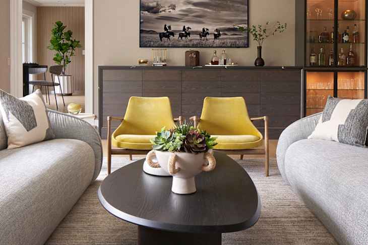
Marigold also occupies a stylistic middle ground. “Marigold can lean both traditional and modern,” Tessler says. “It’s attention-grabbing without dominating a space.” That’s why you’ll see the tone pop up everywhere from classic kitchen cabinets to contemporary side chairs and statement bathroom paint. It delivers serious impact without overwhelming, a quality that feels especially appealing right now.

3 Ways to Drench Marigold in Your Home
If you’re intrigued by marigold but hesitant to commit, Tessler advises starting very small — and adding more layers as your comfort grows. “A thoughtful pop of color can add interest and personality to even the most sophisticated spaces,” she says.
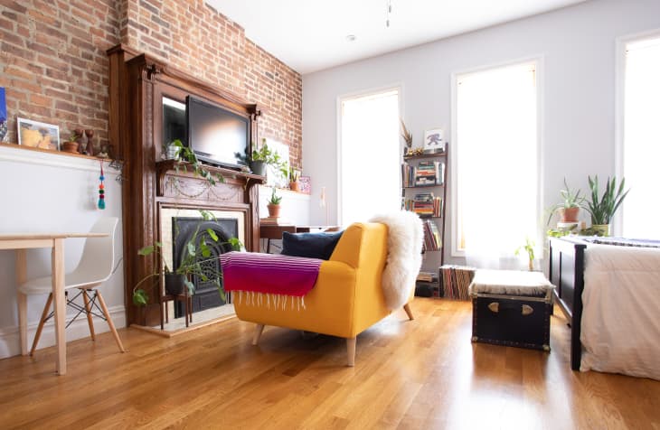
The magic of marigold, though, is its versatility to either be used in smaller doses to punctuate a space — or to envelop an entire room with confident energy.
Feature It in Creative Spaces to Add Energy
Marigold’s inherent vibrancy makes it especially perfect for spaces where creativity rules: home offices, kitchens, kids’ bedrooms, and breakfast nooks. Whether through paint, upholstery, or accessories, use the color to lift the mood for coffee breaks and homework sessions.
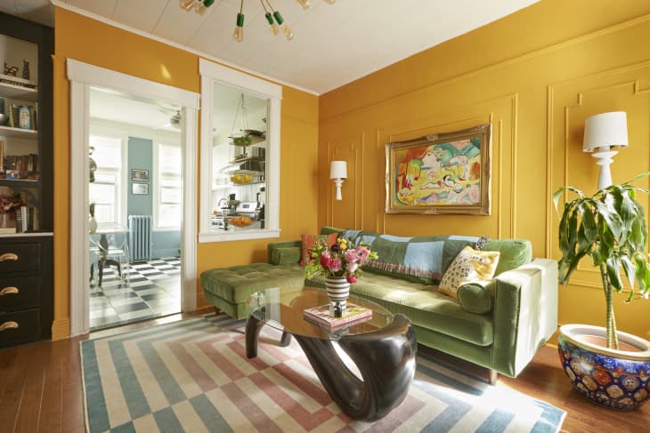
Balance Its Boldness with Neutrals
Since marigold is naturally high-impact, it can be grounded with neutrals. Pair marigold walls with warm creams and natural wood tones to keep it feeling intentional and not overwhelming. For a smaller dose, try it on a ceiling or single accent wall to create drama without saturating an entire room.
Layer It Through Materials
Paint isn’t the only way to work marigold into a space. Upholstery, drapery, rugs, and tile offer other ways to introduce the color. The key is repetition; marigold should appear more than once in a space to feel deliberate.

5 Colors That Perfectly Pair with Marigold
One of marigold’s many strengths is how adaptable it is within many existing palettes. Some standout pairings include:
- Burgundy: Deep and moody, burgundy adds richness and sophistication.
- Olive: Earthy greens ground marigold, giving it an organic, timeless feel.
- Cobalt: Go high-contrast with an equally-as-vibrant blue.
- Soft blue: A gentler contrast subdues marigold’s intensity without dulling it.
- Yellow: Tonal combinations create a dynamic sun-soaked effect.
Color trends come and go, but marigold feels like it’s here to stay. It’s expressive and bold, meeting the cultural moment. Perhaps most importantly, it delivers long-term joy, not just fleeting good feels.
If you’re ready to say goodbye to safe neutrals and experiment with a personality-packed hue, marigold is the color worth committing to this year.
Design Defined
Never miss the style inspo and recommendations you crave with Design Defined. Follow along each week as our Home Director Danielle shares the best style advice, latest trends, and popular decor finds you just can't miss.