
The One Thing You Should Think About When Putting Together a Gallery Wall
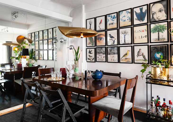
Although gallery walls give the appearance of organically coming together over time, they often take a lot of planning and preparation to get right. Some people swear by adding items that aren’t even artwork, whereas others say it’s all about having cohesive frames. And some say you should think about the overall shape the artwork creates when hung on the wall to ensure the eye knows where to go.
But even if you’ve followed the rules and advice of others, your gallery wall (or any wall decor) could still be lacking that special something — and one Instagram user says that it might have to do with the color palette.

“This is my number-one piece of advice for anyone looking to curate a beautiful gallery wall,” Anna from Anna Conese Designs said in a recent video. “It’s not about the frames that you use, or the subject matter in the art that you choose. It’s about the color palette.”
Conese shared a few images of gallery walls she’s created in her own spaces — each of which has an antique, historic feel to it (although her color tip can be used with any style and aesthetic).
Consider the Overall Color Palette When Organizing a Gallery Wall
“Notice how all the pieces in this wall are within the same color family,” Conese continued. “They all look like they could be siblings with one another. Everything is very cohesive.”
Conese’s gallery walls feature neutral, muted color palettes, and no one piece has a vibrant tone that distracts from the rest of the curation. “The dialogue or interaction between each piece is really smooth.”
But when adhering to the color palette rule, it’s essential to vary the pieces on your wall to maintain visual interest. This means choosing textured frames, wall sculptures, and artworks of various shapes to keep the eye moving around.
“It doesn’t look like I just went onto Etsy and bought a digital download of a pre-curated gallery collection,” Conese said. “There are sculptural pieces, original pieces, a lot of mixed media — that’s important, too.”
So if your gallery wall isn’t sitting right with you, take stock of your color palette. Keep your pieces within the same color family to make your wall look more visually pleasing — and if you pair this tip with all the other gallery wall tricks, you may finally (finally!) nail the look you’ve been going for.