
10 Vibrant Jewel Tone Colors That Designers Use for Luxe Interiors
Nothing can reinvigorate your home faster than color — and there’s none bolder than the sumptuous palette known as jewel tones. These saturated hues are named for dazzling shades found in Earth’s most precious materials. Luxe emerald, mysterious sapphire, fiery ruby, and brilliant topaz are all examples. Jewel tone colors bring a flair of drama into any space while maintaining a sense of sophistication and elegance.
That’s why so many interior designers embrace jewel tone palettes when they’re looking to wow their clients; these colors are bold without being brash, fanciful without being fussy, and surprisingly versatile alongside patterns.

“Jewel tones have this incredible ability to make a room feel instantly more intentional and elevated,” says Jessie Miller of Jessie D Miller Interior Design in St. Louis. “They’re rich, moody, and a little bit magical — like wrapping the space in a velvet evening gown — and are a great way to create atmosphere and depth with an ‘I meant to do that’ kind of confidence.”
London-based designer Samantha Todhunter of Samantha Todhunter Design agrees, crediting the palette’s enduring popularity to its ability to create instant atmosphere. “In a room that maybe isn’t blessed with perfect proportions or architectural detail, a jewel-toned palette can transform even the blandest box into something elevated, characterful, and genuinely special,” she adds.
Color-savvy design pros share their advice below on how to use jewel tones in a way that feels approachable, fresh, and stone-cold chic.
What Are Jewel Tone Colors?
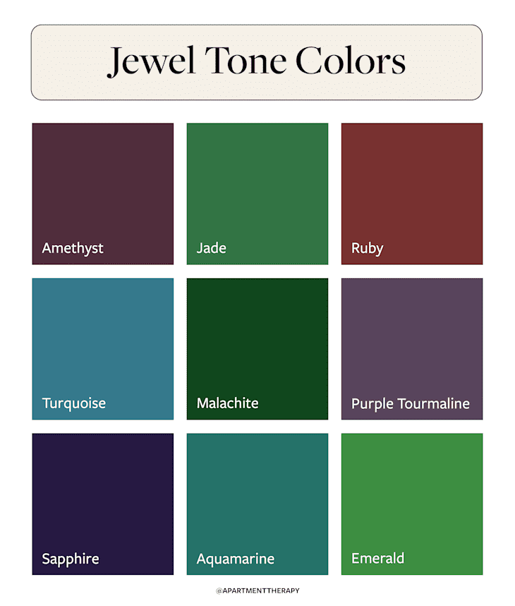
Put simply, jewel tone colors are hues that take inspiration from nature’s most glamorous rocks. Though they take on many forms, some of the most popular associations are with stones like emerald, sapphire, ruby, and turquoise. Above all, jewel tones have a rich, luxurious quality about them; they’re saturated, dramatic, and full of dimension, allowing you to shift the entire mood of a room with even the smallest pop of color.
They can range in many different shades — and the most commonly featured by interior designers are illustrated above. Continue reading to learn more about the most popular jewel tone colors.
10 Best Jewel Tone Colors for Interiors
There isn’t a “bad” jewel tone to use in interior design — rather, the better uses of jewel tones in paint and upholstery hinge on the space itself. Some jewel tones are better used in smaller amounts in tight spaces, whereas others are grand enough to color drench entire rooms. Designers are highlighting the following paint colors as clear-cut winners for any space.

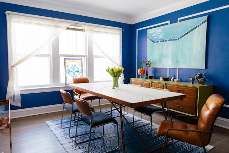
Amethyst
A lush, velvety shade of purple, amethyst blends beautifully with pale woods and shades of cream and white, making it an easy entry into the world of jewel tones. In this dining room, Chicago-based designer Jennie Bishop of Bishop Studio turned to amethyst chairs and accents to “add warmth and quiet drama, grounding the palette and giving the space a more elevated, emotionally resonant feel.”
Designer’s Go-To Paint: Farrow & Ball’s Brassica

Jade
A serene, mid-tone green with subtle blue undertones, jade evokes a calmness and clarity that feels both earthy and refined. The hue can feel serene or, when paired with equally rich shades — as in this dining room by New Jersey-based designer Alicia Bailey of Bailey Li Interiors — jade can take on an ethereal quality.
“For me, jewel tones behave like mood-setters; they have a frequency,” Bailey adds. “When I bring these tones into a home, the entire space starts to communicate differently. The room becomes more intentional, more expressive, and more connected to the inner life of the person living in it.”
Designer’s Go-To Paint: Benjamin Moore’s Jade Green

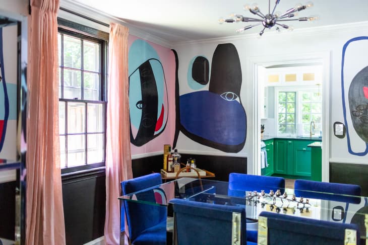
Ruby
To bottle all the fiery energy of red in a more subtle (yet equally impactful) way, look to add ruby to your room’s color palette. The shade strikes a bold note and radiates confidence, all the while playing well with others — especially fellow jewel tones like citrine, emerald, and sapphire, all seen here in a project by DuVäl Reynolds of DuVäl Design.
“Jewel tones can cozy up a room, make it feel more grounded, or even add a subtle sense of drama, depending on how they’re used,” explains the Virginia-based designer. “They pair beautifully with neutrals, metals, natural textures — pretty much anything — which makes them an easy way to introduce personality without sacrificing cohesion.”
Designer’s Go-To Paint: Clare Paint’s Vintage

Turquoise
With a hefty dose of built-in optimism, turquoise is a jewel-tone that establishes both sophistication and playfulness. It looks particularly good when complemented by metallics, especially gold, as seen here in a project by Miller.
“I like to pair jewel tones with warm metals,” she adds. “Jewel tones love gold; unlacquered brass is ideal. Cool metals can dull the depth of jewel tones, so warm finishes are the way to go.”
Designer’s Go-To Paint: Backdrop’s Barbie Dreamhouse Blue

Garnet
Like a good glass of pinot noir, garnet has a velvety finish with an enticing depth, dressed in hints of brown and purple. It’s the ideal way to ground a room in moodiness, and its old-world elegance can bring a sense of history (even in a brand-new home!). Here, Minneapolis-based designer Anne McDonald balanced out its more dramatic tendencies with creamy white walls and layers of textures.
Designer’s Go-To Paint: Sherwin-Williams’ Blackberry

Emerald
For Todhunter, the key to working with iconic emerald green lies in varying the texture and heft of the shade you employ in any space.
“I think it is utterly key to play with tone and texture when working with a rich jewel-toned scheme,” she explains, advising to choose complementary colors (like sapphire shown here!). “Then add a touch of unpredictability, a disruptor, [as] this helps to create the sparkle. In this case, a cushion in a tangerine jacquard and multicolored accessories … cut through the tonality and infuse a divine vibrance and pace to the scheme.”
Designer’s Go-To Paint: Farrow & Ball’s Verdigris Green

Sapphire
Sapphire glows with elegance and power, capturing the best of the versatility of navy blue and the mysteriousness of midnight shades. A chameleon-like shade, it can easily flex between more lighthearted, traditional palettes and moodier scenes, just like the transportive bedroom seen here by Chicago designer Kate Taylor of Kate Taylor Interiors.
“Use jewel-toned paint in the primary bedroom to give the space a moody, rich vibe,” she suggests.
Designer’s Go-To Paint: Clare’s Hyperlink

Purple Tourmaline
Similar to plum or amethyst, purple tourmaline is a regal hue that looks stunning on cabinetry or in small spaces, like a powder room or mudroom. For Atlanta-based designer Kit Castaldo, the hue was a chance to add a luxury to this at-home bar.
“The shade adds depth, personality, and a quiet richness without ever overpowering the room,” she adds. “Its beautifully balanced.”
Designer’s Go-To Paint: Benjamin Moore’s Taro

Aquamarine
With a hint of green, aquamarine typically conjures up the crystalline hues of sunlit seawater. But it can also be equally as compelling when incorporated into palettes with more depth, like the funky dining nook seen here by the team from Sabin Viehland, a bicoastal firm in California and Connecticut.
Designer’s Go-To Paint: Benjamin Moore’s Caribbean Blue Water

Malachite
The stone malachite is characterized by swirling bands that give it a hypnotic depth, and the color iteration of the hue is equally as dynamic. Vibrant yet earthy, it effortlessly flits between flecks of rich emerald and grounded olive for a scheme that looks luxe and organic at once.
“There’s also a natural warmth and depth to the hue that makes rooms feel cozy and welcoming,” says Lucy Derbyshire, cofounder and CEO of London-based design firm Studio QD. “It brings emotion into a space, adding confidence, comfort, and a touch of everyday luxury that just makes a room feel dynamic to be in.”
Designer’s Go-To Paint: Backdrop’s Troop Beverly Hills
5 Tips for Decorating in Jewel Tones
Palettes made with jewel tones can really turn the “wow” factor up in any space, but they’re even more effective when they’re used holistically — meaning they’re coupled with a bit of contrasting colors and patterns. Whether you’re redecorating your entire home or just looking to create a statement wall, these tips will help you get cool colors right before you begin decorating.

Go All In
If you’re choosing between dipping your toes in the jewel tone puddle and diving right in, designers recommend committing in a big way. “Go all in. Jewel tones look their best when fully committed — walls, ceiling, trim, doors,” Miller says. “A monochromatic, color-drenched room is where the real magic happens.”
Bring In Natural Materials
Because jewel tones are inherently inspired by the earth, they naturally pair best with organic materials and finishes. “These hues look their best alongside warm woods, veined stone, and brushed metals, keeping the scheme sophisticated rather than heavy,” Bishop adds.
Lean Into Texture
Creating a dynamic scheme with jewel tones isn’t just about choosing the right hue, but also incorporating sumptuous textural elements that complement the luxury of the palette.
“I love leaning into texture as much as color,” Todhunter says. “A jewel-toned palette thrives on the luxury of velvet, crisp silks, watery taffetas and plenty of gloss, from antique mirrors, to lacquer and brass finished. Together, these layers make the space feel rich, personal, and effortlessly pulled together.”

Start Small
If you’re color-adverse or just not used to working with shades as saturated as jewel tones, most pros would advise to focus on pops of color at first.
“Start with home accents; think pillows, art, a statement chair, or even a seasonal layer, which allows you to play with saturated color without committing the entire space,” Castaldo suggests. “The beauty of jewel tones is their versatility because you can keep year-round pieces in one hue, then weave in another for holidays or seasonal shifts.
Lay the Foundation
When devising your color scheme, start with a “hero” shade of jewel tones and build out from there to ensure you create a palette that’s layered and dynamic.
“When you’re incorporating jewel tones into your home, it helps to start with one anchor color — something like emerald, sapphire, or garnet — and let that shade ground the space so the palette feels intentional rather than overwhelming,” Reynolds says. “From there, focus on balance: Rich colors look their best when paired with inviting textures and warm neutrals, but you can also introduce other bold, complementary hues to help balance and enhance the depth of your main color rather than compete with it.”
Design Defined
Never miss the style inspo and recommendations you crave with Design Defined. Follow along each week as our Home Director Danielle shares the best style advice, latest trends, and popular decor finds you just can't miss.