
The Common Mistake to Avoid When Choosing a Color Palette — According to a Color Theory Expert
Decorating your home doesn’t usually start with a piece of furniture or a paint choice; it often begins with your overall color palette. But choosing the right color scheme isn’t quite as simple as selecting your five favorite colors — you have to make sure they work well together.
Now, you don’t have to be a color theory expert to craft a good palette — but I spoke with one. Her advice? It turns out, it’s less about the hues themselves and more about the temperatures; it doesn’t matter what color scheme you choose; if the temperatures aren’t cohesive, it will feel all wrong.


Why You Should Avoid Mixing Warm and Cool Colors
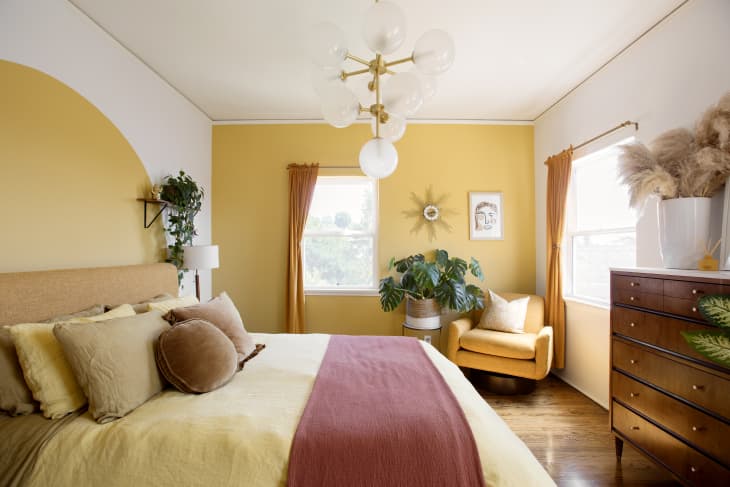
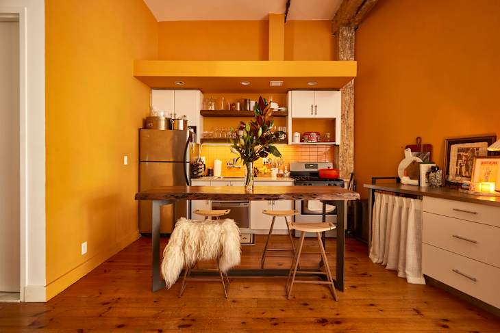
“Whatever shades you go with, focus on one temperature — either cool or warm,” says Donna Cameron, a color theory expert with Wise Move. Warm color palettes tend to include the colors in the yellow, orange, and red families, and can feel subtle and comforting like a hug or a nap in the sunshine. Meanwhile, cool color palettes, including blues, greens, and purples, are known for creating a sense of serenity and calm.
According to Cameron, that sense of calm and balance can be disrupted when warm and cool temperatures come together in one space. “When colors clash or compete for your attention, it’s hard to feel settled or know where to fix your eyes, which only makes it difficult for your mind to relax,” she says.
Cameron goes on to explain that some people love the look of clashing colors and, right now, that is actually quite trendy. However, when it comes to big tasks like repainting or investing in more timeless pieces like rugs, couches, and artwork, mixing and matching cool and warm temperatures is a riskier move.
With this in mind, she also recommends keeping permanent fittings and finishing simple, since strong patterns and bold finishes are hard to pair with other colors and prints and can make a space feel cluttered instead of calming. “Patterened splashback or bold flooring can dominate the space and limit your styling options,” she explains. “Leave the patterns for statement decor that’s easy to swap between seasons or as personal preferences evolve.”
This concept might feel limiting, but it actually makes choosing a color palette a little less difficult, since you can narrow down selections based on the temperature and then go from there.