
Apartment Therapy Editors Cringe When They See These 6 Styling Mistakes
Apartment Therapy editors have truly seen it all when it comes to homes. We’re always talking to designers about the latest decor trends, DIYs, and styling tips and tricks — and best of all, we also talk to real people about what works for them and their homes (and what doesn’t).
Through the years, we’ve all picked up quite a few tips — and, of course, opinions — about interior design. So I got curious: What home features or styling “mistakes” give our editors “the ick” every time? I spoke to several team members to find out firsthand.

Now, an obligatory disclaimer: As our most loyal readers know, we’ll never tell you what you can or can’t do in your own home. Your space should feel like you, and work for you. These are just a few of our editors’ own opinions (and a few even admit to being guilty of these faux pas themselves at one time or another!). Read on for our editors’ biggest “icks.”

Staircase Decor
Editor-in-Chief of Apartment Therapy, Charli Penn, will famously never “yuck your yum,” but there is one decor trend Charli will always avoid. “I’m quite clumsy,” she says. “[So] seeing a staircase filled with delicate floor vases and candles or mirrors (even on landings) gives me ‘the ick’ because I’m always afraid I’m going to bump into it or kick it accidentally.” Same, Charli — especially with pets or kids underfoot who love to play on the stairs!
“While some staircases and landings are wide enough for this not to be an issue, in the East Coast suburb where I live, most homes are colonial-style and built in the ’20s, ’30s, and ’40s … and there really isn’t room for [both] the decor and clumsy little me,” she adds. So when in doubt, avoid making the staircase a style moment; instead keep your steps safe and clear.

Floating (Corner) Furniture
Adrienne Breaux has overseen Apartment Therapy’s House Tours for over a decade, so she’s seen a lot of … well … real homes. Her number-one ick? “My eyes just can’t stand when furniture is placed on the diagonal in a space,” she says. “Whether it’s a bed in a corner or creative sofa placement in a living room, I just need my furniture to be parallel with the walls. It’s not just aesthetics that bother me about it — putting things on the diagonal can create a ton of wasted space.”
Instead, try a corner bookcase — or, style other smaller pieces in your corners to take up space, like in this super-stylish New Orleans house tour.

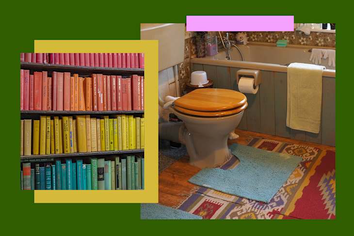
Fuzzy Toilet Covers
“One thing I’m always sad to see in homes are protective toilet seat covers, and [those] U-shaped throw rugs that sit beneath a toilet bowl,” says Zee Krstic, our senior home editor. “It reads the same as a beautiful sofa wrapped in a clear plastic slip cover! I think it’s almost counterintuitive — people may seek these touches to create a bathroom that seems cleanly or more comfortable, but these touches make me wonder what’s being hidden underneath.” Hello, germs!

Boxy Brutalism
Our Cleaning & Organizing Editor, Savannah Daniels, likes a clean space and a clean line. But she steers clear of anything too minimalist. “I am not a huge fan of Brutalist interiors/furniture,” she says. “Think: concrete walls and ceilings, exposed beams, sharp shapes. Too many boxy furniture pieces in a space can imitate that design style … [to me] it’s important to balance out sharp lines and boxy silhouettes with curved furniture, fluffy rugs or throws, warm lighting, cushions, natural wood, etc.”
This eclectic Brooklyn home, for example, is a master class in balance and mixing shapes: Stark white walls, minimalist cabinetry, a boxy burlwood cabinet, and a geometric statement rug are balanced out by curvy, colorful accent chairs and a funky rounded-edge coffee table.

Over-Stylized Bookshelves
Our Executive Editor, Terri Pous’, styling “ick” was one I hadn’t thought about — but once you see it you can’t unsee it. And I’m totally in agreement: Overly stylized bookshelves are just not Terri’s cup of tea. “To me, a good bookshelf is one that is both functional and looks nice,” Terri says. “But honestly, function wins out for me time and time again, which is why these displays don’t work for me.”
There are so many other, better ways to style a bookshelf — trust us! Terri personally organizes her books “by the [first] initial of the author’s last name, so rainbow color-coding is a no-go. And hiding the spines? That’d be a great way to ensure I’d never be able to find (or read) a book again.” Same, Terri, same.
Matchy-Matchy Wood Tones
When I was shopping for furniture for my new apartment, I remember being obsessed with the idea that all of my wood pieces had to be oak so they would all “go” together. But our Shopping Writer, Alexa Casanova, says save yourself the trouble: Wood tones actually look better when mixed and matched!
“Matching wood tones is overrated, in my opinion,” she says. “I think contrast is so much more interesting! Besides, as much as you try to find furniture in matching tones … they’re never a perfect match. When you free yourself from the pressure of everything needing to match perfectly, you’ll have more fun — and find pieces you truly love.” I couldn’t agree more; keep this in mind next time you find a stunning solid wood piece at the antique store — you can (and will) make it work!