
What Goes with Olive Green? 15 Color Combos for Any Space
Just like a martini, olive green has earned its status as a classic. Nestled on the color spectrum between yellow and green, it’s a decidedly earthy color; it’s lived-in, and just the right amount of moody, which allows it to transcend other trendy colors effortlessly.
Olive green boasts an undeniable warmth and depth that’s reminiscent of old-world landscapes and well-loved ceramics, which gives it the ability to instantly make any space feel grounded and collected. If you’ve ever craved the comfort of nature, but felt colors like sage or evergreen were just not right for your space, olive green could be just for you.

The best part? For a shade with so much personality, olive green still plays well with others. Its current popularity can at least partially be attributed to the fact that so many hues pair beautifully with it, from chocolate brown to powder pink. It’s a storied shade that masquerades as a neutral, giving designers and homeowners alike the best of both worlds as they build their palette and room’s design scheme.
Read on below for 15 designer-approved olive green color combinations that will breathe life (and style!) into your interiors.

5 Tips for Pairing Colors with Olive Green
Whether you’re looking to channel the tranquility of nature or upgrade your neutral backdrop to something a bit more daring, there are plenty of colors to choose from when styling your version of olive green. Keep these tips from interior designers in mind as you build your olive green color palette.
Match the undertone.
Every color has an undertone, and being able to decipher whether you’re working with a cool or warm version of a hue will go a long way toward finding its flattering counterpart. “Olive green has a warm, earthy undertone, so pairing it with colors that have a similar warmth, like terracotta or dusty pink, will create a cohesive palette,” explains Los Angeles-based designer Nishia Shubert of Stay Interiors.
Strike a balance.
It can be easy to go overboard in creating a custom palette, often due to a hue that’s too boisterous for said space, or certain colors lending a frenetic energy. To help keep the calm that olive green naturally brings to the table, you want to balance out the saturation with the other colors you pick to complement it.
“I’d recommend pairing it with either a lighter or darker hue to balance it out and not compete,” advises designer Julie Mitchiner of Chicago-based JAM Interior Design.

Play into a mood.
Although olive green boasts an inherently calm, serene mood, you can certainly dial that vibe up (or down!) depending on the color you choose to pair it with.
“Don’t be afraid to mix olive green with complementary colors, like red or coral, to create high contrast and visual interest within a space,” suggests Connecticut-based interior designer Kaitlin Smith. “If you’re looking for a more calming combination, olive green looks beautiful when paired with blues, or even yellow. The possibilities are truly endless.”
Add some texture.
While olive green color palettes are great, this hue also pairs beautifully with raw textures. If you’re feeling uninspired, consider layering in flashy finishes, textiles, and upholstery instead.
“Integrating wood, linen, aged brass, stone, or woven elements prevents the color from feeling flat and instead gives it warmth and quiet richness,” says Sara Swabb, the founder and creative director of Storie Collective, an interior design studio based in Washington, D.C.
Mix up your finishes.
Color drenching a room — that is, painting it floor to ceiling in the same hue — can be a great way to bring drama to a space, especially in a color as atmospheric as olive green. The key to a dynamic feel? Mixing up your paint finish for depth, says Kylie Brewer, owner of Kansas City, Missouri-based Scovell Remodeling. “Matte on the walls and satin on the trim is a classic move,” she adds.
Now, onto olive green color pairings that work well in any space, according to designers.
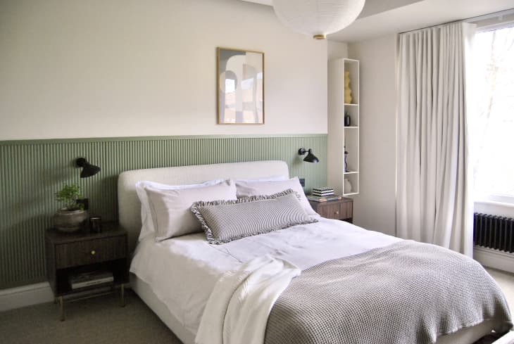
Cream and Olive Green
A splendid pairing for any room in the house, warm, rich white tones can highlight olive green in a way that’ll turn your head — in this case, it doesn’t even need to be the primary color in the space. A drenched wood paneling detail in one of the four bedrooms of this London home naturally highlights the bouclé bed frame, and the cream walls help keep the overall mood cheery and restful.

Mauve and Olive Green
In this space, Chicago-based designer Jessica Lagrange grounded a feminine pink sofa with a more masculine olive green hue on the walls (C2 Paint’s Toadstool) for the perfect balance.
“Since our client loved pink, we decided to utilize olive as a neutral tone to help express and highlight the different shades in the space,” Lagrange shares. “The green grounds the room and helps absorb the light, letting the warmth of the pink and yellows blend seamlessly. It gives the perfect balance between serenity and glam.”

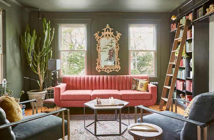
Brick Red and Olive Green
Red and green may conjure holiday vibes, but the key to nailing the combo lies in finding the nuance. Here, designer Henriette von Stockhausen of England-based VSP Interiors opted for a brick red tint to bring warmth to the green bed canopy and headboard.
“I chose this particular green to echo the olive and sage tones in the scenic chinoiserie wallpaper,” she says. “I’m always drawn to greens, but the sludgier shades are my favorites. They pair beautifully with red, as each colour enhances the other and creates a wonderfully balanced palette.”

Gold and Olive Green
As a stunning complementary color combo, yellow (in most shades!) and olive green work well to truly ground any space. The upholstery used in this primary bedroom in a historic New Orleans family home showcases how a regal gold can offset the dramatic tones of olive green that set the mood for a relaxing, rejuvenating space.

Sienna and Olive Green
A toasty red-brown, sienna is a chameleon shade that morphs moods depending on what you team it with. With olive, it brings a calming, nature-inspired vibe that also feels edgy and cool.
“For this project, we used olive green as the anchor of the living room’s palette,” explains Los Angeles-based designer Ashley Justman, co-founder of Avenue Interior Design. “We wrapped the built-ins, millwork, and window surround in Farrow & Ball’s Lichen No. 19, allowing the architectural elements to ground the space.”

Cotton White and Olive Green
White is always a safe bet, but a warm cotton hue brings a particular freshness to olive green, upping its energy and maximizing its dramatic impact.
“We incorporated this gorgeous olive green tile from Heath Ceramics to be the focal point of the bathroom,” Shubert says of this charming bath. “The glaze has a beautiful depth and tonal variation, which adds visual interest beyond what a flat, uniform tile would offer. We then painted the walls in a warm white (Benjamin Moore’s Simply White) to enhance the green tile.”

Terracotta and Olive Green
Earthy yet unexpected, nuanced terracotta can hold its own against the richness of olive, bringing a welcome warmth to leisure-focused spaces — like this finished basement from Scovell Remodeling and Kobel + Co.
“The paint we used is Farrow & Ball’s Lichen, a green that quietly sets the tone for the whole space without shouting for attention,” says Scovell Remodeling owner Kylie Brewer. “What really made a difference was painting the walls, trim, and ceiling all the same shade. This isn’t a flashy look; it’s more about quality, heritage-inspired style that flows smoothly with the rest of the home.”

Peach and Olive Green
Olive green is inherently strong and grounded, so it can sometimes be beneficial to juxtapose it with a sweeter, softer shade for balance. Here, San Diego-based designer Abbie Naber of A. Naber Design paired an olive rug with peach limewash walls to craft a calming escape.
“The olive green velvet sofa from Maidenhome was the first item we selected for the room,” she says. “From there, I worked to incorporate a secondary color that would pair well with the space and ‘hug’ in the room, landing on a peachy terracotta for the walls.”

Mustard and Olive Green
Looking to bring a jolt of energy to your space? Consider pairing olive green with a zestier, more energetic hue, like mustard yellow. In this petite powder room, Mitchiner hung an impactful mustard wallcovering, pairing it with a uniquely shaped olive green concrete sink for a look that’s both modern and funky.

Pink and Olive Green
Olive green has a truly spellbinding effect on otherwise bright (and sometimes shocking!) pink interiors, including the living room in this compact Brooklyn studio apartment. As an accent featured in the sofa’s upholstery, a striking contrast is achieved as these two shades are nearly complementary colors — the muted earthiness of olive green counteracts pink so beautifully!

Burgundy and Olive Green
Another variation on the red family, burgundy has a dramatic yet refined quality about it that makes it a perfect match for olive green. Instead of choosing a paint, designer Ali Burgoon Nolan of Austin, Texas-based firm Studio Burgoon opted to cover the walls of this bathroom with olive green tiles to ground the space.
“In this guest bathroom, the olive green tile became the quiet anchor of the entire palette,” she says. “Because I love balancing green with an unexpected touch of red, I introduced a custom shower curtain in a House of Hackney floral fabric with deep burgundy accents — its pattern gently offsets the strength of the dark green tile.”

Aqua and Olive Green
Unexpected and playful, the combination of aqua with rich olive green offers a fresh twist on tradition without a stiff upper lip in sight. In this living room by Smith, an opulent olive green velvet sofa meets its match in the form of blue-green walls (Benjamin Moore’s Wythe Blue), playful accessories, and pops of red.

Plum and Olive Green
Conjuring up feelings of royalty, the combination of plum and olive green is austere and refined, making it a great option for historical homes, or any space that you want to feel layered.
“In this space, we used olive green as the grounding tone that anchors the entire dining and banquette area,” says Swabb, who tied in the plum hue through the upholstery. “It was important to me that the color felt atmospheric rather than decorative, so the olive was applied across the walls to create a cocooning backdrop for the layered textiles, warm wood tones, and natural light coming through the windows.”

Rose and Olive Green
If you’re looking to bring a bit of whimsy to a nature-inspired bedroom, try pairing olive with a rich rose hue, just like North Carolina-based designer Louise Copeland, founder of L.B. Copeland Interior Design, did here.
The wall color, Farrow & Ball’s Yeabridge Green, walks a beautiful line between a deep, wintry woodland green and something brighter and more springlike, which makes it feel connected to the surrounding forest no matter the season,” she says. “To keep the palette in balance, I let the green be the one strong note on the walls, then echoed it subtly through the bedding trim while keeping the rest of the space clean, light, and airy.”

Ink Black and Olive Green
Looking at this high-gloss, high-glamour room, you’d never guess it was meant to be a back-to-nature retreat. For Nashville-based designer Lori Paranjape, it was important to blend glamour in with the home’s surroundings.
“This is a mountain home, and we wanted to keep our tones earthy and warm,” she says of the space, which she accessorized with dark wood and black accents to maintain a sense of attitude. “The sheen for this room — a lacquer from Fine Paints of Europe — brings an energy that envelopes the space in a warm embrace.”

Wood and Olive Green
While not technically a color, wood is an incredibly flattering accompaniment to olive green tones. Both grounded in nature, the two pair beautifully together, whether you choose a treatment that’s tailored and classic, or a version that’s far more rustic, as seen here in a project from Charleston, South Carolina-based designer Taylor Hill.
“This color in particular [Farrow & Ball’s Bancha] has wonderful yellow and brown undertones that also pair nicely with the rest of the space,” Hill says. “We loved the contrast between the natural barn wood walls and the tangy jungle olive cabinets — it’s punchy without feeling overpowering.”
Design Defined
Never miss the style inspo and recommendations you crave with Design Defined. Follow along each week as our Home Director Danielle shares the best style advice, latest trends, and popular decor finds you just can't miss.