
7 Controversial Front Door Colors Design Pros Always Avoid
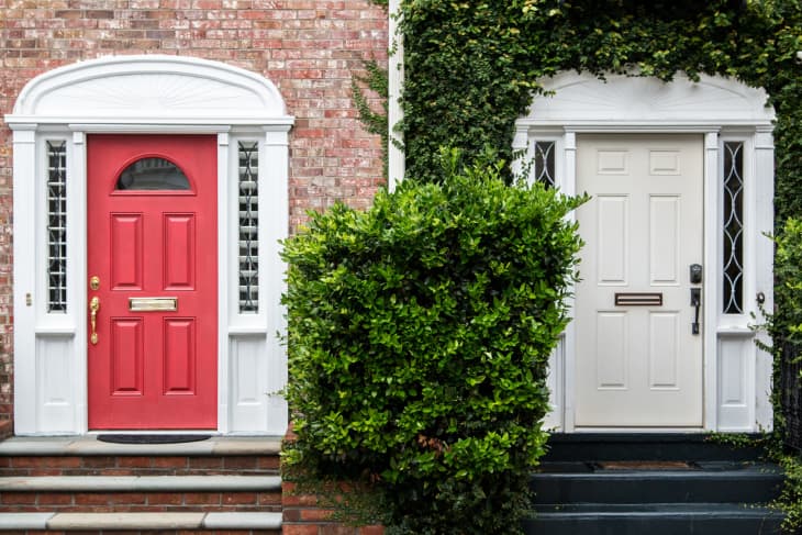
Your front door can make a great first impression with a pop of color — but that color may be sharing a different message than you may think. A front door is more of a standout feature than other details, windows included (which real estate agents have strong opinions on!). It’s why professional designers may spend even more time conceptualizing a front door and its color than anyone may realize.
Color isn’t the only factor that influences how your entryway is perceived — textured woods, door hardware, built-in windows, or other details play a role, too — but it’s the most significant. “Front doors are an opportunity to create interest and add personality to an exterior aesthetic,” says Elizabeth Lord-Levitt, principal designer of Denver-based Elizabeth P. Lord Residential Design.

No two houses are the same, and Apartment Therapy editors have seen some wildly unique doors that break rules in the best ways — but there are a few colors that those in the industry aren’t in love with. Read on to identify each of them, alongside why design pros are hesitant to paint any front door in these particular hues.
Our insider’s guide to trends and more, Design Defined is the easiest way to keep up on style you just can’t miss.

Neon Colors
Bright red, orange, pink, yellow — and in this case, teal — will grab more than just your guests’ attention used as a front door cue in this shade; it’ll distract the whole neighborhood.
“Neons are pretty much always too different and stand out in the wrong ways,” says Meagan Ludwig, founder and principal designer of M.A. Interiors.

Pea Green
While muted earthy tones may be wonderful options for your home’s siding, it often underwhelms when it’s used to drench a front door — especially green, explains Marilyn W. LaVergne, principal designer of New Jersey-based Marilyn LaVergne Interiors.
“I mean, this is a dull green with yellow undertones,” LaVergne asserts. “It diminishes the appeal of brick, siding and stone. It’s serving swamp land, not charm.”

Purple, in Any Shade
Only in very few cases have pro designers been able to pull off a purple front door, muted or vivid. Ludwig is among those who believe purple is too vibrant a color for a front door in that it also is a massive departure from materials and hues used in certain architectural styles, like Tudor-style homes.

Orange, in Warm Shades
This may come across as harsh (especially for fall decor lovers!), but brighter orange hues don’t often achieve the effect you think it may. “Traffic cone orange; it overwhelms the whole façade and nearly shouts, ‘Get out!’ when it should be saying, ‘Come on in,’” LaVergne quips.

Pastel Yellow
If the door appears smaller than it actually is, it could be that the color at hand isn’t doing you any favors.
“I find that a pastel-colored door often feels too light and out of scale for a front door,” Lord-Levitt explains. “Pale blues and softer yellows often get lost on a large facade.”

Pale Green
Like other pastels, a muted green has trouble in standing out from the home’s exterior in most cases, especially in areas where botanical or arboreal landscaping frames the house itself. Pale green and other cool colors have a hard time popping against the modern exterior color palettes that many homeowners spring for these days.

Brown, in Earthy Tones
Again, depending on which materials are used in your home’s siding and trim, adding another one-dimensional layer of brown tones won’t add any emphasis to your entryway. Earthy brown colors can meld into the rest of your home, leaving much to be desired.
“It can come off flat and dated,” LaVergne adds. “It looks like dried dirt and brings zero curb appeal.”
Finding the Right Paint Color for Your Door
Whether you choose to work with a design pro or opt to do it yourself, painting your front door requires some thought if you want your entryway to shine. “The front door color should be chosen with intention, and should complement your trim and exterior materials,” Lord-Levitt adds. “When a color lacks depth, it can often feel uninviting to the space.”
The easiest way to find a front door color that is inviting? Using the color wheel, which can easily help you ID a color that nods to your home’s exterior paint. Colorful homes should aim to have a front door with analogous colors (adjacent on the color wheel), whereas single-color exteriors should make use of a complementary color (opposite on the color wheel), Ludwig explains.
“There are thousands of options for every color on the wheel … just keep in mind, the louder and more unique the color, typically, the shorter the lifespan,” she adds. “But that’s the beauty of a painted front door: It can change and evolve as you do!”
Design Defined
Never miss the style inspo and recommendations you crave with Design Defined. Follow along each week as our Home Director Danielle shares the best style advice, latest trends, and popular decor finds you just can't miss.