
I Asked 4 Designers What’s the Worst Paint Color for Small Spaces — They All Agreed on This One
When you’re working with a small space, it can be challenging to choose a paint color. After all, you don’t want to feel claustrophobic, and the wrong color can easily overpower the room. Paint regret is definitely a thing, and you may feel that regret even more strongly in close quarters.
One regret you might have? Picking a paint color that makes the room feel smaller, not bigger than it is. To help you avoid that post-paint heartbreak, I spoke with four designers to find out what colors to pick — and stay away from. And thankfully, they completely aligned on the number-one paint color to avoid.


Red Is the Worst Color to Paint a Small Room, According to Designers
Every single designer I spoke with agreed: Stay away from red. “Although I do love a sexy red, I would not be caught dead using a bright red paint color in a small room,” says Melissa Fields, CEO and principal designer of Shades of Gray Design Studio. “Red is a very energizing color, so it can be overwhelming if not used in a way that makes visual sense.”
Veronica Colby, principal interior designer at Evergreen Design Co, calls red for small spaces “incredibly intense.” She adds, “Unless the room has ample natural light to offset the depth of the color, I would not recommend it to my clients.”
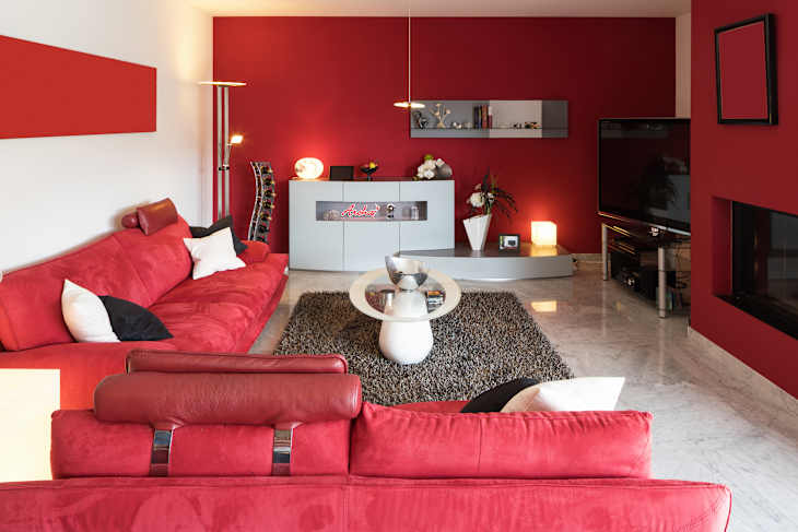
Terracotta, an orange-tinted shade within the red color family, may be having a moment — but still, in a small room, interior designer Carla Royder says, “it’ll feel like being trapped inside a pumpkin.” Monique Holland, principal designer at Holland Custom Designs, even goes so far as to say that using red in a small room could increase stress levels and make you feel anxious, a fact that is backed up by color psychology.
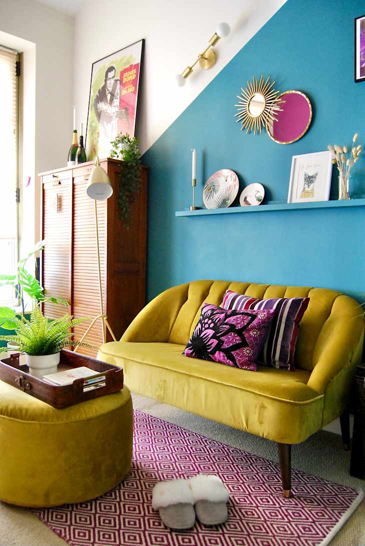
The Best Alternative Paint Colors for a Small Space
Colby recommends any neutral that has a hint of green, blue, or brown for enhancing a smaller space. These colors are gentle on the eyes, and “evoke a peaceful feeling,” she adds. Fields tends toward creamy whites and light shades of gray, which she says act as a perfect neutral backdrop in a smaller room — not too white, not too dark, and can complement a wide array of color palettes.
But let’s say that you want to dial up the drama just a bit, and feeling closed-in and cozy doesn’t bother you — or perhaps is even exactly the vibe you’re going for. As Royder puts it, “Dark doesn’t [always] equal cramped — it equals confident.”
In this case, Holland says that you can choose a jewel-toned color, such as teal, that can lend a rich, saturated look to a small space. “Most people want a combination of cozy and stylish, and this vibrant color can do just the trick,” she says.
Where Can I Use Red, Then?
However, if you simply must paint with red somewhere in your home, there certainly are still ways to incorporate the shade without it feeling overpowering. The shade is in fact often well suited to larger rooms, where you want a feeling of increased energy and enthusiasm — like in an office or a playroom. Fields says that in larger or midsize spaces, bright red works well as an accent wall, or when used only on certain sections of the wall or woodwork.
Additionally, Holland says that red is a good choice for spacious dining rooms. “This color can actually increase your appetite and make you hungry,” she says, something that has been confirmed through color psychology since red is often linked to food.
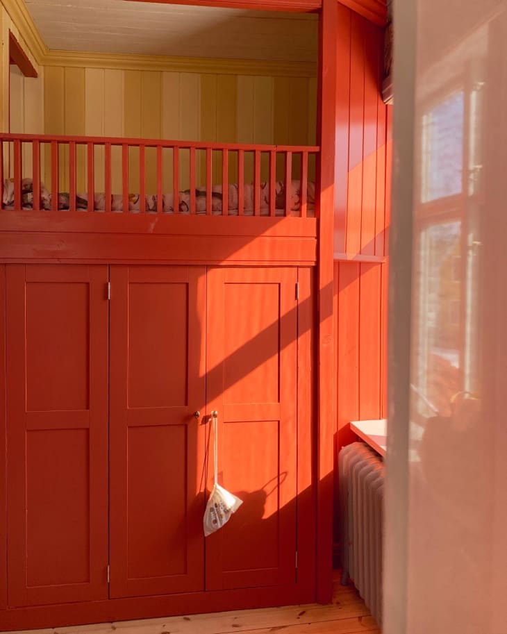
“I have used a bright red color in a dining room by painting the walls above the chair rail molding,” Holland says. “This is exactly the feeling you want your family to have during the holidays so they linger and allow for the creation of memories.”