
How to Create a Japandi Color Palette That’s Pure Bliss, According to Designers
If there was only one interior design style setting the tone in 2026, it would be Japandi. Apartment Therapy’s State of Home Design survey identified Japandi style as one of the year’s top design aesthetics, according to insights from 140 designers — and it’s easy to see why. As more people strive to create spaces that feel calming, intentional, and grounded in nature, Japandi’s blend of Japanese restraint and Scandinavian warmth feels especially timely. The result is a fresh, globally influenced take on minimalism that balances simplicity with depth and character.
One of the most defining elements of Japandi is its serene, sophisticated color palette, so getting it right matters. Luckily, creating a quintessential Japandi color palette is easier than it looks.

Sitting somewhere between the airy brightness of Scandinavian design and the moodier tones of Japanese interiors, Japandi colors strike a careful balance between light and depth. So what’s the key to crafting a Japandi color palette for your space? Here’s what you need to know to curate Japandi colors like a pro.

Which Colors Are Core to Japandi Style?
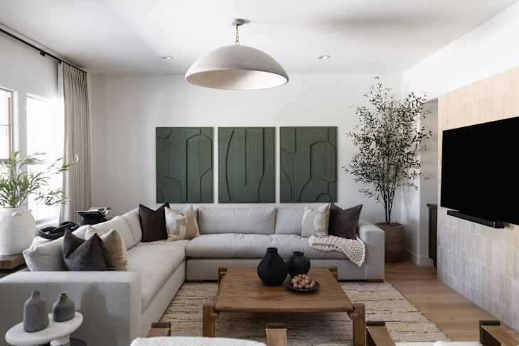
Japandi is characterized by neutral color palettes that are deeply inspired by nature. Warm whites, sandy beiges, mushroom tones, and muddy grays form the foundation, creating spaces that feel calm and grounded. Dark, charcoal grays and black can also be found in this style, adding contrast and grounding the space. The result is sophisticated yet inviting, organic and yet also minimalist — the perfect blend between Scandinavian simplicity and Japanese serenity.
That said, Japandi style isn’t strictly monochromatic. Subtle shades of blue and green (think: muted ocean blues, olive green, and deep forest greens) are very much welcome when used intentionally. They are often incorporated through decor and greenery, adding a touch of color without overwhelming the calm, meditative palette for which Japandi is known.
What you won’t typically see are bright, high-energy hues. Saturated colors can feel jarring and artificial in spaces where natural influences are prioritized. Japandi aesthetics also tend to steer clear of hues on the pink, orange, and red side of the color wheel. While muted shades of these colors can technically be found in nature, Japandi style prioritizes earthier colors. Think of Japandi as a peaceful walk through the forest, rather than a vibrant stroll through a flower garden.
The exception? Temporary, nature-driven accents. A simple bouquet of seasonal flowers or a single branch styled on a countertop can introduce a fleeting pop of color that feels intentional while still being easy to swap out. While purists may stick to greenery alone, modern Japandi diehards leave room for a little seasonal charm.

8 Japandi Colors That Designers Use in Palettes
When working on designing a holistic Japandi-style interior, colors should inform every step of the process, beyond paint and your walls. Build a selection of the following colors to inform upholstery, accents, and furniture selections in the room at hand.
Warm White
Of all the colors used in Japandi, warm white is probably the most common, stemming directly from Scandinavian influences. You’ll find it used regularly on walls, in textiles, in light fixtures, and in decor in various shades. The key to finding the perfect warm white for your Japandi space (not every warm white is created equal!) is to strike the right balance between warm and earthy. Avoid overly yellow undertones and opt for subtlety where possible.

Sandy Beiges
Beige is another hallmark of Japandi design. It can be used alongside white for lighter palettes, or in place of white if you’re building a palette that feels a bit moodier. It’s commonly used on walls and upholstery, providing a light, neutral base from which supporting decor can build.
Just like white, it’s important to avoid beiges with aggressive yellow or pink undertones to stay true to a classic Japandi look. Sandy or muddy beiges are always a good bet.

Gray
Gray is another mainstay of the style. It can be found in varying shades, from light greiges to moody charcoal — but the one thing every Japandi gray has in common is its warm undertones. Cool grays (including shades like pewter!) are not welcome in this organic style, as they can feel cold and artificial.
Taupe
A blend of brown and gray, taupe is an earthy neutral you’ll often see in Japandi interiors. This moody color is often used in decor (think: textiles, sculptures, fixtures, vases, and more). There are endless shades of taupe to play with, but stick to muted, earthier tones to stay true to the organic aesthetic Japandi is known for.

Brown
Shades of brown are a staple in Japandi interiors, often incorporated using wood and other natural materials rather than paint. Light, medium, and dark wood tones are acceptable in Japandi; the key is keeping the finish looking natural. That means no high-gloss finishes or overly cool tones, which can read as artificial. Brown can also be incorporated into Japandi interiors through textiles, decor (think: vases and ceramic vessels), and even paint, when used sparingly and with intention.

Black
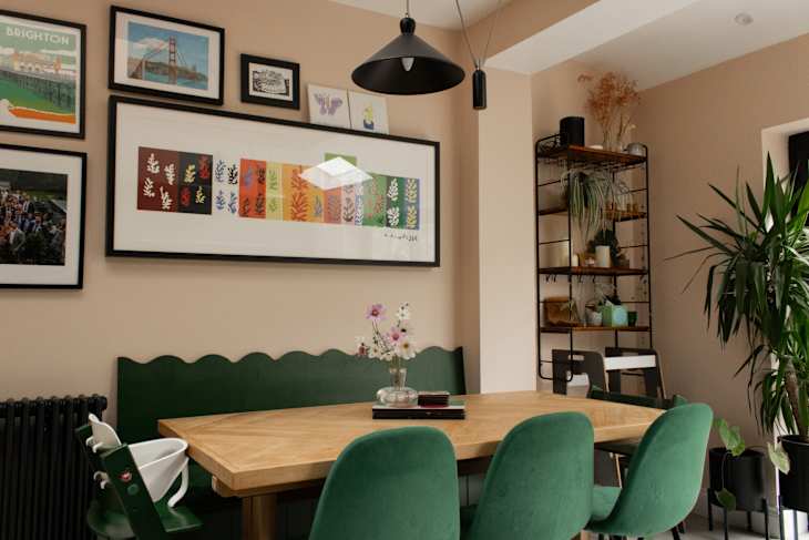
Black is used in Japandi interiors to add contrast and ground a space. It’s often not the primary color in a home, but can be used to add juxtaposition and create a cocooning effect, as seen in this Japandi dining room designed by Scottsdale interior design firm Living with Lolo.
As with brown, the key to using black successfully in Japandi spaces is to keep it looking natural with solid finishes. High-gloss and even medium-gloss finishes are a no-go for black interiors; instead, stick to matte, charcoal-like finishes to evoke a more natural look.

Earthy Greens
Beyond neutrals, green is one of the most commonly used colors in Japandi interiors. It has a grounding, earthy quality that lends to the serene atmosphere the style creates, without pulling focus. It’s often found in both light and dark shades with warm undertones and muted saturation. Olive green, sage, and deep forest greens are just a few examples.

Muted Blue
Like green, blue is known for its calming effect, making it well-suited to the Japandi style. While it’s featured far less often than green, it can still be used to add a touch of color without creating visual tension. Stick to muted tones to nail the look — soft gray-blues, smoky navy blues, and more.
Design Defined
Never miss the style inspo and recommendations you crave with Design Defined. Follow along each week as our Home Director Danielle shares the best style advice, latest trends, and popular decor finds you just can't miss.