
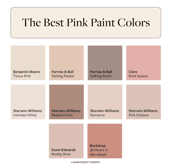
10 Refined Pink Paint Colors That Interior Designers Use in Every Room
Once confined to children’s rooms and nurseries, or more recently consigned to Barbiecore fanatics only, pink paint has officially grown up. Today, it’s a favorite among interior designers for adding warmth, charm, and even sophistication to spaces throughout the home. When chosen thoughtfully, pink can be surprisingly versatile, working seamlessly across different decor styles (from modern interiors to modern farmhouse!) and color palettes (from minimalist hues to bold maximalist looks!).
“Pink is a beautiful wall color when chosen with intention,” says Sarah Barnard, founder and principal designer of Los Angeles-based Sarah Barnard Design. “Softer varieties can be calming and cozy, making them perfect for living rooms, bedrooms, and powder rooms. Warmer mid-tones can enliven entryways and kitchens.”

So, which pink paints are designers reaching for now? Across the board, they agree: Muted pinks are having a moment.
Think dusty rose, earthy clay hues, and powdery blush tones, all major upgrades to the often overused millennial pink you loved in the 2010s. These soft, desaturated tones inject a warm, playful vibe — all without assaulting your eyes with bright hues, explains Carla Royder, founder of San Antonio-based Carla Royder Designs & Co. Thanks to their muted tones, many pink paints even serve as neutrals, grounding a room’s palette while still feeling fresh.
That said, if you’re aiming for a brighter, more energetic look, designers aren’t discounting interiors dressed in vibrant pinks altogether. “Alongside these earthier pinks, there has also been a joyful embrace of more vibrant, fruit-forward tones, such as raspberry and dragonfruit, that bring freshness and playfulness to interiors,” Barnard explains. They are less popular yet beautiful nonetheless; designers reserve these punchier shades for moments where drama and brightness are required.
I spoke to six interior designers to get the scoop on the most popular pink paint colors that’ll earn you major style points; they didn’t hold back. From earthy hues to sophisticated blush tones, here are the top 10 designer-approved pink paint colors for any space.
1. Benjamin Moore’s Tissue Pink
Benjamin Moore’s Tissue Pink (1163) sits somewhere between a classic blush tone and a subdued beige, and its appearance can adjust as such depending on the light and what it’s paired with. It’s warm, inviting, and sophisticated, like the grown-up version of your favorite ballet pink.
“It’s neutral enough to work in any room, yet brings just the right amount of charm for a girls’ bedroom or bathroom,” says Peggy Haddad, founder and principal designer of the Denver-based design firm Peggy Haddad Interiors. “It is stunning in a powder room, quietly sophisticated and, as Benjamin Moore puts it, gives the walls a ‘flattering glow.’”

2. Farrow & Ball’s Setting Plaster
Aptly named, Farrow & Ball’s Setting Plaster (No.231) takes inspiration from the blushing walls that can often be found in newly plastered homes. It’s muted and earthy with subtle yellow undertones. Designers overwhelmingly agree that this barely-there pink is at the top of their favorite pink paint colors list.
“Earthy and blush-toned, this color behaves almost like a neutral. It settles beautifully against stone, oak, and other natural finishes. In a living room, textured fabrics and vintage finds bring out its depth so the walls feel rich rather than flat,” says Lauren Saab, founder and principal designer of Saab Studios based in Dallas, Texas.
3. Farrow & Ball’s Sulking Room Pink
Farrow & Ball’s Sulking Room Pink (No. 295) is a warm mid-tone pink described as a dusty rose or mauve. It’s earthy and muted, offering an enveloping color for interiors, without taking center stage. “It brings depth without overpowering, making it ideal for living rooms or bedrooms with warm lighting. It complements light upholstery or brass accents so the color feels balanced and tailored,” says Saab.

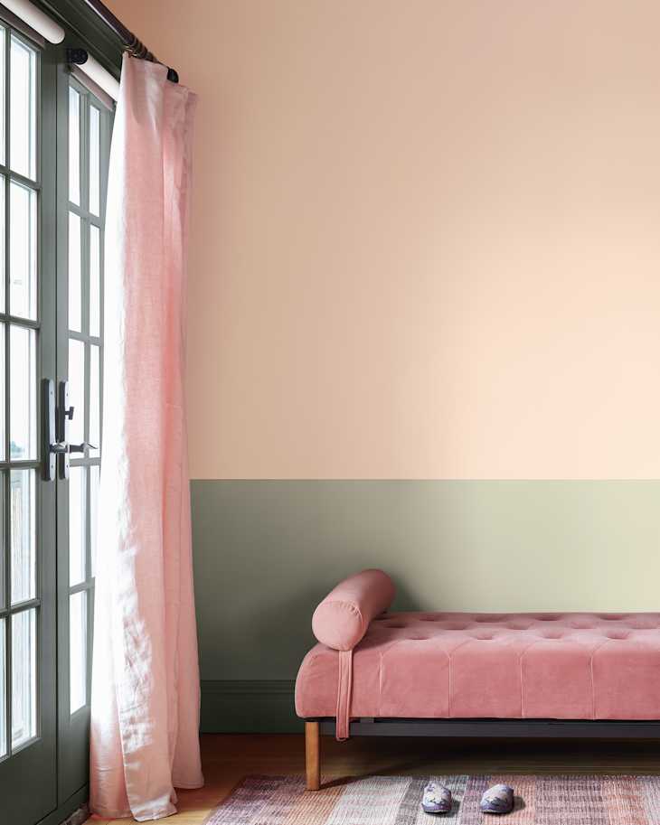
4. Clare Paint’s Rosé Season
If you’re looking for something a little brighter and more peppy, Clare Paint’s Rosé Season may be the perfect pick. Just like your favorite glass of Rosé, this pink paint is crisp, bright, and a little bit sweet. “Sunlight loves this fresh, sophisticated pink … It plays easily with warm neutrals and woven or wood textures for a space that feels casual but pulled together,” adds Saab.

5. Sherwin-Williams’ Intimate White
Don’t be fooled by the name; Intimate White (SW 6322) is pink through and through. This light shade is a whisper of pink with a touch of warmth that makes it incredibly versatile, says Krystal Reinhard, founder and principal designer of Old Soul Design Studio in West Chester, Pennsylvania.
“It behaves almost like a neutral but adds a subtle glow to a space, which I find especially effective in entryways, dining rooms, or nurseries,” she adds. “We recently used it in a nursery, and I love that it doesn’t feel overly juvenile — it’s a pink that can grow with the child, making it timeless as the room evolves.”

6. Sherwin-Williams’ Redend Point
Named as the Sherwin-Williams 2023 Color of the Year, this deep, muddy pink borders on the fringe between brown and red. Redend Point (SW 9081) is a versatile and inviting hue whose complex undertones add depth and interest to any space. “Redend Point is one of my favorite modern neutrals — it has warmth, depth, and just enough earthiness to feel grounding without being heavy,” says Reinhard. “I love using it in living rooms and bedrooms where you want that cocooning, inviting effect.”

7. Sherwin-Williams’ Romance
Sherwin-Williams’ Romance (SW 6323) is a soft and delicate blush tone. Its subtle beige and mauve undertones add warmth, making it an inviting choice for any room in the home. “It’s a soft, barely-there pink perfection that plays nice with nearly everything,” says Royder. “If you end up with it in your powder room, don’t be surprised when your guests can’t stop talking about it — or taking bathroom selfies. Consider yourself warned.”

8. Sherwin-Williams’ Pink Shadow
Sherwin-Williams’ Pink Shadow (SW 0700) is an ethereal yet sophisticated blush tone. Sallie Lord of GreyHunt Interiors loves this timeless pink for its softness and versatility, a feature that makes it a solid choice for living rooms, home offices, bathrooms and more. It’s perfect for spaces that aim to feel light and airy, and can even be used as a soft, flavored neutral, according to Lord.

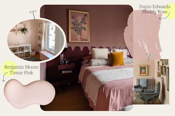
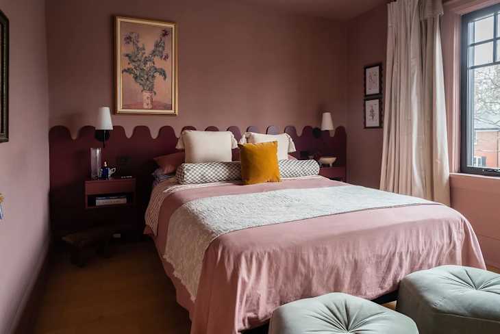
9. Dunn-Edwards’ Muddy Rose
Another muted rose pink that designers can’t get enough of is Dunn-Edwards’ Muddy Rose (DE6087). “[Muddy Rose] is an elegant shade of pink that pairs brilliantly with warm whites, deep greens, and teal,” adds Barnard.
If the idea of painting an entire pink wall feels intimidating, take a note from Barnard’s recent home office project illustrated above, where she used Muddy Pink on the trim and baseboards for a sweet pop of color that doesn’t overwhelm. “Pink can also be introduced through built-in shelving, the inside of a closet, or even a painted ceiling for a subtle, unexpected touch,” she says.

10. Backdrop’s 36 Hours in Marrakesh
Warm, vibrant, and undeniably earthy, Backdrop’s 36 Hours in Marrakesh is the perfect pick if you’re looking for a pop of color that doesn’t feel overpowering. It’s a “terracotta pink that feels warm and grounded, almost sun-baked,” explains Saab. “In a dining room or reading nook, it works with tonal trim and clay-colored accents to create a space that’s fresh in the morning and warm and enveloping at night.”