
How to Create a Bright Color Palette with These 14 Bold Hues
Earthy tones and muted hues may be having a moment (just look at 2025’s colors of the year so far!), but bright colors are always a timeless choice for interiors. Zesty oranges, vibrant teals, sunny yellows, and punchy pinks bring life, energy, and character into any home while suiting many design aesthetics. After years of “beige on beige” and “millennial gray” interiors, bright color palettes are becoming increasingly popular as people look to create spaces that feel personal and packed with personality.
“They have the effect of making a room feel more vibrant, lively, and emotionally uplifting. When done right, bright colors can strike a balance between boldness and sophistication, transforming a space into something both stylish and full of character,” explains Lindsey Jamison, partner and lead designer at Rumor Designs.

While bright color palettes often pack a visual punch, bringing them into your home may also feel intimidating. With the right approach, bright colors can be layered, balanced, and styled to create a space that feels vibrant and curated, not overwhelming.
If you’re craving more energy, spunk, and a heavy dose of visual interest, a bright color palette may be just what you need. Here’s what you need to know about creating bright color palettes for your home, including specific colors that designers are loving and how to layer them expertly.

What Are the Most Stylish Bright Colors?
Using bright colors in design is about more than just visual interest. Tenets of modern color psychology suggest that certain hues can influence your mood, making the use of bright colors in the home as strategic as it is aesthetically pleasing.
“In nature, color represents life, and I feel it can do the same in your interiors. Being drawn to color is inherent in our human nature, so why wouldn’t we incorporate that into our homes? I believe it can bring joy and energy into your life!” says Dani Dazey, maximalist interior and print designer (whose projects include Palm Springs’ Trixie Motel), and author of The Maximalist: Colorful Interiors for Bold Living.
For example, blue is known for its calming effects in cool palettes, making it a popular choice for restful bedrooms. Conversely, warm colors like red, orange, and yellow are known for their vibrant and energizing qualities, making them ideal for spaces meant for socializing and entertaining (think living rooms and kitchens).
That said, are there any bright colors that are off-limits, per design experts? According to designers I spoke to, the answer depends on the style and look you’re hoping to achieve. Some may choose to avoid bold, primary hues, opting instead for rich, sophisticated jewel tones. Others prefer a bold pop of red or blue instead.
Ultimately, the colors you choose for your home should reflect your unique taste. But being aware of the impact that color can have on any given room can also help you create a color palette that feels cohesive and harmonious.
Bright Color Palettes
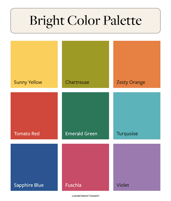
Combining a selection of bright colors into a palette is one of the quickest ways to create vibrancy and energy in your home. Bright colors that interior designers love include:
- Sunny yellow
- Chartreuse
- Zesty orange
- Tomato red
- Ruby red
- Forest green
- Emerald green
- Aqua
- Turquoise
- Bright blue
- Sapphire blue
- Fuschia
- Plum
- Violet
It’s an extensive list — but not all of these colors work together, and designers say doing it right makes all the difference. When rushed or overwrought, a bright color palette can easily feel chaotic and overwhelm a room. So what’s the trick to nailing a bright color palette every time? According to Jamison, understanding color theory is foundational to building a bright color palette that works (or any color palette, really!).
“When trying to decide what colors to pair, take it back to the color wheel,” she says. “Colors from the same ‘families’ pair well, like blues and greens together. Or go for opposites: Think, a rich plum and a vibrant mustard yellow.”
These are known as analogous colors and complementary colors, respectively. Opt for an analogous color scheme (think yellow, green, and blue, or red, orange, and yellow) for a more harmonious look. Otherwise, lean into a complementary color scheme if energy and contrast are your top priorities.
Alternatively, monochromatic color schemes can be a fun way to experiment with bringing bright color into a space. Monochromatic schemes utilize different shades of the same hue for a cohesive look that feels sophisticated and visually harmonious.
Whatever kind of color palette you create, designers recommend working with a maximum of two or three bright colors at a time to reduce visual overwhelm. Muted hues and neutral colors, as well as natural materials, will anchor the rest of the accents and the overall color palette in this space.
“Be careful not to mix too many bright colors in a single space — especially in bedrooms. Bright colors carry energy and can be too stimulating when you’re trying to wind down and fall asleep,” explains Heather Kirk, founder of Seattle-based Kirk Riley Design.
How to Use Bright Color Palettes
When it comes to using bright colors in your home, your options are just as varied as the hues available to choose from. Whether you love a minimalist look or are a maximalist color junkie at heart (hello, color drenching!), there’s a way to incorporate bright colors into your home decor.
If you need some inspiration, here are a few simple ways you can bring bright color palettes to add life and vibrancy to any space.

Take a minimalist approach with bold pops of color.
You don’t need bright colors covering every surface in your space to turn heads. For a minimalist, pared-back look, try incorporating bold pops of color into an otherwise neutral space, as demonstrated in this design-forward kitchen by Heather Kirk of Kirk Riley Design.

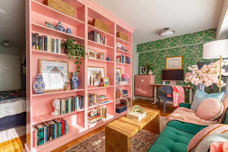
Keep the palette restrained.
Create a harmonious atmosphere with bright colors by keeping the color palette restrained with just two main colors, as demonstrated in this loft space by GreyHunt Interiors. Just as with monochromatic color schemes, the trick to pulling off a pared-back color scheme is to incorporate plenty of variation in texture and pattern (hello, colorful ceiling!) to ensure that the space doesn’t feel flat or monotonous.
Stay consistent with accent decor in the room.
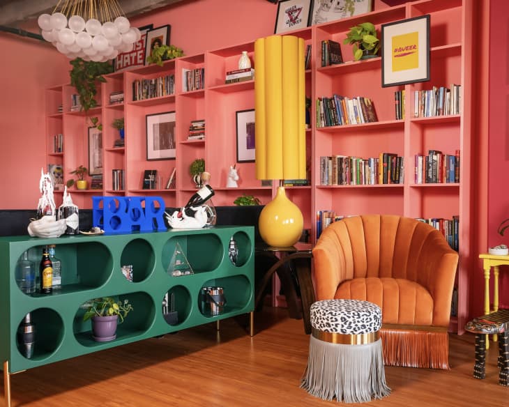
Designers agree that when it comes to bright color palettes, consistency is key. “Choosing a color palette and sticking with it is the trick! You can get away with a lot when you keep tying pieces in the room back to the color scheme,” says Dazey. “Print mixing, tons of textures, layered decadent decor. It all works out in the end if you keep a tight color palette,” she adds.

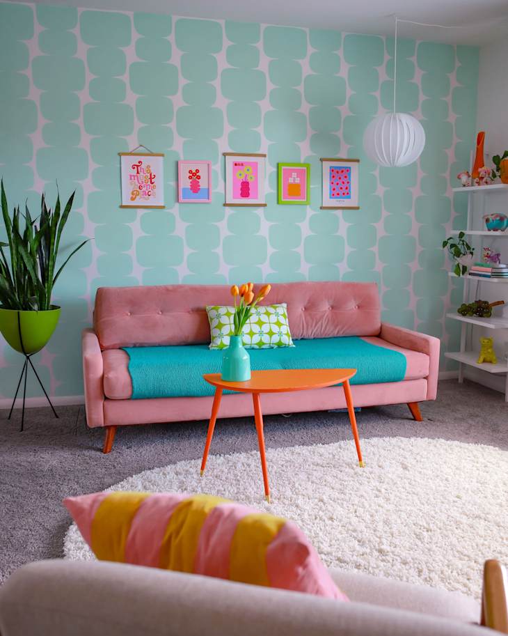
Play with patterns within your color palette.
If you’re looking for a foolproof way to incorporate bright hues into your space, don’t be afraid to experiment with layering bold colors into a standout pattern. Utilizing a bold stripe or floral pattern can feel less intimidating than working with block swatches of paint. Just take a look at this colorful Colorado-based apartment.

Go for a monochromatic look.
Bright color palettes are inherently vibrant and energetic, but opting for a monochromatic look can help create a cozy, calming, and sophisticated look — even with bold hues. This Amsterdam apartment features vibrant shades of pink for a look that’s equally soft and energizing.

Invite elegance with jewel tones.
Rich and lustrous jewel tones sit somewhere between bright colors and muted tones, and they are perfect for creating spaces that feel elegant and luxurious. This stylish powder room by GreyHunt Interiors features bright magenta wainscotting and crown molding with coordinating wallpaper. Brushed gold fixtures and matching decor bring the look home.
Lean into a retro aesthetic.
Bright, punchy colors like teal, bubblegum pink, lime green, neon orange, red, and yellow lend themselves well to nostalgic, retro designs. If these electric hues speak to you, why not add a little retro flair to your home decor? Take inspiration from this retro-inspired Indianapolis-based home that was completely transformed using bright colors — and read more about how retro style is back in vogue.