
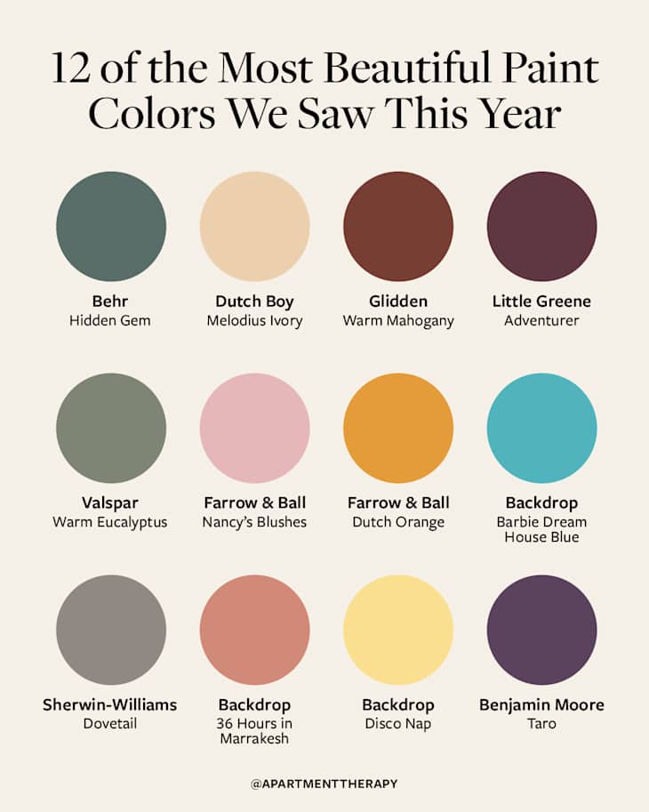
The 12 Most Beautiful Paint Colors Our Editors Saw (and Loved!) in 2025
With a new year just ahead, the editors at Apartment Therapy are celebrating the best of 2025 — and that includes some of the most beautiful colors our style pros saw this year. For anyone thinking of tackling a few home projects during the holidays, we know you’re already on the hunt for stunning hues to make old spaces feel brand-new again. You may find plenty of options if you look at the color of the year announcements from leading brands like Pantone and Sherwin-Williams — but there’s more to consider.
“We’re hearing from interior designers that 2026 will be a banner year for maximalist spaces that are full of character and personality — and colors will continue to be deep, rich, and full of life,” says Zee Krstic, Apartment Therapy’s senior home editor, referencing data collected for the 2026 State of Home Design report (available now!). “Warm paint colors that help make any room feel inviting and cozy are going to dominate our social feeds in the year to come.”

And editors have already spotted these gorgeous hues in real homes. If you’re looking for color inspo, consider the following list of our editors’ favorite paint colors of 2025; they range from dark and moody to light, bright, and spunky to boot. No matter which direction you take your room makeover, there’s definitely a color on this list that’ll speak to you.
1. Behr’s Hidden Gem
Although Behr’s “Hidden Gem” was a hit this past year, it’s also the brand’s 2026 Color of the Year, so it’s not fading into the background anytime soon. Described by the brand as a “smoky jade with an air of mystery and sophistication,” it’s the perfect cool-toned shade of earthy green that packs a serious punch when used for color drenching. Or, it can serve as a grounding accent color in a neutral-heavy space.

2. Dutch Boy’s Melodious Ivory
If Pantone’s Color of the Year, “Cloud Dancer,” just doesn’t quite scratch that itch when it comes to a neutral paint, Dutch Boy’s “Melodious Ivory” might do the trick. It’s a warm ivory that “brings a nostalgic, elevated vibe, perfect for showcasing handmade pieces and bold layers,” according to the Dutch Boys website. With a hint of peach, a dash of yellow, and a base of cream, it’s far from a stark white, yet creates a neutral base that feels warm and homey.
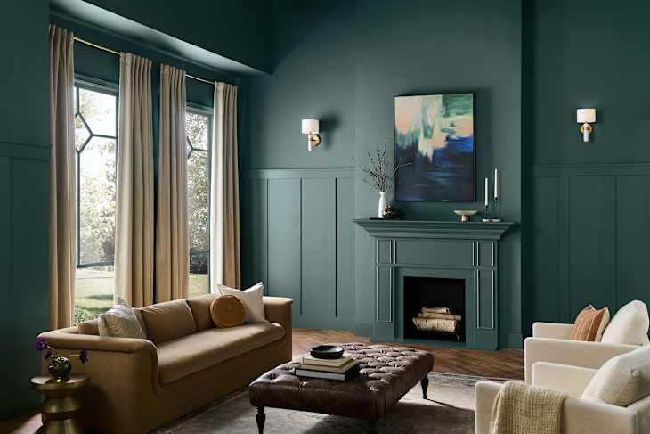
3. Glidden’s Warm Mahogany
Like a color that brings a heavy dose of drama to a room? Glidden’s “Warm Mahogany” does the trick. It’s a “rich, grounded red” that pairs perfectly with neutrals or stands strong on its own. This deep, earthy red tone pairs well with sagey greens, muted blues and aquas, warm grays, and red-toned browns, but it’s also ideal for color drenching if you prefer a bolder look.

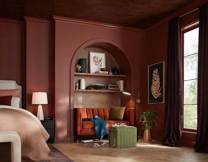
4. Little Greene’s Adventurer
Little Greene’s “Adventurer” is a little bit plum, a little bit eggplant, and a whole lot of moodiness packed into a single shade. It’s the perfect paint color for those who want to go dark without sticking to gray scale. Little Greene recommends “Adventurer” for bedrooms because it creates a sense of intimacy, and if you want to lighten it up, pair it with dusky pinks, sage greens, or pale blues.

5. Valspar’s Warm Eucalyptus
Think of Valspar’s “Warm Eucalyptus” as “Hidden Gem’s” warmer, sagier cousin. It teeters on gray, making it perfect for the person who wants to experiment with a richer hue without stepping too far out of neutral territory. It’s actually Valspar’s Color of the Year, so expect to see it more; it’s calming, serene, comforting, and will help you be more mindful in the year ahead.

6. Farrow & Ball’s Nancy’s Blushes
IKEA named “Rebel Pink” as its 2026 Color of the Year, and Farrow & Ball’s “Nancy Blushes” is a perfect paint color to choose if you want to hop on the “Rebel Pink” trend. “Nancy’s Blushes” is a “true pink” and “certainly grabs your attention,” the paint brand admits. It’s powdery, playful, and super cheery, plus it pairs well with creams and whites, teal blues, and more rustic reds.
7. Farrow & Ball’s Dutch Orange
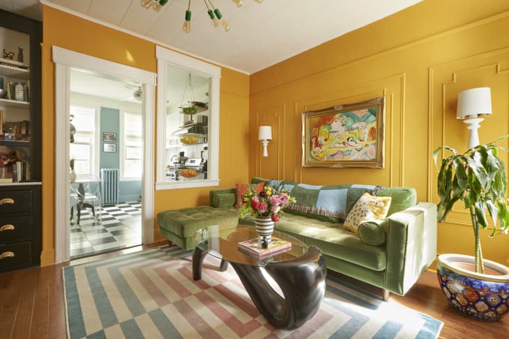
Our style pros called it back in July, but Marigold paint is going to change your mind about orange-adjacent colors in your space. Farrow & Ball’s “Dutch Orange” is a “clean bright orange” shade that’s lively, warm, and adds a pop of brightness to any space. It playfully accents modern design, brings a fun touch to historic or traditional spaces, and can make a boring color so much more interesting.

8. Backdrop’s Barbie Dreamhouse Blue
If you’ve been on the hunt for a true teal, Backdrop’s “Barbie Dreamhouse Blue” might be the winner. Backdrop’s take is the same color as the iconic hue featured in Barbie’s Dreamhouse pool. Of course, it looks incredible with a classic pink, but you can keep it simple by pairing it with creams, lighter blues and aquas, or even pops of orange (“Dutch Orange,” perhaps!).
9. Sherwin-Williams’ Dovetail
Sherwin-Williams’ “Dovetail” may just be the perfect warm gray that acts as a neutral base while keeping a space feeling cozy. It’s dark enough to feel like an intentionally bold color choice, but it remains neutral and far from overwhelming. It works well as a base for pops of colorful decor in accent details.
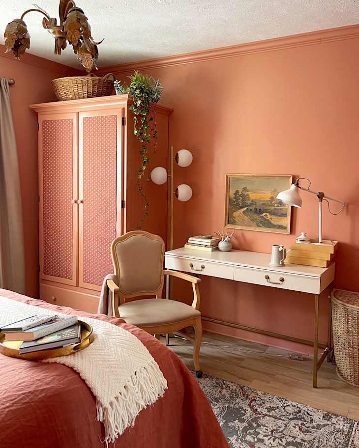
10. Backdrop’s 36 Hours in Marrakesh
A mix between terracotta and pink, Backdrop’s “36 Hours in Marrakesh” is a warm, earthy, hue that feels like you’re on a sunbaked vacation abroad. It’s perfect for those people who like the idea of leaning into the “Rebel Pink” theme, but don’t want to commit to a color that screams pink.

11. Backdrop’s Disco Nap
The butter yellow trend is getting a dose of acidity with Backdrop’s “Disco Nap.” Known as a “dirty pastel, acid yellow of your dreams,” this is the perfect yellow shade for those who enjoy a pop of color that isn’t too overpowering. It will make your space feel brighter, lighter, and cheery — how can you not be happy in a yellow room?

12. Benjamin Moore’s Taro
The perfect purple shade actually does exist, and it’s Benjamin Moore’s “Taro.” It’s a “rich, soulful” hue that packs a punch whether it’s used as an accent color or if it’s used to drench the entire space. It can lean either warm or cool, depending on the colors you pair it with — plus, the dusky finish gives the shade a muted feeling in certain lighting.
Design Defined
Never miss the style inspo and recommendations you crave with Design Defined. Follow along each week as our Home Director Danielle shares the best style advice, latest trends, and popular decor finds you just can't miss.